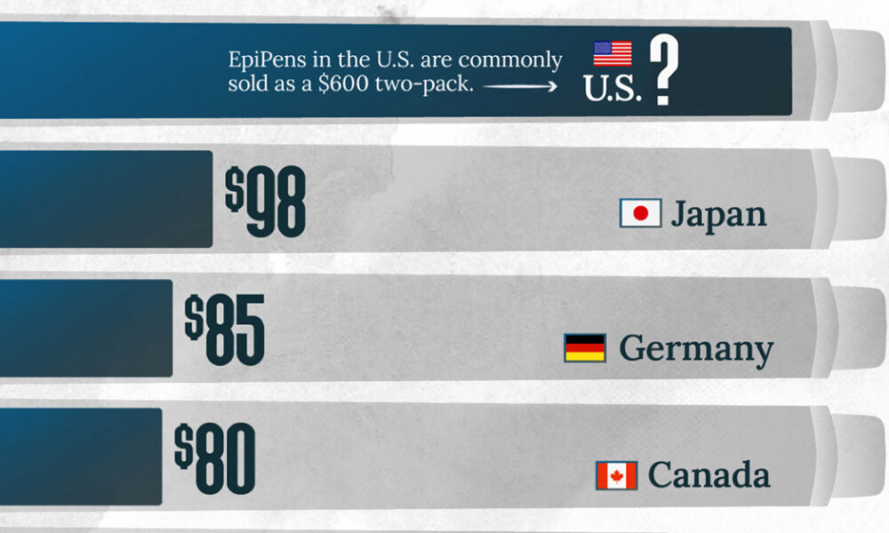
This visualization compares EpiPen prices around the world, with the U.S. having the highest prices by far.
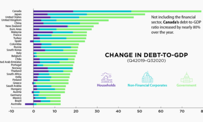

The battle against the COVID-19 pandemic has resulted in heightened debt-to-GDP levels across all sectors and countries.


This graphic compares consumers’ most loved brands before the COVID-19 pandemic to their most loved brands during the pandemic.
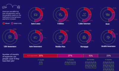

57% of U.S. consumers' incomes have taken a hit during the pandemic. How do such financial anxieties affect the ability to pay bills on time?
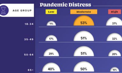

This graphic visualizes the impact of COVID-19 on emotional distress levels by different demographic subgroups such as race, education, or sex.
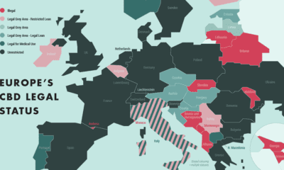

This graphic explains the innately complex legal status of CBD products in Europe and highlights the countries leading the CBD charge.
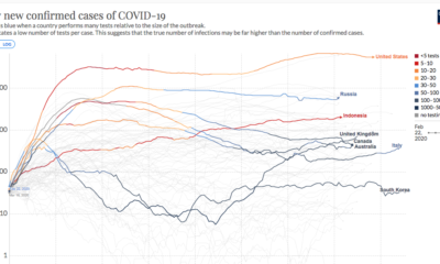

This continuously updated chart provides a more complete look at the efficacy of COVID-19 containment strategies.
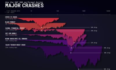

How does the COVID-19 market crash compare to previous financial crises? We navigate different contextual factors impacting crashes.
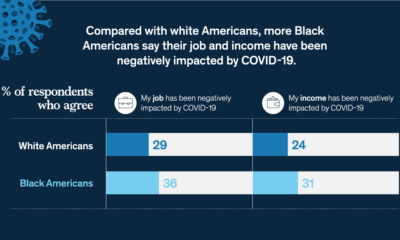

COVID-19 has worsened Black-White financial inequality, with Black Americans more likely to see negative impacts to their job and income.


This infographic provides a simple overview of the seven most common psychedelic substances and explores their therapeutic potential.
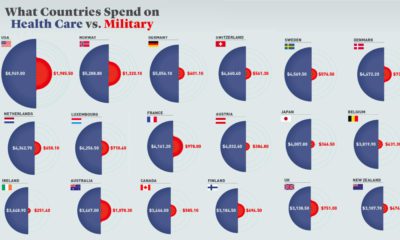

Every year, governments spend trillions on healthcare and defense. But how much is spent per person, and how does this compare by country?


