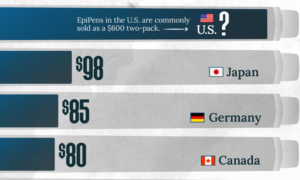
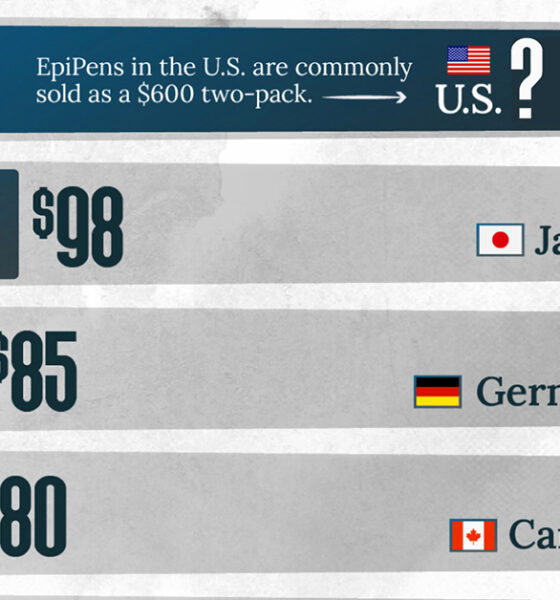
This visualization compares EpiPen prices around the world, with the U.S. having the highest prices by far.
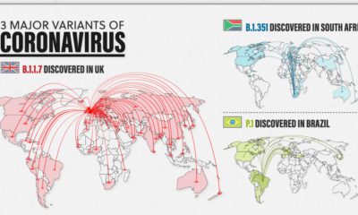

New variants of COVID-19 are spreading fast around the world. Here’s a look at the 3 major ones and how they differ from one another.


It’s been a long year since the WHO declared the novel coronavirus a global pandemic. This visual looks at key events in the COVID-19 timeline.
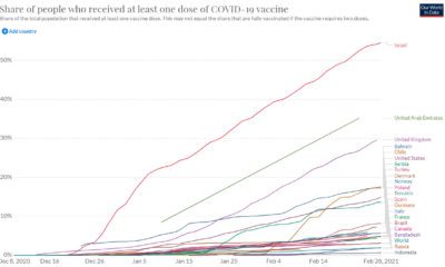

Vaccine rollouts are underway, but how quickly are COVID-19 vaccines being administered? This charts follows vaccine administration globally.
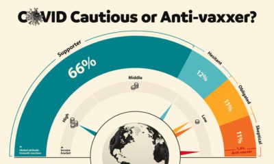

This graphic visualizes global attitudes to vaccines categorized into five segments including anti-vaxxers and COVID cautious.
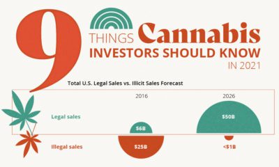

This graphic provides an overview of 9 key developments in the cannabis industry that investors should be aware of going into 2021.
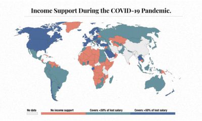

The need for income support during COVID-19 has been vast. This map visualizes different levels of income support around the world.
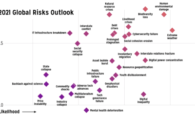

Which risks are top of mind in 2021? We visualize the World Economic Forum's risk assessment for top global risks by impact and livelihood.
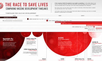

This graphic looks at how long vaccine development has historically taken for pandemics dating back to the 1900s.
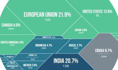

Visualizing the share of COVID-19 vaccines purchased by different countries and the companies that are manufacturing them.
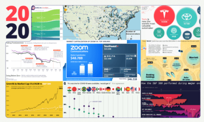

These 20 charts, maps, and visualizations help capture what happened in a tumultuous year around the globe.


