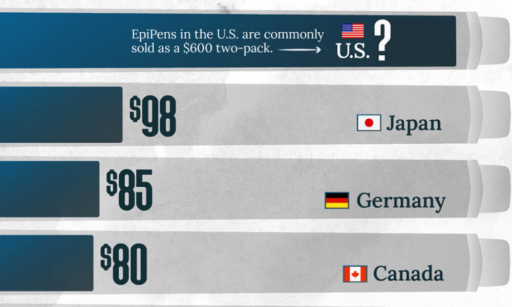
This visualization compares EpiPen prices around the world, with the U.S. having the highest prices by far.
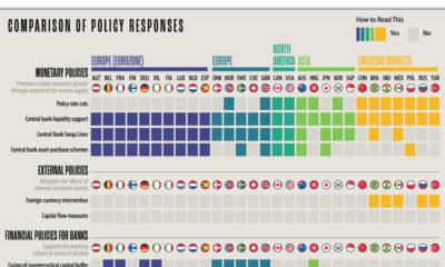

What policy tools are global central banks implementing to combat the economic effects of COVID-19? We compare the responses of 29 countries.
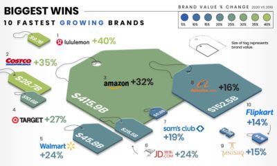

This infographic illustrates how the fastest growing and declining retail brands are attempting to stay relevant in the pandemic economy.
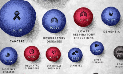

COVID-19 deaths can be hard to interpret without context. This graphic shows how many people die each day globally, by cause.
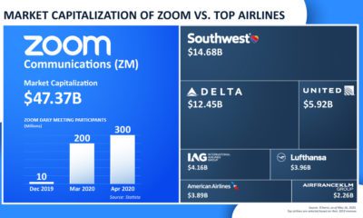

Zoom benefits from the COVID-19 virtual transition—but other industries aren't as lucky. The app is now more valuable than the world's seven largest airlines.
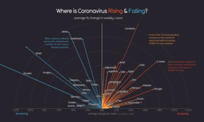

Globally, the curve of COVID-19 cases is flattening, but individual countries vary considerably as new pockets of the world deal with the pandemic.
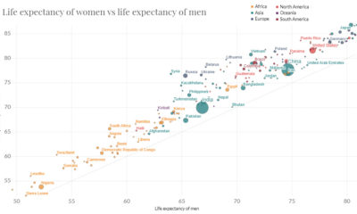

In just 65 years, global life expectancy has skyrocketed. See its ascent in this short animation, or dive into the interactive version for more data.
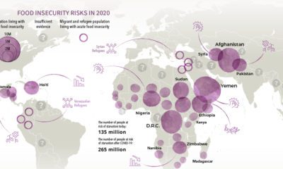

Over 135 million people face acute food insecurity worldwide—but COVID-19 could almost double these numbers. Which regions could be most affected?
Which apps have been the winners and losers of the COVID-19 lockdown? See how consumer behavior and app popularity has shifted in recent months.
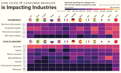

This infographic showcases the industries that will benefit from COVID-19 consumer spending, and the industries that have a very uncertain future.
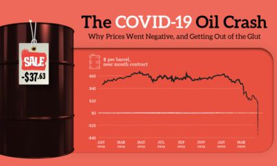

How oil prices went negative: this explainer shows how a collapse in demand, a Saudi-Russia price war, and oversupply led to futures prices going wonky.


