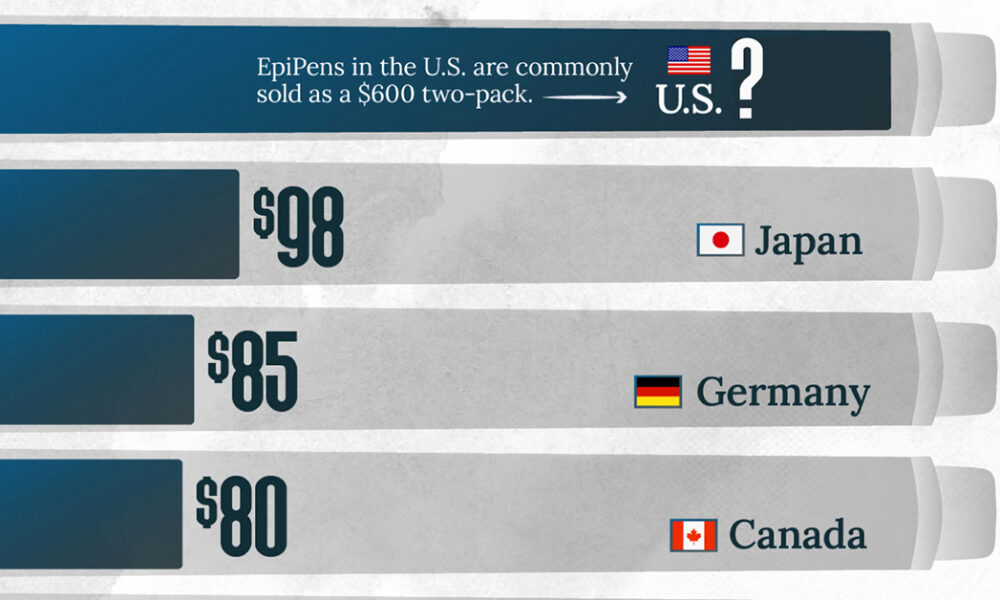
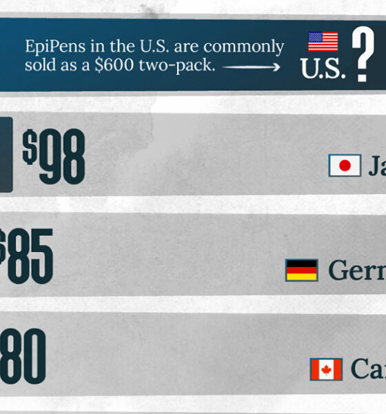
This visualization compares EpiPen prices around the world, with the U.S. having the highest prices by far.
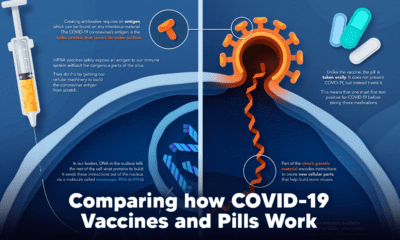

Despite tackling the same disease, vaccines and antiviral pills work differently to combat COVID-19. We visualize how they work in the body.
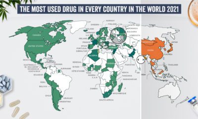

What are the most commonly used illicit drugs around the world?
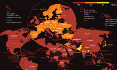

There are 8 common blood groups but 36 human blood types in total. Here we map the most widespread blood types in every country in the...
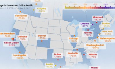

All North American downtowns are facing a sluggish recovery, but some are still seeing more than 80% less foot traffic than pre-pandemic times
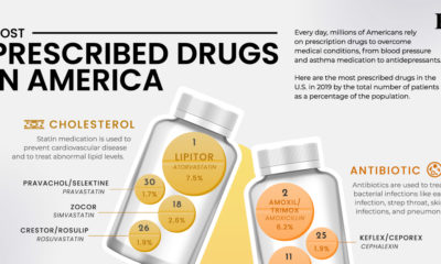

Here are the 30 most prescribed drugs in America, from blood pressure treatments to asthma medication.
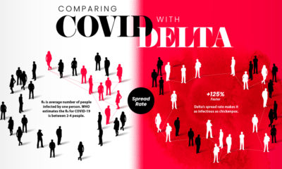

How does the COVID-19 Delta variant compare with the original disease? Here are the key differences according to consolidated studies.
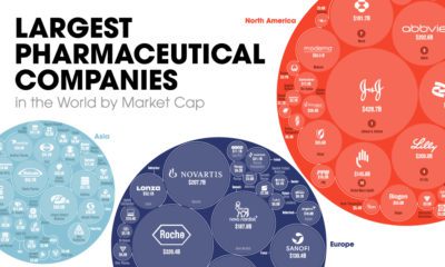

The world's biggest pharmaceutical companies are worth $4.1 trillion. Here we map the top 100 companies based on their market cap value.
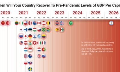

The path to COVID-19 recovery varies worldwide—some countries have already recovered, while others will not be back to normal for years.
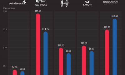

Compared to America, the EU has paid significantly less for a range of COVID-19 vaccines. Here's a look at vaccine prices in each region.
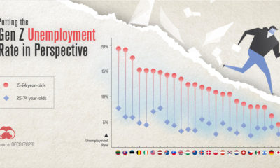

COVID-19 has impacted everyone, but one generation is taking it harder than the others. This graphic reveals the Gen Z unemployment rate.


