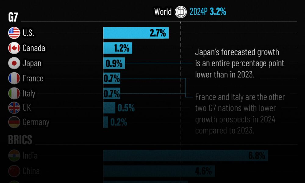
The IMF has released its economic growth forecasts for 2024. How do the G7 and BRICS countries compare?
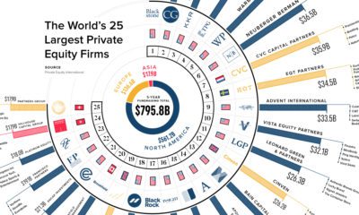

How big is private equity? We show funds raised by the largest 25 private equity firms over the last five years and their notable investments.
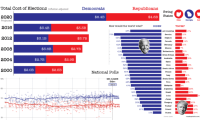

Buckle up your seatbelts—we look at 9 key data-driven charts to get you prepped for this consequential day in U.S. election history.


Where are the world’s highest cities? This graphic ranks the world’s major urban centers by altitude above sea level.
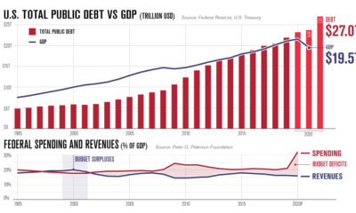

America's debt recently surpassed $27 trillion. In this infographic, we peel back the layers to understand why it keeps on growing.
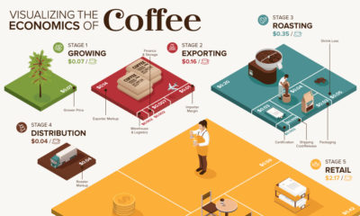

What makes your cup of coffee possible, and how much does it really cost? Here’s how the $200B coffee supply chain breaks down economically.
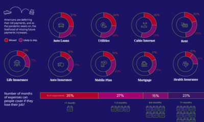

57% of U.S. consumers' incomes have taken a hit during the pandemic. How do such financial anxieties affect the ability to pay bills on time?
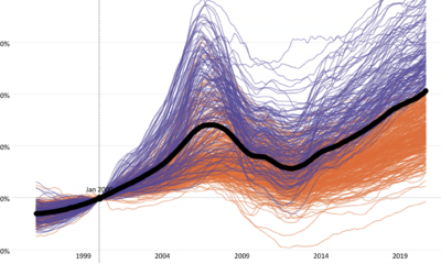

This interactive visualization tracks two decades of home price changes in hundreds of cities in the United States.
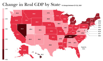

In just a few months, the U.S. economy reeled from COVID-19. As real change in GDP suffered, which states and industries were the hardest-hit?
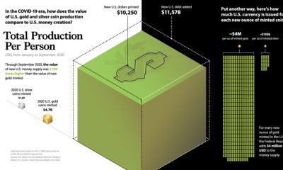

Amid trillions in COVID-19 stimulus, this graphic compares new U.S. dollars printed to U.S. precious metal coin production.


The Dow Jones Industrial Average is constantly evolving. This chart tracks which companies have come and gone since the inception of the index in 1928.


