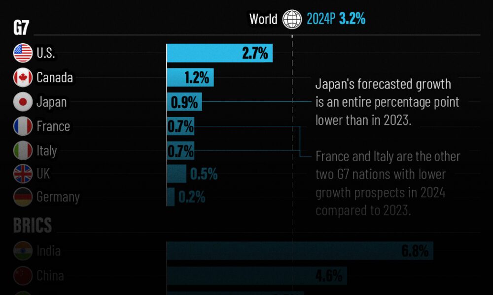
The IMF has released its economic growth forecasts for 2024. How do the G7 and BRICS countries compare?
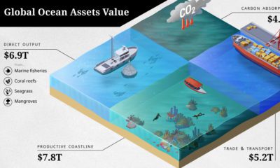

The ocean economy is under threat. How are human activities impacting the sustainable use of our ocean assets, valued at over $24 trillion?
As unemployment levels rise, we navigate the fallout of COVID-19 as layoffs ripple across the once-thriving startup ecosystem.
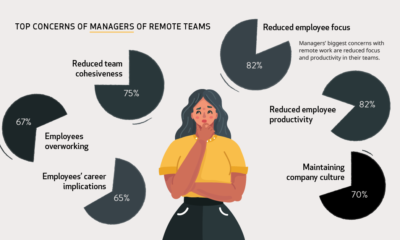

During the pandemic, millions of people have transitioned to working remotely. But how do workers and managers actually feel about it?
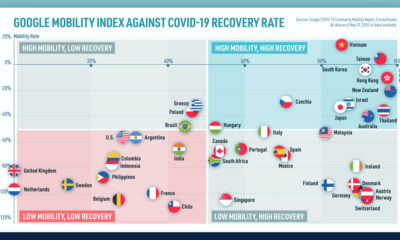

We look at mobility rates as well as COVID-19 recovery rates for 41 economies, to see which countries are reopening for business.
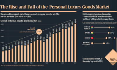

This infographic charts the rise and fall of the $308 billion global personal luxury market, and explores what the coming year holds for its growth
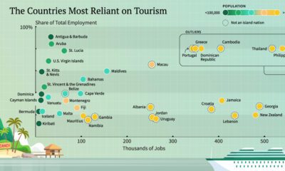

With international travel grinding to a halt, here are the economies that have the most to lose from a lack of tourism.
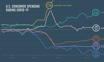

How has COVID-19 transformed consumer spending trends so far? We look at credit and debit card spending of 5 million U.S. consumers across 18 categories.
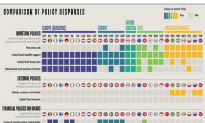

What policy tools are global central banks implementing to combat the economic effects of COVID-19? We compare the responses of 29 countries.
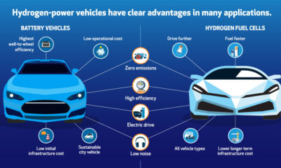

Here are six reasons why hydrogen and fuel cells can be a fit for helping with the transition to a lower-emission energy mix.
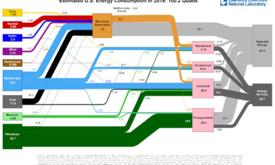

This incredible flow diagram shows how U.S. energy use broke down in 2019, including by source and end sector.


