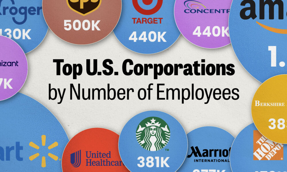
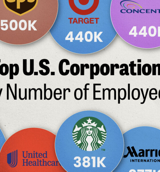
We visualized the top U.S. companies by employees, revealing the massive scale of retailers like Walmart, Target, and Home Depot.
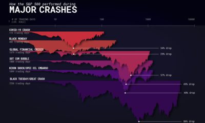

How does the COVID-19 market crash compare to previous financial crises? We navigate different contextual factors impacting crashes.
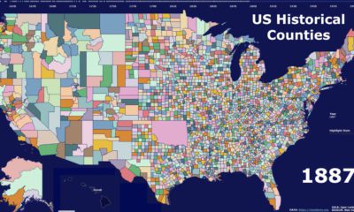

This video highlights the history of American counties, and how their boundaries have changed over the last 300 years.
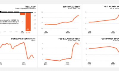

As COVID-19 spreads around the U.S. leaving economic upheaval in its wake, this snapshot reveals how major economic indicators are trending
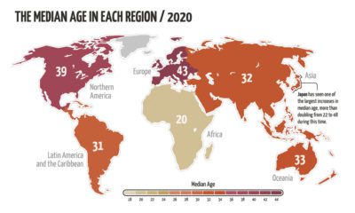

The world’s population is aging, but not at the same rate. This animated map visualizes the changes in median age in every region since 1950.
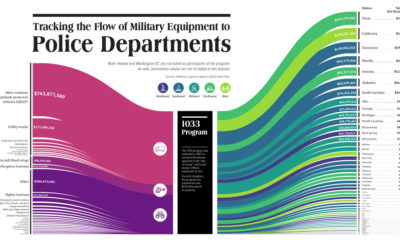

This visualization tracks the last decade of the 1033 Program, which provides free military equipment to police departments around the U.S.
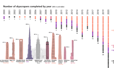

Once a rarity, supertall skyscrapers now punctuate the skylines of cities around the world. We chart the construction of these structures over the past 20 years
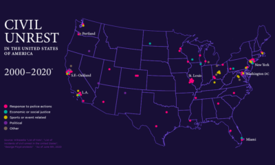

This map of civil unrest in the United States helps provide much needed context on how individual events fit within the nation-wide pattern over time.
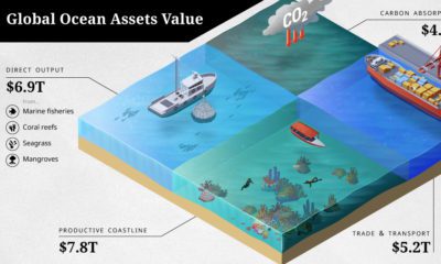

The ocean economy is under threat. How are human activities impacting the sustainable use of our ocean assets, valued at over $24 trillion?
As unemployment levels rise, we navigate the fallout of COVID-19 as layoffs ripple across the once-thriving startup ecosystem.
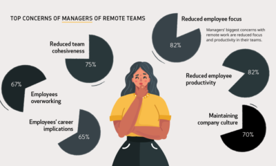

During the pandemic, millions of people have transitioned to working remotely. But how do workers and managers actually feel about it?


