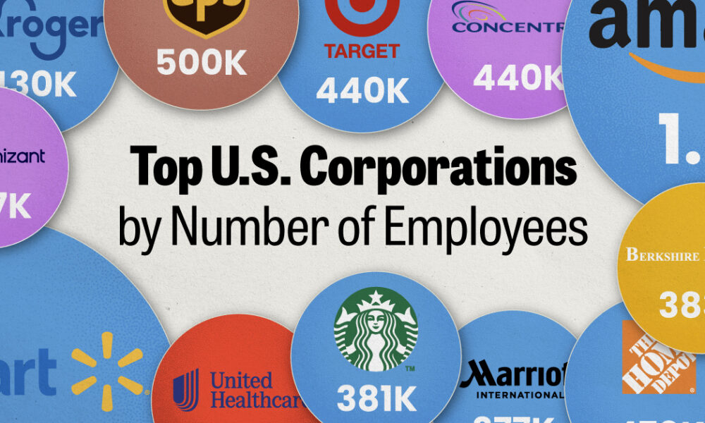
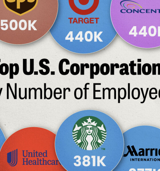
We visualized the top U.S. companies by employees, revealing the massive scale of retailers like Walmart, Target, and Home Depot.
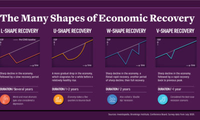

Economic recovery from COVID-19 could come in four shapes—L, U, W, and V. What do they mean, and what do global CEOs see as the most...
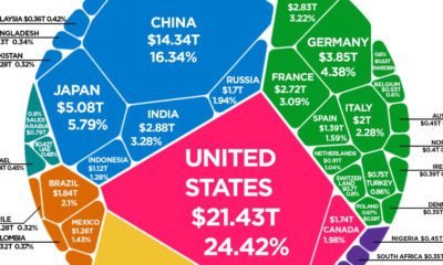

The world's total GDP crested $88 trillion in 2019—but how are the current COVID-19 economic contractions affecting its future outlook?
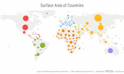

We’ve come a long way since Pangea. This short video examines the area, population, and GDP of our continents as a share of the world's total.
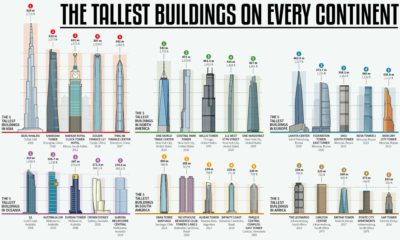

How much higher and further into the skies can we reach? This infographic looks at the most impressive skyscrapers gracing every continent.
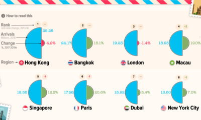

Even a pandemic can't curb wanderlust—when tourism comes back, here are the most popular city destinations that will be seeing visitors.
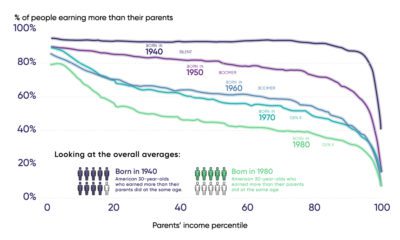

Each generation of Americans has historically earned more than their parents, but declining upward mobility is putting this growth at risk.
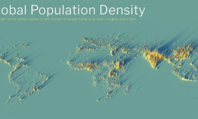

What does population density look like on a global scale? These detailed 3D renders illustrate our biggest urban areas and highlight population trends.
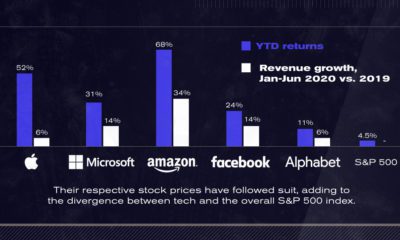

After a strong start to 2020, U.S. tech giants continue to advance to unprecedented highs. The Big Five now account for 25% of the S&P 500.


Picking the right VP makes all the difference to a President's success. We look at running mates of all Presidential hopefuls since 1940.


How does coffee get from a faraway plant to your morning cup? See the great journey of beans through the coffee supply chain.


