

Lions, tigers, and bears, oh my!—these animals do not feature on this list of popular American household pets.
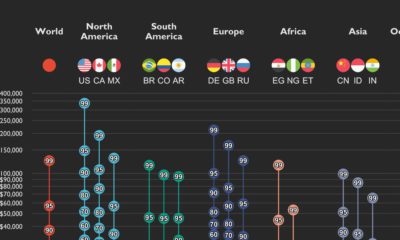

This graphic shows income distributions in 16 different countries around the world, using data from the World Inequality Database.
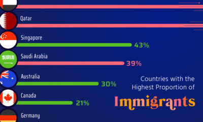

Here, we highlight countries that are magnets for immigration, such as UAE and Qatar, as well as nations with very few foreign born residents.
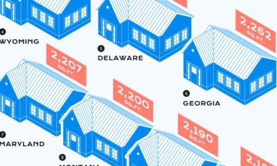

Over the last century, the median home size in the U.S. has skyrocketed. Here’s a look at which states have the biggest and smallest homes.
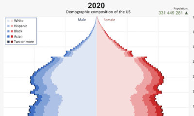

From 1901 to 2020, the U.S. population has changed significantly. This video reveals the change in America's demographics over 100+ years.
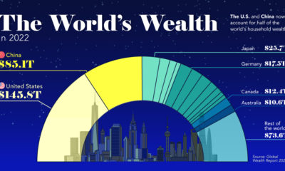

This visualization breaks down how household wealth is distributed around the world. Just 10 countries now account for 75% of total household wealth.
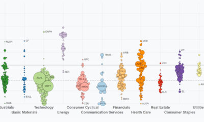

This video highlights S&P 500 performance through Q3. See how sectors and key companies have performed from Jan 1 to Sep 30, 2022.
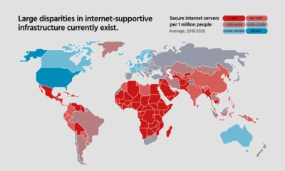

In this infographic, we examine the current state of digital fragmentation and it’s implications on the world.
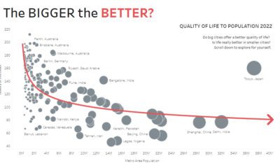

Are big cities all they’re cracked up to be? These interactive charts about population size question whether bigger always equals better.
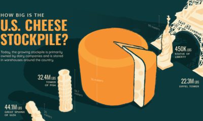

The U.S. has 1.5 billion pounds of cheese in cold storage across the country—around $3.4 billion worth of cheese.
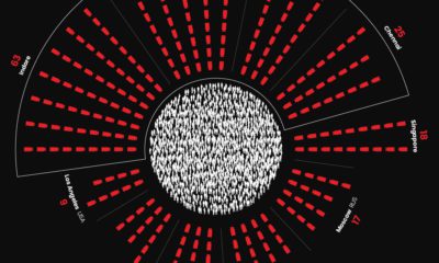

The world's most surveilled cities contain hundreds of thousands of cameras. View this infographic to see the data in perspective.


 Creator Program