Energy
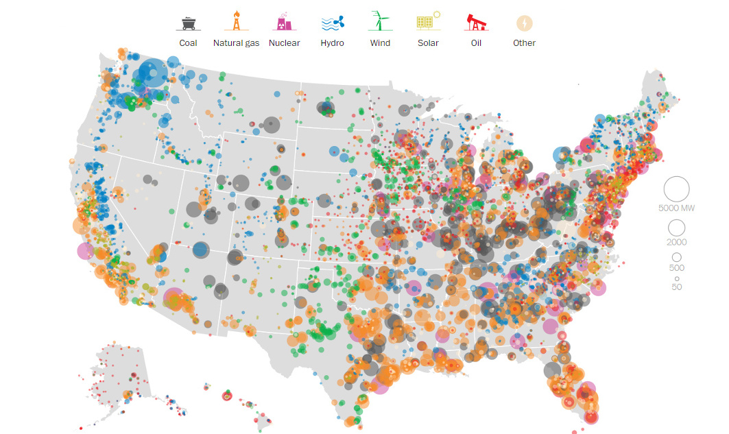
Mapping Every Power Plant in the United States
Note: Updated to reflect 2017 numbers
The Washington Post has put together an extraordinary data visualization that shows how the United States has generated its electricity so far this year. Using data from the Energy Information Administration, they have mapped every power source and categorized it by type and size.
Related Topic: What it Takes to Power New York (Slideshow)
I will recap the most interesting parts of their project here, but we highly recommend that you visit their online interactive version of this visualization to get the most out of their work.
Plant Capacity by Megawatt
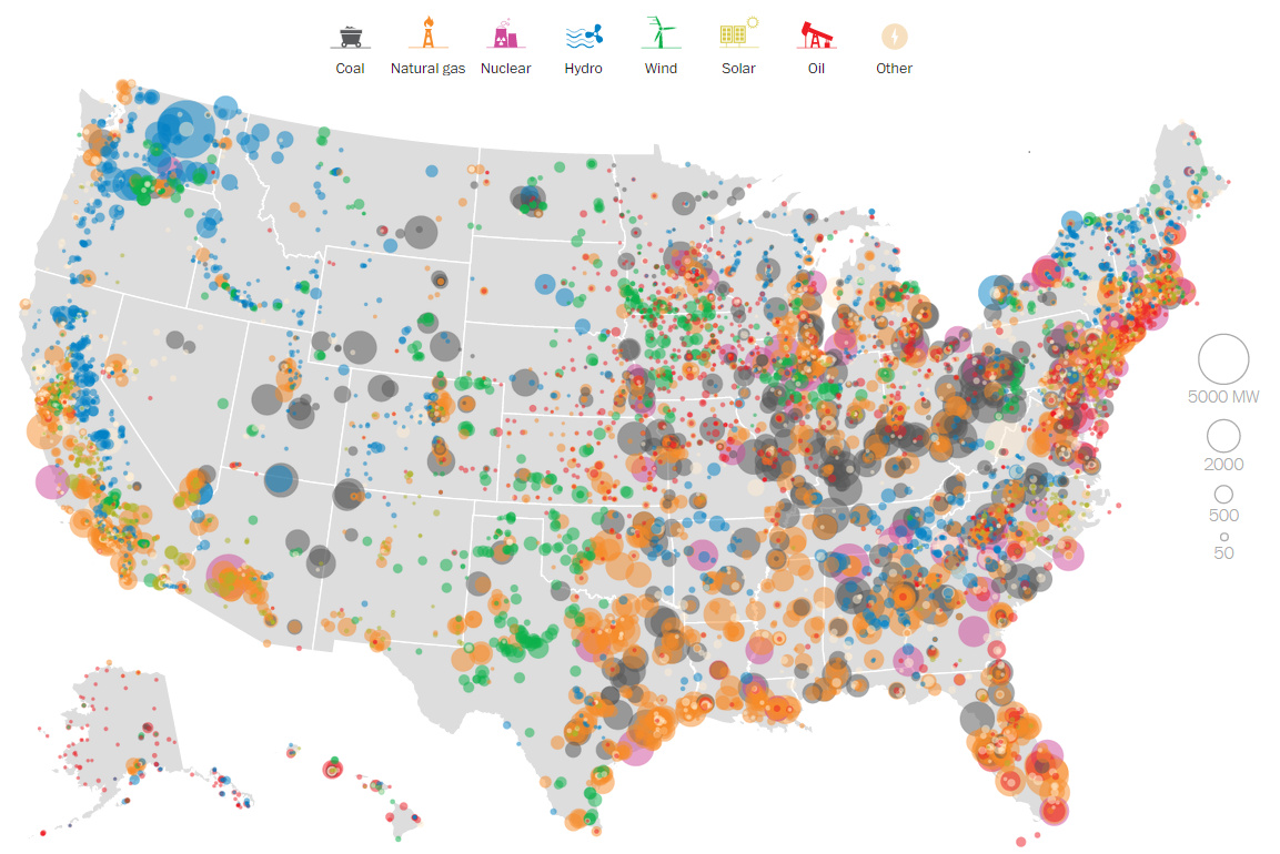
This above visualization is a little overwhelming, as it includes every power source in America. However, later on we will show various visualizations by power type, which make it easier to make sense of.
Power Generated by Source: Coal
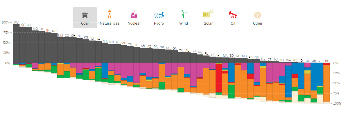
Data visualized like this shows there is still a large reliance on specific energy types such as coal, hydro, and nuclear. For example, in 2017, 27 states still rely on coal to produce at least 25% of their electricity.
Meanwhile, the following chart on solar shows how far photovoltaics still have to go to make a significant impact in the overall energy mix.
Power Generated by Source: Solar
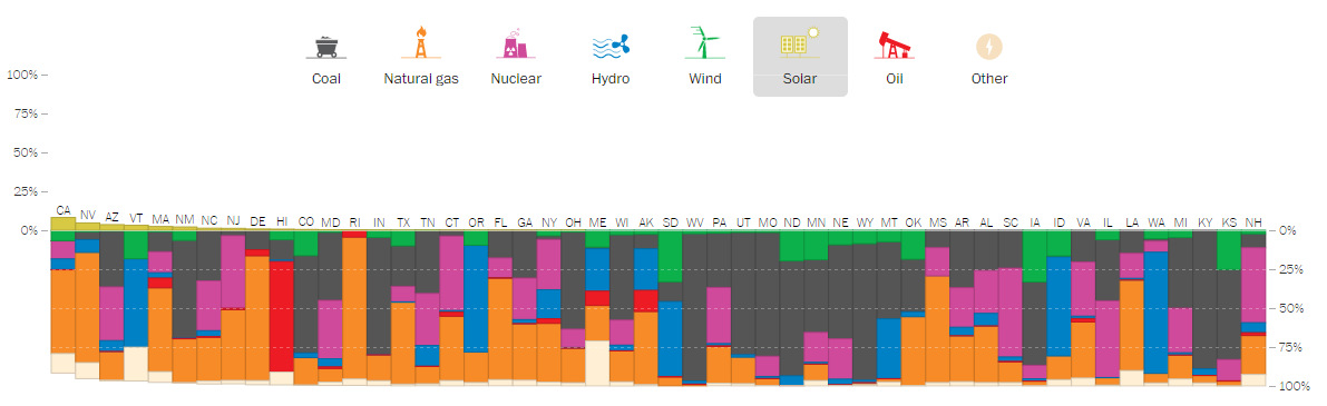
While community solar farms are starting to take off in the United States, solar technology as a whole still does not provide substantial amounts of electricity. It is clear that California is the leader in solar capacity, but it actually only accounts for 10% of total electricity generation in the state.
Coal Power Map
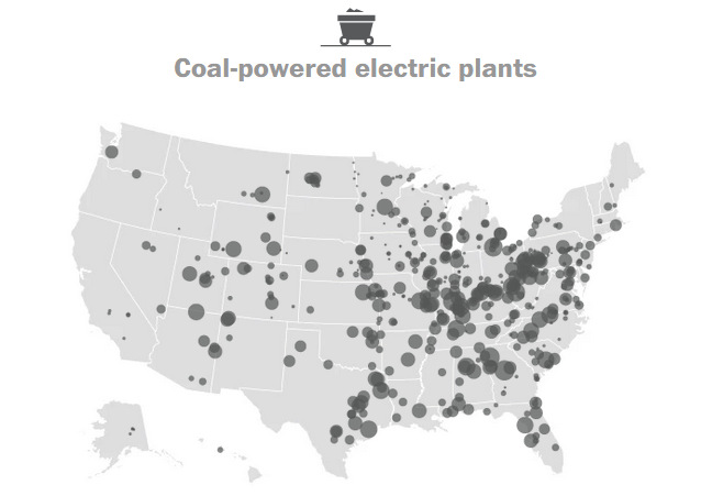
The United States has 400 coal-fired power plants that generate 30% of the nation’s electricity. Coal produces the majority of energy in 13 sates, but thanks to America’s Clean Power Plan, a whopping 111 plants have been shut down since 2015.
Natural Gas Power Map
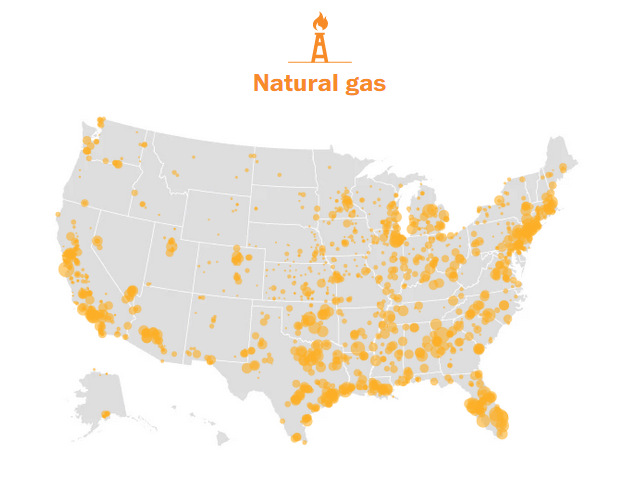
The United States has 1,793 natural gas power plants that generate 34% of the nation’s electricity. Natural gas is the primary source of power in 19 states.
Nuclear Power Map
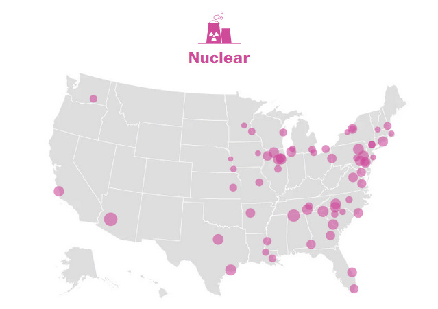
The United States has 61 nuclear reactors that generate 20% of the nation’s electricity. 20 states get no power from nuclear at all.
Hydro Power Map
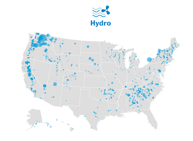
The United States has 1,444 hydroelectric dams that generate 7% of the nation’s electricity. The Grand Coulee Dam in Washington State has 6,809 MW of installed capacity, making it the largest contributor in nameplate capacity in the country. (However, as Forbes notes, actual electricity generated depends on capacity factor.)
Wind Power Map
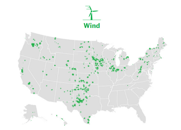
The United States has 999 wind power plants that generate 6% of the nation’s electricity. The best source for wind is in the Great Plains, where it blows very reliably. Around 2010, China leapfrogged the USA with parabolic wind power growth.
Solar Power Map
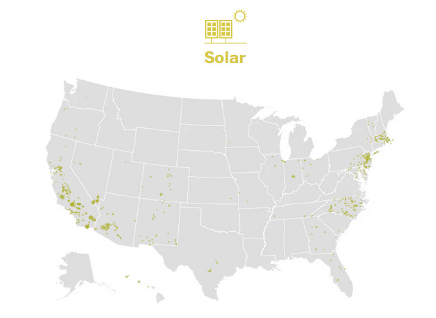
The United States has 1,721 solar power plants that generate 1% of the nation’s electricity.
Oil Power Map
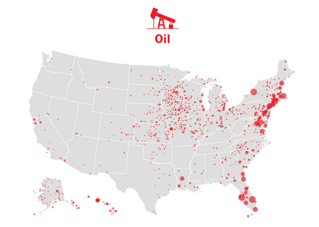
The United States has 1,076 oil-fired power plants that generate less than 1% of the nation’s electricity. America is shaking off its addiction to oil and no longer relies on it for generating electricity because of price swings. Hawaii is the only state to get the majority of its energy from oil.


Energy
Mapped: The Age of Energy Projects in Interconnection Queues, by State
This map shows how many energy projects are in interconnection queues by state and how long these projects have been queued up, on average.
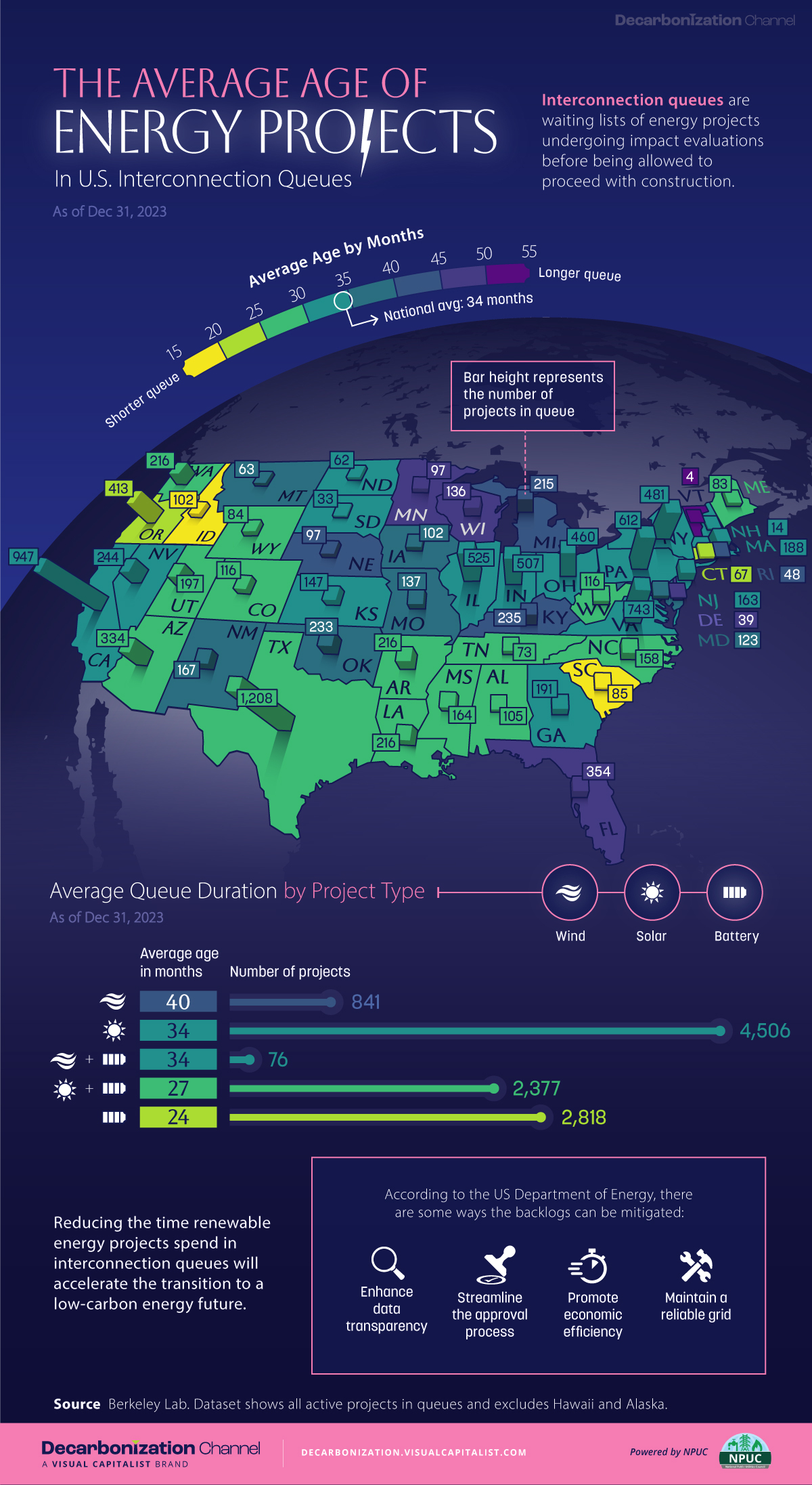
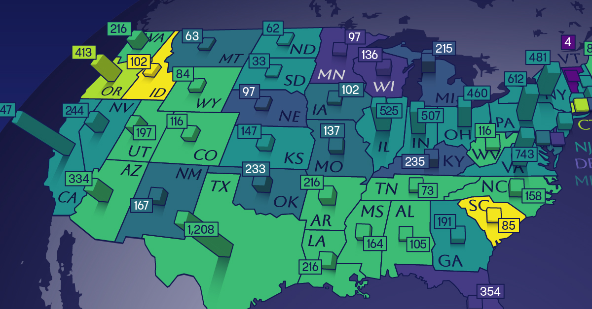
Age of Energy Projects in Interconnection Queues, by State
This was originally posted on our Voronoi app. Download the app for free on iOS or Android and discover incredible data-driven charts from a variety of trusted sources.
By the end of 2023, more than 11,000 energy projects were in interconnection queues in the United States, waiting for a green-light from regional grid operators to proceed with construction.
This map, created in partnership with the National Public Utilities Council, maps out the average age of active energy projects in interconnection queues by state, using data from Berkeley Lab.
Interconnection Queues, Explained
Interconnection queues are lists of energy projects that have made interconnection requests to their regional grid operators. Once submitted, these requests formally initiate the impact study process that each project goes through before grid connection, forming waiting lists for approval known as interconnection queues.
In recent years, both the number and generation capacity of queued projects have surged in the United States, along with the length of time spent in queue.
According to Berkeley Lab, the amount of generation capacity entering queues each year has risen by more than 550% from 2015 to 2023, with average queue duration rising from 3 years to 5 years the same period.
As a result of the growing backlog, a large proportion of projects ultimately withdraw from queues, leading to only 19% of applications reaching commercial operations.
The Backlog: Number of Projects and Average Wait Times
Of the 11,000 active projects in U.S. queues at the end of 2023, Texas, California, and Virginia had the most in queue; 1,208, 947, and 743, respectively.
When looking at the average ages of these projects, all three states hovered around the national average of 34 months (2.83 years), with Texas sporting 28 months, California 33, and Virginia 34.
Vermont, Minnesota, Wisconsin, and Florida, on the other hand, had the highest average queue durations; 54, 49, 47, and 46 months, respectively.
Average Queue Duration by Project Type
At the end of 2023, more than 95% of the generation capacity in active interconnection queues was for emission-free resources. The table below provides a breakdown.
| Project Type | Average Queue Duration (As of 12/31/2023) | Number of Projects in Queue |
|---|---|---|
| Wind | 40 months | 841 |
| Solar | 34 months | 4,506 |
| Wind+Battery | 34 months | 76 |
| Solar+Battery | 27 months | 2,377 |
| Battery | 24 months | 2,818 |
Wind projects had the highest wait times at the end of 2023 with an average age of 40 months (3.33 years). Solar projects, on the other hand, made up more than 40% of projects in queue.
Overall, reducing the time that these renewable energy projects spend in queues can accelerate the transition to a low-carbon energy future.
According to the U.S. Department of Energy, enhancing data transparency, streamlining approval processes, promoting economic efficiency, and maintaining a reliable grid are some of the ways this growing backlog can be mitigated.

-

 Money7 days ago
Charted: Which Country Has the Most Billionaires in 2024?
-

 Energy2 weeks ago
Ranked: The Top 10 EV Battery Manufacturers in 2023
-

 Demographics2 weeks ago
Countries With the Largest Happiness Gains Since 2010
-

 VC+2 weeks ago
VC+: Get Our Key Takeaways From the IMF’s World Economic Outlook
-

 Demographics2 weeks ago
The Countries That Have Become Sadder Since 2010
-

 Money2 weeks ago
Charted: Who Has Savings in This Economy?
-

 Technology2 weeks ago
Visualizing AI Patents by Country
-

 Economy2 weeks ago
Economic Growth Forecasts for G7 and BRICS Countries in 2024