

Going on a cruise ship and flying domestically are the most carbon-intensive travel methods.


Intel, TSMC, and more have received billions in subsidies from the U.S. CHIPS Act in 2024.


Just two countries account for half of the top 20 cities with the most billionaires. And the majority of the other half are found in Asia.
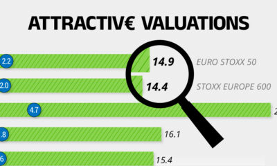

On average, the European stock market has valuations that are nearly 50% lower than U.S. valuations. But how can you access the market?


The IMF has released its economic growth forecasts for 2024. How do the G7 and BRICS countries compare?


See which countries have been granted the most AI patents each year, from 2012 to 2022.
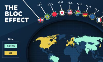

Rising geopolitical tensions are shaping the future of international trade, but what is the effect on trading among G7 and BRICS countries?


Older, better-educated adults are winning the savings game, reveals a January survey by the National Opinion Research Center at the University of Chicago.
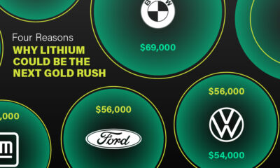

Visual Capitalist has partnered with EnergyX to show why drops in prices and growing demand may make now the right time to invest in lithium.


Tracking Gallup survey data for more than a decade reveals some countries are witnessing big happiness declines, reflecting their shifting socio-economic conditions.


