Personal Finance
Visualizing $156 Trillion in U.S. Assets, by Generation
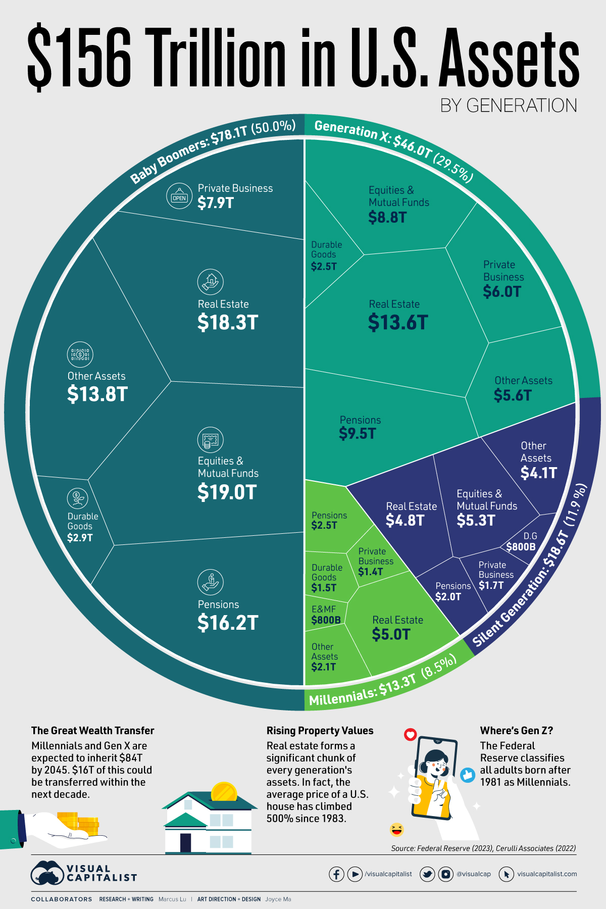


Visualizing U.S. Wealth by Generation
The distribution of wealth is an important measure of the economic power of each generation.
In the U.S., for example, baby boomers own half of the nation’s $156 trillion in assets despite making up 21% of the country’s population.
To learn more about U.S. wealth by generation, we’ve created two visualizations using Q4 2022 data from the Federal Reserve that break down both the assets and liabilities held by each American generation.
Assets by Generation
Assets by generation are listed in the table below. All figures are as of Q4 2022 and in USD trillions.
| Generation | Equities & Mutual Funds | Real Estate | Pensions | Private Businesses | Durable and Other Assets | Generation's Total Assets |
|---|---|---|---|---|---|---|
| Silent Generation | $5.3 | $4.8 | $2.0 | $1.7 | $4.9 | $18.6 |
| Baby Boomers | $19.0 | $18.3 | $16.2 | $7.9 | $16.7 | $78.1 |
| Generation X | $8.8 | $13.6 | $9.5 | $6.0 | $8.1 | $46.0 |
| Millennials | $0.8 | $5.0 | $2.5 | $1.4 | $3.6 | $13.3 |
| Totals | $33.8 | $41.8 | $30.1 | $17.1 | $33.3 | $156.0 |
Baby boomers’ biggest category of assets is Equities & Mutual Funds, where they own 56% of the national total. Millennials, on the other hand, represent just 2%.
Where millennials do have more wealth is Real Estate, with 12% of the national total. This suggests that millennials have, for the most part, foregone investing in financial assets in order to purchase a home.
Liabilities by Generation
The following charts show a breakdown of liabilities by generation. Not surprisingly, Mortgages make up the largest component of liabilities for all generations.
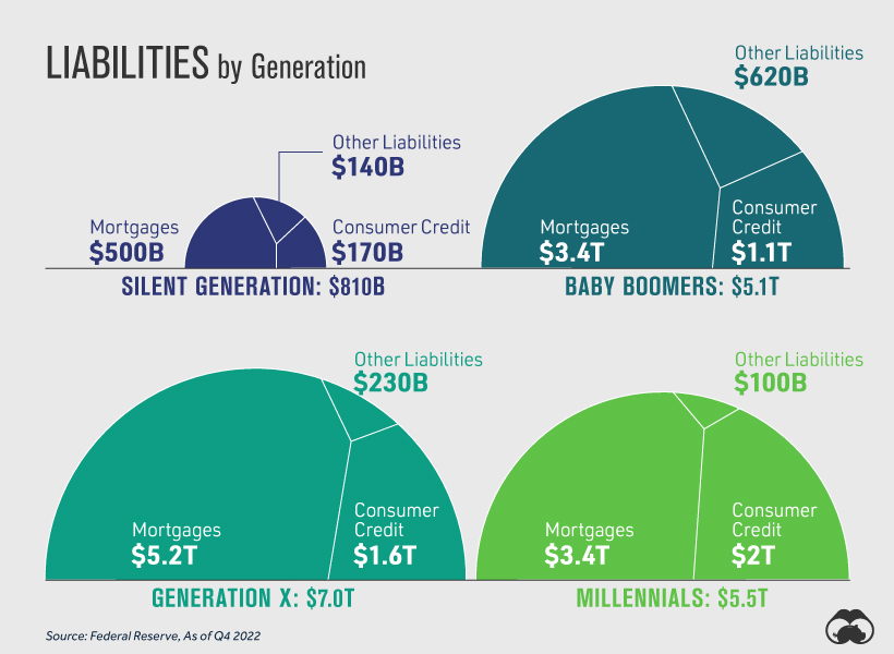
Something to highlight is that millennials are carrying the largest amount of Consumer Credit, at $2 trillion (representing about 43% of total consumer credit). As of 2022, millennials accounted for 22% of the U.S. population.
U.S. Wealth by Generation
Finally, we subtract liabilities from assets to arrive at total wealth by generation in the United States. Figures again are USD and in trillions.
| Generation | Assets | Liabilities | Wealth | Share of Wealth |
|---|---|---|---|---|
| Silent Generation | $18.6 | $0.8 | $17.8 | 13% |
| Baby Boomers | $78.1 | $5.1 | $73.0 | 53% |
| Generation X | $46.0 | $7.0 | $39.0 | 28% |
| Millennials | $13.3 | $5.5 | $7.8 | 6% |
| Totals | $156.0 | $18.4 | $137.6 | 100% |
As a final note, it’s worth highlighting that Gen Z is still too young to be included as a separate demographic in datasets like these. Born between 1997 and 2012, these individuals are currently between 11 and 26 years old. Interestingly, the Federal Reserve currently considers all U.S. adults born after 1981 as millennials.


Personal Finance
Chart: The Declining Value of the U.S. Federal Minimum Wage
This graphic compares the nominal vs. inflation-adjusted value of the U.S. minimum wage, from 1940 to 2023.
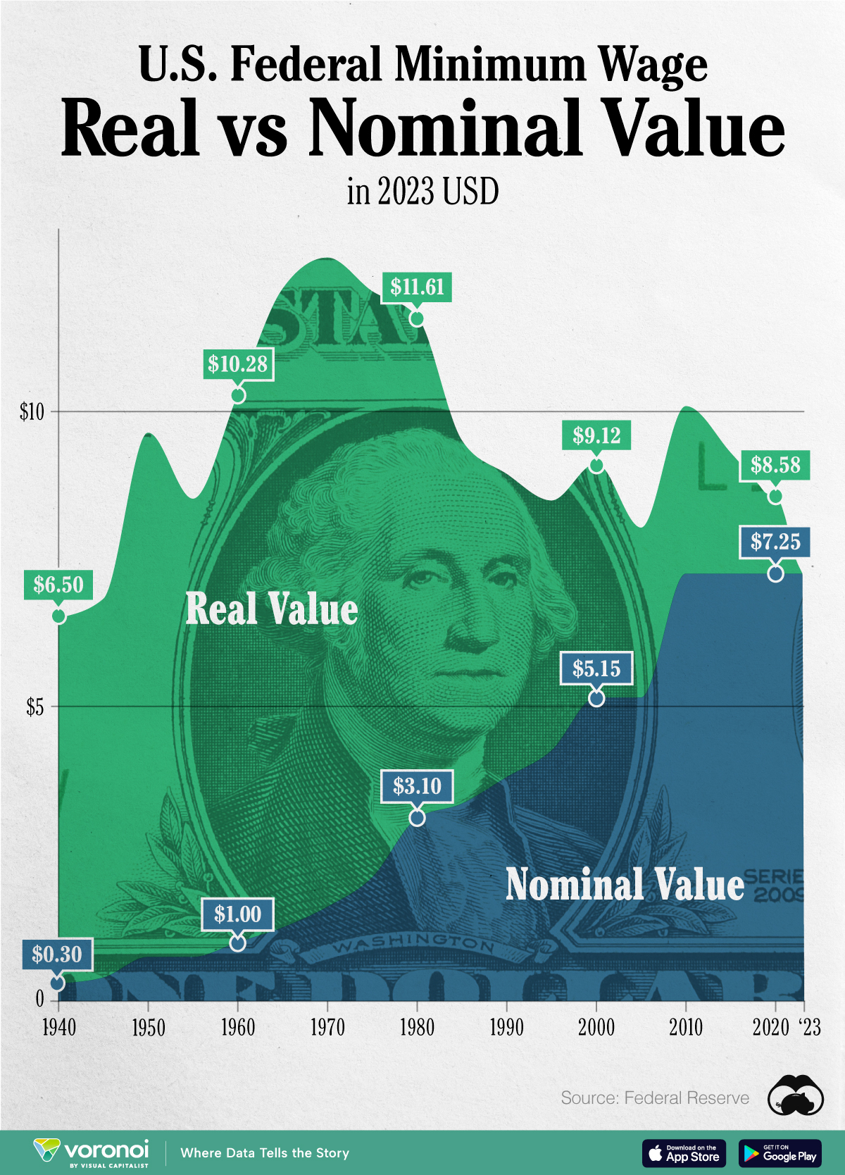
The Declining Value of the U.S. Federal Minimum Wage
This was originally posted on our Voronoi app. Download the app for free on iOS or Android and discover incredible data-driven charts from a variety of trusted sources.
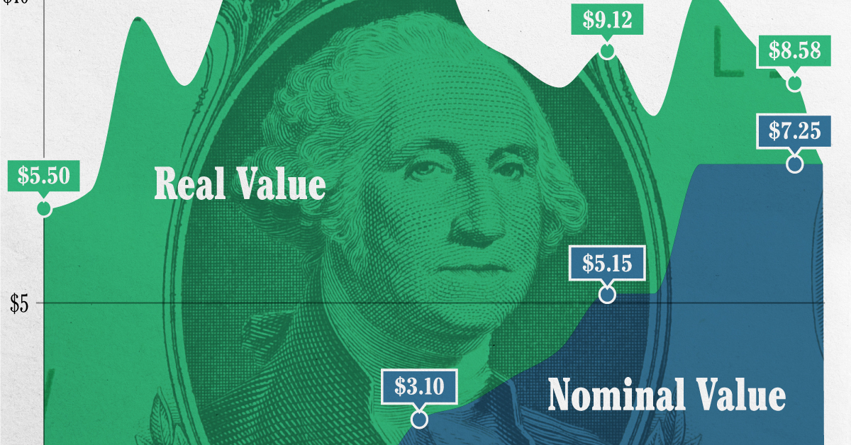
This graphic illustrates the history of the U.S. federal minimum wage using data compiled by Statista, in both nominal and real (inflation-adjusted) terms. The federal minimum wage was raised to $7.25 per hour in July 2009, where it has remained ever since.
Nominal vs. Real Value
The data we used to create this graphic can be found in the table below.
| Year | Nominal value ($/hour) | Real value ($/hour) |
|---|---|---|
| 1940 | 0.3 | 6.5 |
| 1945 | 0.4 | 6.82 |
| 1950 | 0.75 | 9.64 |
| 1955 | 0.75 | 8.52 |
| 1960 | 1 | 10.28 |
| 1965 | 1.25 | 12.08 |
| 1970 | 1.6 | 12.61 |
| 1975 | 2.1 | 12.04 |
| 1980 | 3.1 | 11.61 |
| 1985 | 3.35 | 9.51 |
| 1990 | 3.8 | 8.94 |
| 1995 | 4.25 | 8.49 |
| 2000 | 5.15 | 9.12 |
| 2005 | 5.15 | 8.03 |
| 2010 | 7.25 | 10.09 |
| 2015 | 7.25 | 9.3 |
| 2018 | 7.25 | 8.78 |
| 2019 | 7.25 | 8.61 |
| 2020 | 7.25 | 8.58 |
| 2021 | 7.25 | 8.24 |
| 2022 | 7.25 | 7.61 |
| 2023 | 7.25 | 7.25 |
What our graphic shows is how inflation has eroded the real value of the U.S. minimum wage over time, despite nominal increases.
For instance, consider the year 1960, when the federal minimum wage was $1 per hour. After accounting for inflation, this would be worth around $10.28 today!
The two lines converge at 2023 because the nominal and real value are identical in present day terms.
Many States Have Their Own Minimum Wage
According to the National Conference of State Legislatures (NCSL), 30 states and Washington, D.C. have implemented a minimum wage that is higher than $7.25.
The following states have adopted the federal minimum: Georgia, Idaho, Indiana, Iowa, Kansas, Kentucky, New Hampshire, North Carolina, North Dakota, Oklahoma, Pennsylvania, Texas, Utah, Wisconsin, and Wyoming.
Meanwhile, the states of Alabama, Louisiana, Mississippi, South Carolina, and Tennessee have no wage minimums, but have to follow the federal minimum.
How Does the U.S. Minimum Wage Rank Globally?
If you found this topic interesting, check out Mapped: Minimum Wage Around the World to see which countries have the highest minimum wage in monthly terms, as of January 2023.

-

 Debt1 week ago
How Debt-to-GDP Ratios Have Changed Since 2000
-

 Countries2 weeks ago
Population Projections: The World’s 6 Largest Countries in 2075
-

 Markets2 weeks ago
The Top 10 States by Real GDP Growth in 2023
-

 Demographics2 weeks ago
The Smallest Gender Wage Gaps in OECD Countries
-

 United States2 weeks ago
Where U.S. Inflation Hit the Hardest in March 2024
-

 Green2 weeks ago
Top Countries By Forest Growth Since 2001
-

 United States2 weeks ago
Ranked: The Largest U.S. Corporations by Number of Employees
-

 Maps2 weeks ago
The Largest Earthquakes in the New York Area (1970-2024)