Markets
Understanding the Disconnect Between Consumers and the Stock Market


The Disconnect Between Consumers and Stock Markets
Consumer sentiment indices are relatively accurate indicators for the outlook of an economy. They rise during periods of growth as consumers become more financially confident, and fall during recessions as consumers cut back on discretionary spending.
Since the direction of the overall economy also affects stock markets, measures of consumer sentiment have historically moved in tandem with major indices like the S&P 500. Since the COVID-19 pandemic began, however, consumers and stock markets have become noticeably disjointed from one another.
To help us understand why this may be the case, this infographic charts the University of Michigan’s Index of Consumer Sentiment against the S&P 500, before diving into potential underlying factors for their divergence.
A Tale of Two Indices
Before we compare these two indices, it’s helpful to first understand how they’re comprised.
The Index of Consumer Sentiment
The University of Michigan’s Index of Consumer Sentiment (ICS) is derived from a monthly survey of consumers that aims to get a snapshot of personal finances, business conditions, and buying conditions in the market.
The survey consists of five questions (paraphrased):
- Are you better or worse off financially compared to a year ago?
- Will you be better or worse off financially a year in the future?
- Will business conditions during the next year be good, bad, or other?
- Will business conditions over the next five years be good, bad, or other?
- Is it a good time to make large purchases such as major household appliances?
A score for each of these questions is calculated based on the percent of favorable and nonfavorable replies. The scores are then aggregated to arrive at the final index value, relative to 6.8—the 1966 base period value.
The S&P 500
The S&P 500 is a market capitalization-weighted index of the 500 largest publicly traded U.S. companies. A company’s market capitalization is calculated as its current stock price multiplied by its total number of outstanding shares.
Market caps change over time, with movements determined by daily stock price fluctuations, the issuance of new stock, or the repurchase of existing shares (also known as share buybacks).
The COVID-19 Divergence
Throughout past market cycles, these two indices have displayed some degree of correlation.
During the bull market of the ‘90s, the S&P 500 generated an astonishing 417% return, and was accompanied by a 75% increase in consumer sentiment. Critically, both indices also peaked at roughly the same time. The ICS began to decline after reaching its record high of 112.0 in January 2000, while the S&P 500 began to falter in August that same year.
Fast forwarding to 2020, we can see that these indices have responded quite differently during the pandemic so far:
| Index | Jan 2020 | Feb 2020 | Mar 2020 | Apr 2020 | May 2020 | June 2020 | July 17, 2020 |
|---|---|---|---|---|---|---|---|
| ICS Value | 99.8 | 101 | 89.1 | 71.8 | 72.3 | 78.1 | 73.2 |
| ICS YTD | 0.5% | 1.7% | -10.3% | -27.7% | -27.2% | -21.4% | -26.3% |
| S&P 500 Value | 3225.5 | 2954.2 | 2584.6 | 2912.4 | 3044.3 | 3100.3 | 3224.7 |
| S&P 500 YTD | -0.2% | -8.6% | -20.0% | -9.9% | -5.8% | -4.0% | -0.2% |
All figures as of month end unless otherwise specified. Source: Yahoo Finance
The ICS has not yet recovered from its initial decline beginning in March, whereas the S&P 500 has seemingly bounced back during the same time frame.
Examining the Disconnect
Why are stock markets failing to recognize the hardships that consumers are feeling? Let’s examine two central factors behind this disconnect.
Reason 1: Tech’s Dominance of the S&P 500
Recall that a company’s weight in the S&P 500 is determined by its market cap. This means that certain sectors can form a larger part of the index than others. Here’s how each sector sizes up:
| S&P 500 Sector | Index weight as of June 30, 2020 (%) |
|---|---|
| Information technology | 27.5% |
| Health care | 14.6% |
| Consumer discretionary | 10.8% |
| Communication services | 10.8% |
| Financials | 10.1% |
| Industrials | 8.0% |
| Consumer staples | 7.0% |
| Utilities | 3.1% |
| Real estate | 2.8% |
| Energy | 2.8% |
| Materials | 2.5% |
Source: S&P Global
Based on this breakdown, we can see that the information technology (IT) sector accounts for over a quarter of the S&P 500. With a weighting of 27.5%, the sector alone is bigger than the bottom six combined (Industrials to Materials).
This inequality means the performance of the IT sector has a stronger relative impact on the index’s overall returns. Within IT, we can highlight the FAANGM subset of stocks, which include some of America’s biggest names in tech:
| Stock | Market Cap as of June 30, 2020 ($) |
|---|---|
| Apple | $1.6 trillion |
| Microsoft | $1.5 trillion |
| Amazon | $1.4 trillion |
| $930 billion | |
| $668 billion | |
| Netflix | $200 billion |
| S&P 500 average | $53 billion |
Source: Yahoo Finance
These companies have grown rapidly over the past decade, and continue to perform strongly during the pandemic. If this trend continues, the S&P 500 could skew even further towards the IT sector, and become less representative of America’s overall economy.
Reason 2: The U.S. Federal Reserve
Stock prices typically reflect a company’s future earnings prospects, meaning they are influenced, to a degree, by the outlook for the broader economy.
With an ongoing pandemic and steep decline in consumer sentiment, it’s reasonable to believe that many company prospects would look bleak. This is especially true for consumer cyclicals—companies like automobile manufacturers that rely on discretionary spending.
In a somewhat controversial move, the U.S. Federal Reserve has stepped in to counter these effects by creating the Secondary Market Corporate Credit Facility (SMCCF). This facility operates two programs which ensure businesses have access to funding during the pandemic.
Corporate Bond Purchase Program
The SMCCF is currently buying corporate bonds from an index of nearly 800 companies. Of the ten largest recipients of this program, five are categorized as consumer cyclical:
| Issuer | Category | Index Weight (%) |
|---|---|---|
| Toyota Motor Credit Corp | Consumer cyclical | 1.74% |
| Volkswagen Group America | Consumer cyclical | 1.74% |
| Daimler Finance NA LLC | Consumer cyclical | 1.72% |
| AT&T Inc | Communications | 1.60% |
| Apple Inc | Technology | 1.60% |
| Verizon Communications | Communications | 1.60% |
| General Electric | Capital goods | 1.48% |
| Ford Motor Credit Co LLC | Consumer cyclical | 1.34% |
| Comcast Corp | Communications | 1.32% |
| BMW US Capital LLC | Consumer cyclical | 1.25% |
Source: Investopedia
This program is intended to support the flow of credit, but its announcement in June also gave stock markets a boost in confidence. With the Fed directly supporting corporations, shareholders are being shielded from risks related to declining sales and bankruptcy.
By the end of June, the SMCCF had purchased $429 million in corporate bonds.
ETF Purchase Program
The SMCCF is also authorized to purchase corporate bond ETFs, a historic first for the Fed. The facility’s five largest ETF purchases as of June 18, 2020, are detailed below:
| ETF Name | Purchase size ($) | ETF Description |
|---|---|---|
| iShares iBoxx $ Investment Grade Corporate Bond ETF (LQD) | $1.7 billion | Tracks an index composed of USD-denominated, investment grade corporate bonds. |
| Vanguard Short-Term Corporate Bond ETF (VCSH) | $1.3 billion | Invests primarily in investment grade corporate bonds, maintaining an average maturity of 1 to 5 years. |
| Vanguard Intermediate-Term Corporate Bond ETF (VCIT) | $1.0 billion | Invests primarily in investment grade corporate bonds, maintaining an average maturity of 5 to 10 years. |
| iShares Short-Term Corporate Bond ETF (IGSB) | $608 million | Tracks an index composed of USD-denominated investment-grade corporate bonds with maturities between 1 and 5 years. |
| SPDR Barclays High Yield Bond ETF (JNK) | $412 million | Seeks to provide a diversified exposure to USD-denominated high yield corporate bonds. |
Source: Investopedia
Although the SMCCF’s purchase of ETFs outsize those of corporate bonds, the Fed has signaled its intention to make direct bond purchases its primary focus going forward.
Will Markets and Consumers Reconnect Anytime Soon?
It’s hard to see the S&P 500 moving towards a more balanced sector composition in the near future. America’s big tech stocks have been resilient during the pandemic, with some even reaching new highs.
The Fed also remains committed to providing corporations with credit, thereby enabling them to “borrow” their way out of the pandemic. These commitments have propped up stock markets by reducing bankruptcy risk and potentially speeding up the economic recovery.
Consumer sentiment, on the other hand, has yet to show signs of recovery. Surveys released in early July may shed some light on why—63% of Americans believe it will take a year or more for the economy to fully recover, while 82% are hoping for an extension of COVID-19 relief programs.
With both sides moving in opposite directions, it’s possible the disconnect could grow even larger before it starts to shrink.


Markets
The European Stock Market: Attractive Valuations Offer Opportunities
On average, the European stock market has valuations that are nearly 50% lower than U.S. valuations. But how can you access the market?
European Stock Market: Attractive Valuations Offer Opportunities
Europe is known for some established brands, from L’Oréal to Louis Vuitton. However, the European stock market offers additional opportunities that may be lesser known.
The above infographic, sponsored by STOXX, outlines why investors may want to consider European stocks.
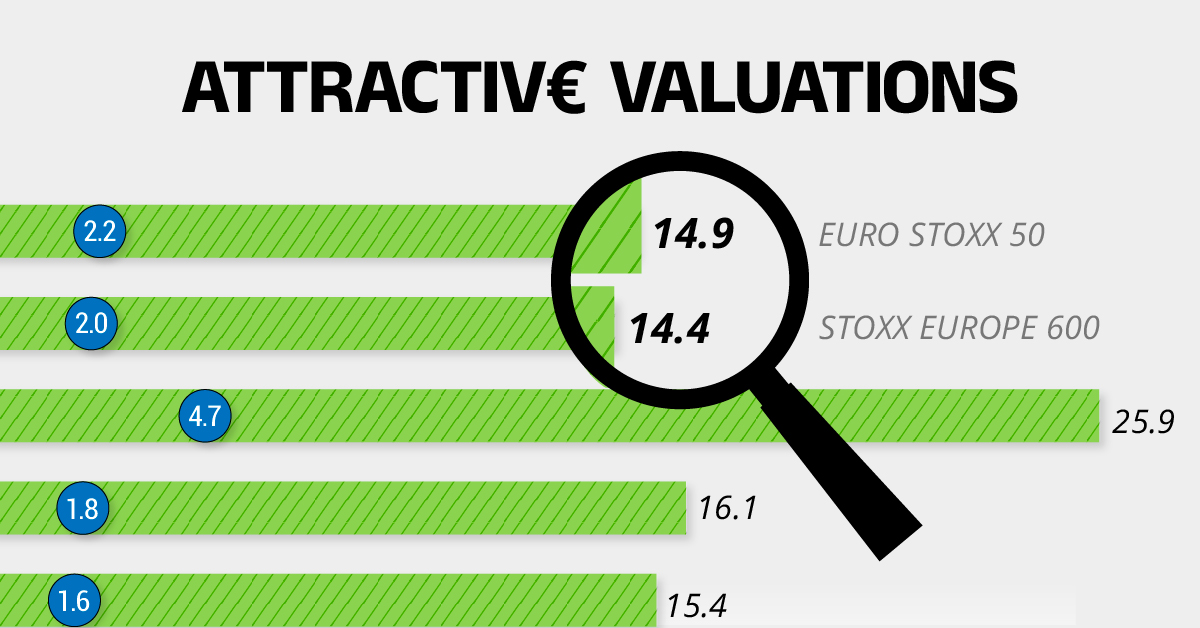
Attractive Valuations
Compared to most North American and Asian markets, European stocks offer lower or comparable valuations.
| Index | Price-to-Earnings Ratio | Price-to-Book Ratio |
|---|---|---|
| EURO STOXX 50 | 14.9 | 2.2 |
| STOXX Europe 600 | 14.4 | 2 |
| U.S. | 25.9 | 4.7 |
| Canada | 16.1 | 1.8 |
| Japan | 15.4 | 1.6 |
| Asia Pacific ex. China | 17.1 | 1.8 |
Data as of February 29, 2024. See graphic for full index names. Ratios based on trailing 12 month financials. The price to earnings ratio excludes companies with negative earnings.
On average, European valuations are nearly 50% lower than U.S. valuations, potentially offering an affordable entry point for investors.
Research also shows that lower price ratios have historically led to higher long-term returns.
Market Movements Not Closely Connected
Over the last decade, the European stock market had low-to-moderate correlation with North American and Asian equities.
The below chart shows correlations from February 2014 to February 2024. A value closer to zero indicates low correlation, while a value of one would indicate that two regions are moving in perfect unison.
| EURO STOXX 50 | STOXX EUROPE 600 | U.S. | Canada | Japan | Asia Pacific ex. China |
|
|---|---|---|---|---|---|---|
| EURO STOXX 50 | 1.00 | 0.97 | 0.55 | 0.67 | 0.24 | 0.43 |
| STOXX EUROPE 600 | 1.00 | 0.56 | 0.71 | 0.28 | 0.48 | |
| U.S. | 1.00 | 0.73 | 0.12 | 0.25 | ||
| Canada | 1.00 | 0.22 | 0.40 | |||
| Japan | 1.00 | 0.88 | ||||
| Asia Pacific ex. China | 1.00 |
Data is based on daily USD returns.
European equities had relatively independent market movements from North American and Asian markets. One contributing factor could be the differing sector weights in each market. For instance, technology makes up a quarter of the U.S. market, but health care and industrials dominate the broader European market.
Ultimately, European equities can enhance portfolio diversification and have the potential to mitigate risk for investors.
Tracking the Market
For investors interested in European equities, STOXX offers a variety of flagship indices:
| Index | Description | Market Cap |
|---|---|---|
| STOXX Europe 600 | Pan-regional, broad market | €10.5T |
| STOXX Developed Europe | Pan-regional, broad-market | €9.9T |
| STOXX Europe 600 ESG-X | Pan-regional, broad market, sustainability focus | €9.7T |
| STOXX Europe 50 | Pan-regional, blue-chip | €5.1T |
| EURO STOXX 50 | Eurozone, blue-chip | €3.5T |
Data is as of February 29, 2024. Market cap is free float, which represents the shares that are readily available for public trading on stock exchanges.
The EURO STOXX 50 tracks the Eurozone’s biggest and most traded companies. It also underlies one of the world’s largest ranges of ETFs and mutual funds. As of November 2023, there were €27.3 billion in ETFs and €23.5B in mutual fund assets under management tracking the index.
“For the past 25 years, the EURO STOXX 50 has served as an accurate, reliable and tradable representation of the Eurozone equity market.”
— Axel Lomholt, General Manager at STOXX
Partnering with STOXX to Track the European Stock Market
Are you interested in European equities? STOXX can be a valuable partner:
- Comprehensive, liquid and investable ecosystem
- European heritage, global reach
- Highly sophisticated customization capabilities
- Open architecture approach to using data
- Close partnerships with clients
- Part of ISS STOXX and Deutsche Börse Group
With a full suite of indices, STOXX can help you benchmark against the European stock market.
Learn how STOXX’s European indices offer liquid and effective market access.

-

 Economy2 days ago
Economic Growth Forecasts for G7 and BRICS Countries in 2024
The IMF has released its economic growth forecasts for 2024. How do the G7 and BRICS countries compare?
-

 Markets1 week ago
U.S. Debt Interest Payments Reach $1 Trillion
U.S. debt interest payments have surged past the $1 trillion dollar mark, amid high interest rates and an ever-expanding debt burden.
-

 United States2 weeks ago
Ranked: The Largest U.S. Corporations by Number of Employees
We visualized the top U.S. companies by employees, revealing the massive scale of retailers like Walmart, Target, and Home Depot.
-

 Markets2 weeks ago
The Top 10 States by Real GDP Growth in 2023
This graphic shows the states with the highest real GDP growth rate in 2023, largely propelled by the oil and gas boom.
-

 Markets2 weeks ago
Ranked: The World’s Top Flight Routes, by Revenue
In this graphic, we show the highest earning flight routes globally as air travel continued to rebound in 2023.
-

 Markets3 weeks ago
Ranked: The Most Valuable Housing Markets in America
The U.S. residential real estate market is worth a staggering $47.5 trillion. Here are the most valuable housing markets in the country.


-

 Education1 week ago
How Hard Is It to Get Into an Ivy League School?
-

 Technology2 weeks ago
Ranked: Semiconductor Companies by Industry Revenue Share
-
Markets2 weeks ago
Ranked: The World’s Top Flight Routes, by Revenue
-

 Demographics2 weeks ago
Population Projections: The World’s 6 Largest Countries in 2075
-
Markets2 weeks ago
The Top 10 States by Real GDP Growth in 2023
-

 Demographics2 weeks ago
The Smallest Gender Wage Gaps in OECD Countries
-

 Economy2 weeks ago
Where U.S. Inflation Hit the Hardest in March 2024
-

 Green2 weeks ago
Top Countries By Forest Growth Since 2001