Mining
The Silver Series: The Start of A New Gold-Silver Cycle (Part 1 of 3)
The world has experienced a decade of growth fueled by record-low interest rates, a burgeoning money supply, and historic debt levels – but the good times only last so long.
As the global economy slows and eventually begins to retract, can precious metals offer a useful store of value to investors?
Part 1: The Start of a New Cycle
Today’s infographic comes to us from Endeavour Silver, and it outlines some key indicators that precede a coming gold-silver cycle in which exposure to hard assets may help to protect wealth.

Bankers Blowing Bubbles
Since 2008, central bankers around the world launched a historic market intervention by printing money and bailing out major banks. With cheap and abundant money, this strategy worked so well that it created a bull market in every sector — except for precious metals.
Stock markets, consumer lending, and property values surged. Meanwhile, the U.S. Federal Reserve’s assets ballooned, and so did corporate, government, and household debt. By 2018, total debt reached almost $250 trillion worldwide.
Currency vs. Precious Metals
The world awash in unprecedented amounts of currency, and these dollars chase a limited supply of goods. Historically speaking, it’s only a matter of time before the price of goods increases or inflates – eroding the purchasing power of every dollar.
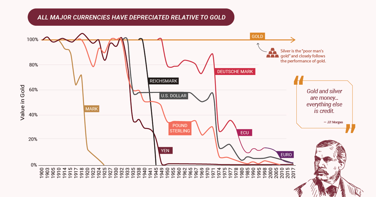
Gold and silver are some of the only assets unaffected by inflation, retaining their value.
Gold and silver are money… everything else is credit.
– J.P. Morgan
The Perfect Story for a Gold-Silver Cycle?
Investors can use several indicators to gauge the beginning of the gold-silver cycle:
- Gold/Silver Futures
Most traders do not trade physical gold and silver, but paper contracts with the promise to buy at a future price. Every week, U.S. commodity exchanges publish the Commitment of Traders “COT” report. This report summarizes the positions (long/short) of traders for a particular commodity.
Typically, speculators are long and commercial traders are short the price of gold and silver. However, when speculators and commercial traders positions reach near zero, there is usually a big upswing in the price of silver.
- Gold-to-Silver Ratio Compression
As the difference between gold and silver prices decreases (i.e. the compression of the ratio), history suggests silver prices can make big moves upwards in price. The gold-to-silver ratio compression is now at high levels and may eventually revert to its long-term average, which implies a strong movement in prices is imminent for silver.
- Scarcity: Declining Silver Production
Silver production has been declining despite its growing importance as a safe haven hedge, as well as its use in industrial applications and renewable technologies.
- The Silver Exception
Silver is not just for coins, bars, jewelry and the family silverware. It stands out from gold with its practical industrial uses which account for 56.1% of its annual consumption. Silver will continue to be a critical material in solar technology. While photovoltaics currently account for 8% of annual silver consumption, this is set to change with the dramatic increase in the use of solar technologies.
The Price of Gold and Silver
Forecasting the exact price of gold and silver is not a science, but there are clear signs that point to the direction their prices will head. The prices of gold and silver do not accurately reflect a world awash with cheap and easy money, but now may be their time to shine.
Don’t miss another part of the Silver Series by connecting with Visual Capitalist.


Lithium
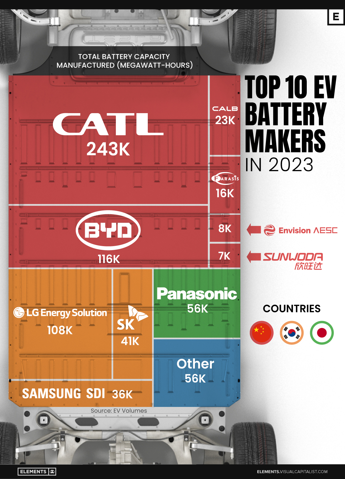
Ranked: The Top 10 EV Battery Manufacturers in 2023
Asia dominates this ranking of the world’s largest EV battery manufacturers in 2023.

The Top 10 EV Battery Manufacturers in 2023
This was originally posted on our Voronoi app. Download the app for free on iOS or Android and discover incredible data-driven charts from a variety of trusted sources.
Despite efforts from the U.S. and EU to secure local domestic supply, all major EV battery manufacturers remain based in Asia.
In this graphic we rank the top 10 EV battery manufacturers by total battery deployment (measured in megawatt-hours) in 2023. The data is from EV Volumes.
Chinese Dominance
Contemporary Amperex Technology Co. Limited (CATL) has swiftly risen in less than a decade to claim the title of the largest global battery group.
The Chinese company now has a 34% share of the market and supplies batteries to a range of made-in-China vehicles, including the Tesla Model Y, SAIC’s MG4/Mulan, and various Li Auto models.
| Company | Country | 2023 Production (megawatt-hour) | Share of Total Production |
|---|---|---|---|
| CATL | 🇨🇳 China | 242,700 | 34% |
| BYD | 🇨🇳 China | 115,917 | 16% |
| LG Energy Solution | 🇰🇷 Korea | 108,487 | 15% |
| Panasonic | 🇯🇵 Japan | 56,560 | 8% |
| SK On | 🇰🇷 Korea | 40,711 | 6% |
| Samsung SDI | 🇰🇷 Korea | 35,703 | 5% |
| CALB | 🇨🇳 China | 23,493 | 3% |
| Farasis Energy | 🇨🇳 China | 16,527 | 2% |
| Envision AESC | 🇨🇳 China | 8,342 | 1% |
| Sunwoda | 🇨🇳 China | 6,979 | 1% |
| Other | - | 56,040 | 8% |
In 2023, BYD surpassed LG Energy Solution to claim second place. This was driven by demand from its own models and growth in third-party deals, including providing batteries for the made-in-Germany Tesla Model Y, Toyota bZ3, Changan UNI-V, Venucia V-Online, as well as several Haval and FAW models.
The top three battery makers (CATL, BYD, LG) collectively account for two-thirds (66%) of total battery deployment.
Once a leader in the EV battery business, Panasonic now holds the fourth position with an 8% market share, down from 9% last year. With its main client, Tesla, now sourcing batteries from multiple suppliers, the Japanese battery maker seems to be losing its competitive edge in the industry.
Overall, the global EV battery market size is projected to grow from $49 billion in 2022 to $98 billion by 2029, according to Fortune Business Insights.

-

 Misc1 week ago
How Hard Is It to Get Into an Ivy League School?
-

 Technology2 weeks ago
Ranked: Semiconductor Companies by Industry Revenue Share
-

 Markets2 weeks ago
Ranked: The World’s Top Flight Routes, by Revenue
-

 Countries2 weeks ago
Population Projections: The World’s 6 Largest Countries in 2075
-

 Markets2 weeks ago
The Top 10 States by Real GDP Growth in 2023
-

 Demographics2 weeks ago
The Smallest Gender Wage Gaps in OECD Countries
-

 United States2 weeks ago
Where U.S. Inflation Hit the Hardest in March 2024
-

 Green2 weeks ago
Top Countries By Forest Growth Since 2001