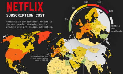

This map of Netflix price by country shows how much a basic subscription package costs around the world.
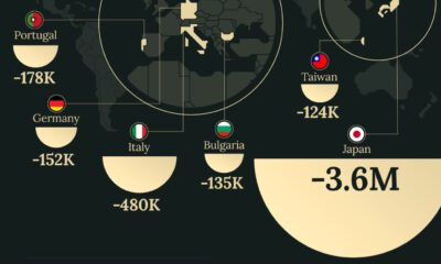

Despite the consumer class growing worldwide, some countries are predicted to see a decline in the number of consumers over the next decade.
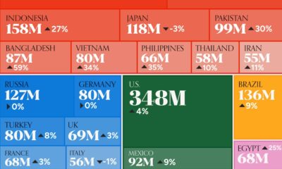

We visualize the 20 largest consumer markets in the world in 2030—from Asian giants to North and South American powerhouses.
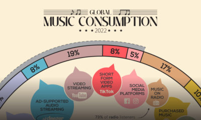

How do people around the world consume their music, and how are these consumption habits changing as technology evolves?
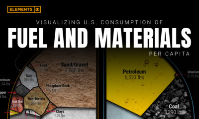

Wealthy countries consume large amounts of natural resources per capita, and the U.S. is no exception. See how much is used per person.
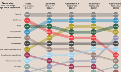

This interactive graphic shows a breakdown of how average Americans spend their money, and how expenses vary across generations.
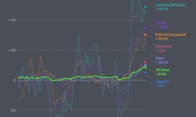

In May 2022, U.S. Inflation was the highest its been since 1981. Here’s a look at which products saw the biggest price jumps.
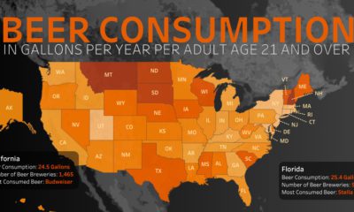

Which U.S. states consume the most beer per capita, and what beers do people prefer?
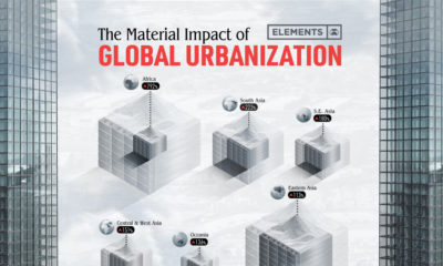

The world’s material consumption is expected to grow from 41 billion tonnes in 2010 to about 89 billion tonnes by 2050. This graphic shows the impact...
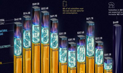

Governments pour nearly $500 billion into fossil fuel subsidies annually. This chart breaks down fossil fuel subsidies between 2010 and 2021.


 Creator Program