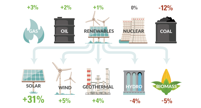
How is U.S. energy consumption shifting? This week's chart looks at the rate of change in the use of different energy sources, including future projections.
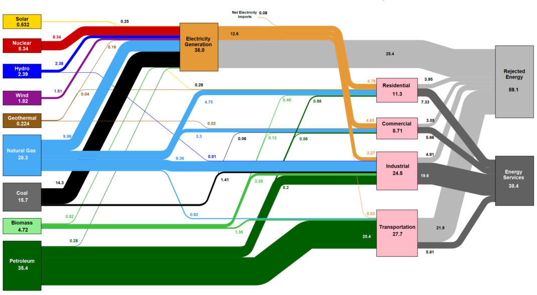
This massive diagram shows all energy created in the U.S., and where it goes. It's not sexy, but it gives a great 10,000 ft overview of...
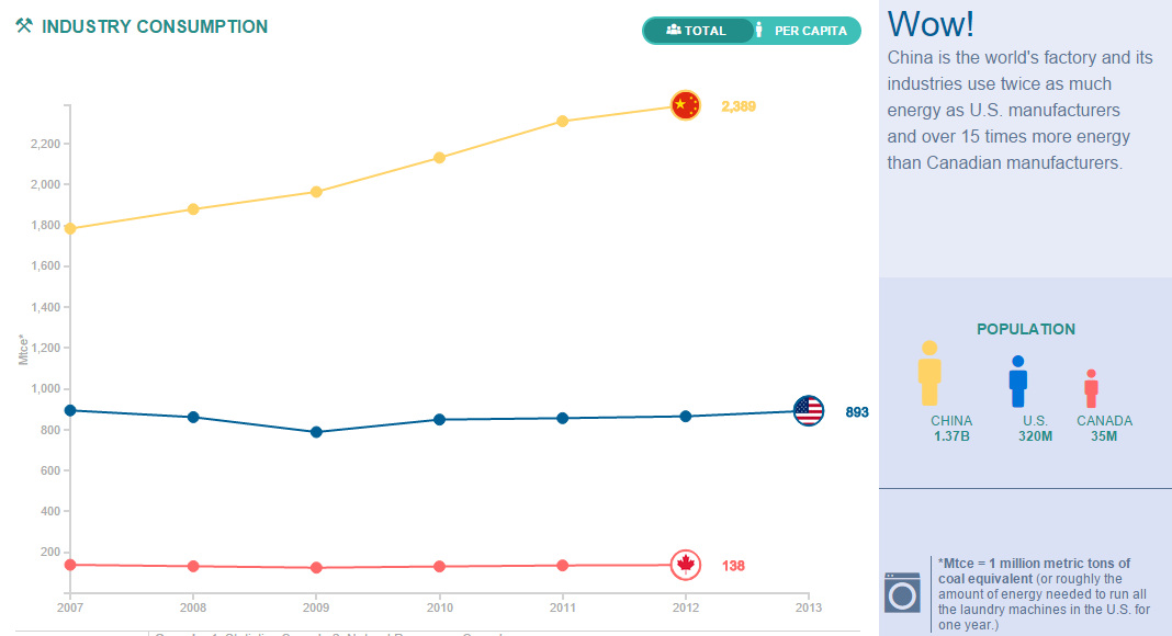
Compare the United States, China, and Canada side-by-side to see the differences in how these energy titans consume, produce, and import/export energy.
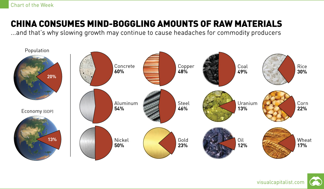
The 1.4 billion people living in China account for 13% of global GDP, but this chart shows that for commodity producers, the country means so much...
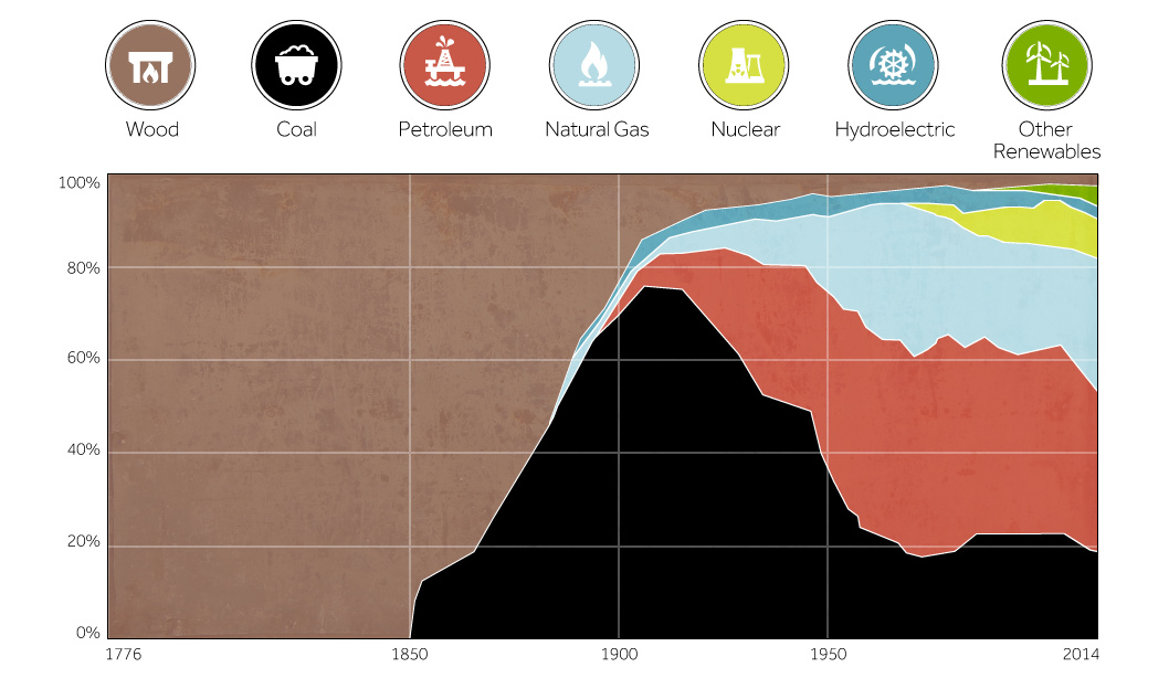
This chart shows the history of America's energy supply based on energy source. This brief history covers all from wood-powered locomotives to solar panels.
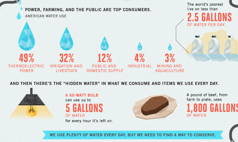
Less abundant water supply, aging infrastructure, and inefficiencies are compounding America's water crisis as seen in this infographic.


