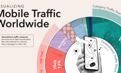

Of the millions of apps available around the world, just a small handful of the most used apps dominate global internet traffic.
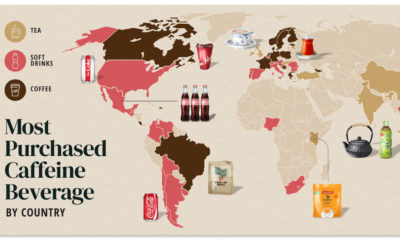

Do you drink coffee, tea, or cola? Each country has their own drink preference.
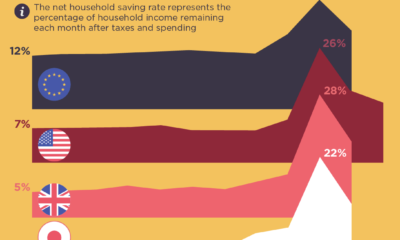

Were people more frugal during the pandemic or did they break the bank? This visual assesses the saving rates across different countries.
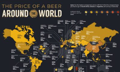

The global desire for beer prevails even in a pandemic. These maps compare the average beer price in 58 countries—just how much do we drink?
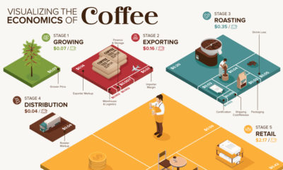

What makes your cup of coffee possible, and how much does it really cost? Here’s how the $200B coffee supply chain breaks down economically.
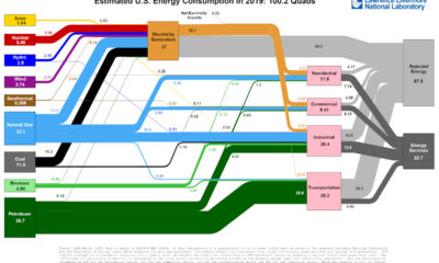

This incredible flow diagram shows how U.S. energy use broke down in 2019, including by source and end sector.
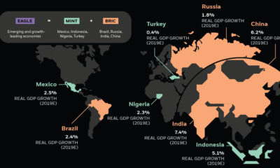

Emerging markets are ascending on the global stage and wielding more economic power—and it's drastically altering the investment landscape.
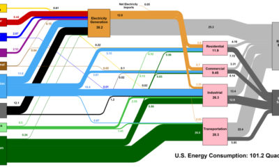

This interesting diagram breaks down all U.S. energy use by both source and industry, and everything that happens in between.
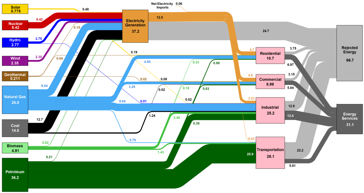
How is the country's energy generated, and how is it consumed? This nifty Sankey diagram shows U.S. energy consumption in a simple and understandable way.
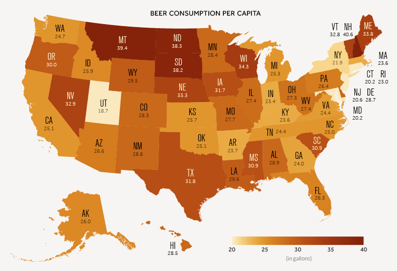
A data-driven look at consumption of America's most popular alcoholic beverage: beer.


