Misc
The United States of Beer
Across the board, beer consumption in the United States has been slowly and steadily dropping since the early ’80s.
However, that fact doesn’t tell the whole story. Trends around beer consumption are anything but uniform, and the industry is evolving rapidly thanks to the craft beer boom in cities throughout the country.
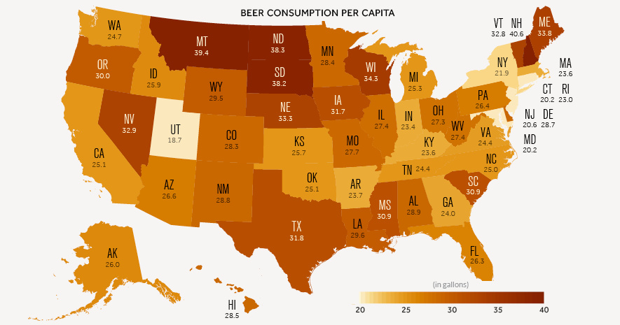
Beer Consumption by State
Today’s infographic looks at regional beer consumption, as well as trends over the past half-decade.
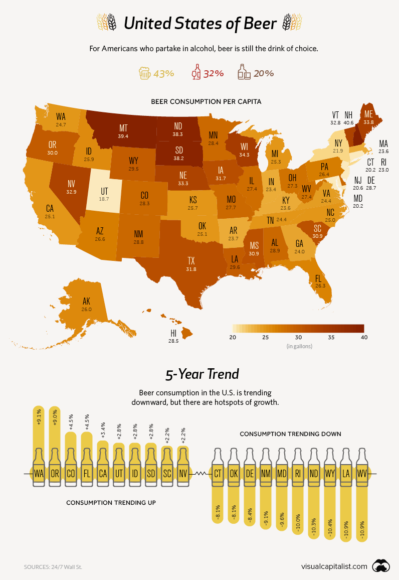
Pints of Interest
Beer is still the most popular alcoholic beverage in America, though that demand is not spread equally. Here are states and regions that stand out:
Utah
The Beehive State has unusually low levels of beer consumption for a couple of reasons. First, the state has a high population of Mormons (~60%), who mostly abstain from drinking alcohol. Secondly, Salt Lake City has unusual liquor laws that restrict the percentage of alcohol in beer to 4.0% ABV.
Despite these barriers, Utah’s beer consumption grew by 2.8% between 2012 and 2017 – the sixth highest growth rate in the country.
New Hampshire
Another outlier, though in the opposite direction, is New Hampshire. The state has no sales tax, a fact that beer drinkers in Vermont, Massachusetts, and Maine are well aware of. It’s estimated that over 50% of the states alcohol sales are to out-of-state visitors. NH’s tax-free booze is such a big draw, that bootlegging has become a problem for states like New York.
Pacific Northwest
America’s West Coast – Oregon in particular – has been at the forefront of the craft beer revolution sweeping the country. Portland alone has over 100 craft brewers, and nearly double-digit growth in the past five years. In states like Oregon and Washington, demand shows no sign of slowing down.
The Full List
Here’s a complete table, that sums up beer consumption across the country, as per data from Wall St 24/7.
(Note: It’s currently sorted by % change over the last half-decade)
| State | Per Capita Consumption (Gallons) | Total Consumption (Millions of Gallons) | Change ('12–'17) |
|---|---|---|---|
| Washington | 24.7 | 135.6 | 9.1% |
| Oregon | 30.0 | 95.4 | 9.0% |
| Colorado | 28.3 | 117.6 | 4.5% |
| Florida | 26.3 | 423.1 | 4.5% |
| California | 25.1 | 724.9 | 3.4% |
| Idaho | 25.9 | 31.5 | 2.8% |
| South Dakota | 38.2 | 23.7 | 2.8% |
| Utah | 18.7 | 38.1 | 2.8% |
| Nevada | 32.9 | 72.9 | 2.2% |
| South Carolina | 30.9 | 115.0 | 2.2% |
| Montana | 39.4 | 30.8 | 1.4% |
| Texas | 31.8 | 626.3 | 1.3% |
| Maine | 33.8 | 34.9 | 0.2% |
| Georgia | 24.0 | 179.6 | 0.1% |
| Minnesota | 28.4 | 115.4 | 0.1% |
| Kentucky | 23.6 | 77.1 | -0.8% |
| North Carolina | 25.0 | 188.0 | -1.1% |
| Arizona | 26.6 | 135.6 | -1.4% |
| Tennessee | 24.4 | 120.8 | -1.6% |
| Nebraska | 33.3 | 45.3 | -1.7% |
| Alabama | 28.9 | 103.7 | -2.3% |
| Wisconsin | 34.3 | 147.1 | -2.4% |
| Hawaii | 28.5 | 30.6 | -2.9% |
| New York | 21.9 | 327.5 | -2.9% |
| New Hampshire | 40.6 | 41.8 | -3.5% |
| New Jersey | 20.6 | 138.0 | -3.5% |
| Virginia | 24.4 | 152.7 | -3.6% |
| Michigan | 25.3 | 186.7 | -3.8% |
| Illinois | 27.4 | 259.4 | -3.9% |
| Iowa | 31.7 | 72.0 | -4.0% |
| Alaska | 26.0 | 14.0 | -5.1% |
| Massachusetts | 23.6 | 121.9 | -5.7% |
| Vermont | 32.8 | 15.6 | -5.8% |
| Indiana | 23.4 | 112.7 | -6.0% |
| Pennsylvania | 26.4 | 254.1 | -6.5% |
| Mississippi | 30.9 | 66.6 | -6.7% |
| Arkansas | 23.7 | 52.0 | -6.8% |
| Ohio | 27.3 | 234.7 | -6.9% |
| Missouri | 27.7 | 125.6 | -7.2% |
| Kansas | 25.7 | 53.2 | -7.9% |
| Connecticut | 20.2 | 54.2 | -8.1% |
| Oklahoma | 25.1 | 70.7 | -8.1% |
| Delaware | 28.7 | 20.7 | -8.4% |
| New Mexico | 28.8 | 43.8 | -9.1% |
| Maryland | 20.2 | 90.1 | -9.6% |
| Rhode Island | 23.0 | 18.4 | -10.0% |
| North Dakota | 38.3 | 20.9 | -10.3% |
| Wyoming | 29.5 | 12.3 | -10.4% |
| Louisiana | 29.6 | 99.4 | -10.9% |
| West Virginia | 27.4 | 37.8 | -10.9% |


VC+
VC+: Get Our Key Takeaways From the IMF’s World Economic Outlook
A sneak preview of the exclusive VC+ Special Dispatch—your shortcut to understanding IMF’s World Economic Outlook report.

Have you read IMF’s latest World Economic Outlook yet? At a daunting 202 pages, we don’t blame you if it’s still on your to-do list.
But don’t worry, you don’t need to read the whole April release, because we’ve already done the hard work for you.
To save you time and effort, the Visual Capitalist team has compiled a visual analysis of everything you need to know from the report—and our upcoming VC+ Special Dispatch will be available exclusively to VC+ members on Thursday, April 25th.
If you’re not already subscribed to VC+, make sure you sign up now to receive the full analysis of the IMF report, and more (we release similar deep dives every week).
For now, here’s what VC+ members can expect to receive.
Your Shortcut to Understanding IMF’s World Economic Outlook
With long and short-term growth prospects declining for many countries around the world, this Special Dispatch offers a visual analysis of the key figures and takeaways from the IMF’s report including:
- The global decline in economic growth forecasts
- Real GDP growth and inflation forecasts for major nations in 2024
- When interest rate cuts will happen and interest rate forecasts
- How debt-to-GDP ratios have changed since 2000
- And much more!

Get the Full Breakdown in the Next VC+ Special Dispatch
VC+ members will receive the full Special Dispatch on Thursday, April 25th.
Make sure you join VC+ now to receive exclusive charts and the full analysis of key takeaways from IMF’s World Economic Outlook.
Don’t miss out. Become a VC+ member today.
What You Get When You Become a VC+ Member
VC+ is Visual Capitalist’s premium subscription. As a member, you’ll get the following:
- Special Dispatches: Deep dive visual briefings on crucial reports and global trends
- Markets This Month: A snappy summary of the state of the markets and what to look out for
- The Trendline: Weekly curation of the best visualizations from across the globe
- Global Forecast Series: Our flagship annual report that covers everything you need to know related to the economy, markets, geopolitics, and the latest tech trends
- VC+ Archive: Hundreds of previously released VC+ briefings and reports that you’ve been missing out on, all in one dedicated hub
You can get all of the above, and more, by joining VC+ today.

-

 Green1 week ago
Ranked: The Countries With the Most Air Pollution in 2023
-

 Automotive2 weeks ago
Almost Every EV Stock is Down After Q1 2024
-

 AI2 weeks ago
The Stock Performance of U.S. Chipmakers So Far in 2024
-

 Markets2 weeks ago
Charted: Big Four Market Share by S&P 500 Audits
-

 Real Estate2 weeks ago
Ranked: The Most Valuable Housing Markets in America
-

 Money2 weeks ago
Which States Have the Highest Minimum Wage in America?
-

 AI2 weeks ago
Ranked: Semiconductor Companies by Industry Revenue Share
-

 Travel2 weeks ago
Ranked: The World’s Top Flight Routes, by Revenue