Economy
Charted: Four Decades of U.S. Inflation
Article/Editing:
Charted: Four Decades of U.S. Inflation
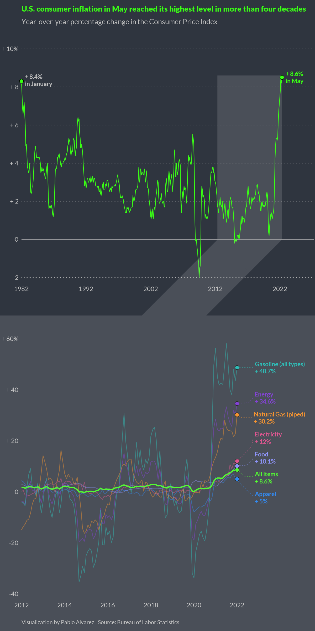
In May 2022, the annual rate of U.S. inflation grew to 8.6%—the highest it’s been in four decades, according to the Bureau of Labor Statistics.
What’s driving this surge, and what products are seeing the most significant price jumps?
This visualization by Pablo Alvarez shows U.S. inflation levels since 1982 and highlights a few product categories that have seen the biggest year-over-year increases.
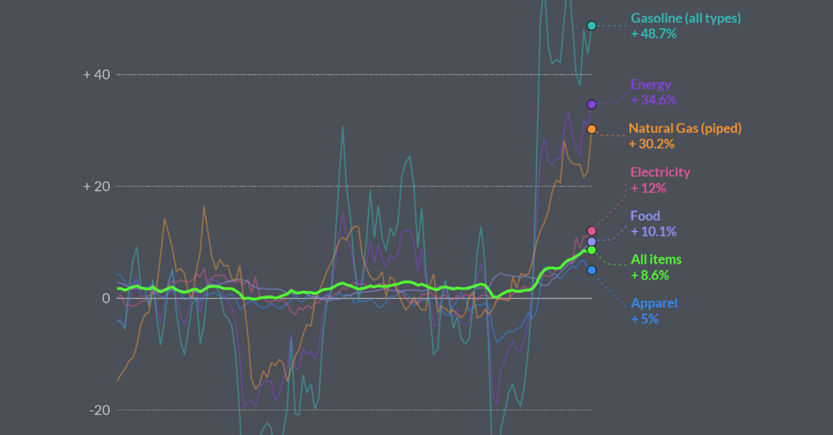
The Category Breakdown
Perhaps unsurprisingly, energy sources have seen the biggest year-over-year climb. Gasoline has seen one of the biggest spikes, up 48.7% since May 2021.
| Item | % yearly change (May 2022) |
|---|---|
| Gasoline (all types) | 48.7% |
| Energy | 34.6% |
| Natural Gas | 30.2% |
| Electricity | 12.0% |
| Food | 10.1% |
| All items | 8.6% |
| Apparel | 5.0% |
Across the U.S., the average price of gas sat at $4.807 per gallon as of July 4, and experts predict this figure could grow to $6 per gallon by the end of the summer.
While fuel prices were on the upswing prior to the Russia-Ukraine conflict, due to loosening COVID-19 restrictions and increased demand for travel, the conflict sent oil prices skyrocketing. This is because many countries placed sanctions on Russian oil, which put a squeeze on global supply.
Food has also seen a massive cost spike, up 10.1% since May 2021. This is largely due to supply-chain issues, increased transportation costs, and fertilizer shortages.
The Spending Spree Continues
Despite rising prices, many consumers have been continuing to spend. In May 2022, personal consumption expenditures (which account for inflation) were up 0.5% compared to the month prior, according to the Bureau of Economic Analysis.
Rather than adjust their spending habits, Americans have been relying on their savings to cope with price hikes. A recent survey of over 2,000 Americans showed that 67% of respondents have used some of their savings to deal with price increases, and 23% have made a substantial dent in their nest eggs.
To help combat inflation, central banks have been raising interest rates to encourage savings and ultimately slow down spending. But this is a delicate dance—if rates are raised too fast and spending screeches to a halt, this could lead to a recession.

This article was published as a part of Visual Capitalist's Creator Program, which features data-driven visuals from some of our favorite Creators around the world.


Markets
Ranked: The Largest U.S. Corporations by Number of Employees
We visualized the top U.S. companies by employees, revealing the massive scale of retailers like Walmart, Target, and Home Depot.
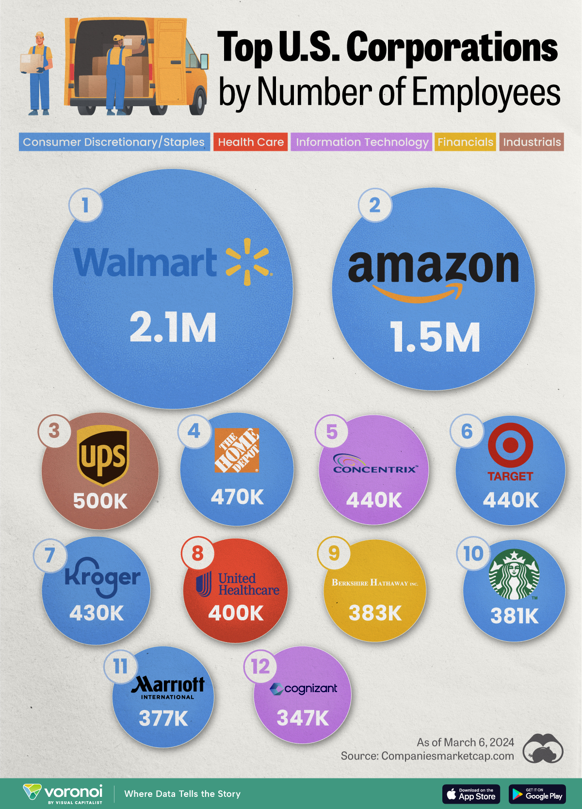
The Largest U.S. Corporations by Number of Employees
This was originally posted on our Voronoi app. Download the app for free on Apple or Android and discover incredible data-driven charts from a variety of trusted sources.
Revenue and profit are common measures for measuring the size of a business, but what about employee headcount?
To see how big companies have become from a human perspective, we’ve visualized the top U.S. companies by employees. These figures come from companiesmarketcap.com, and were accessed in March 2024. Note that this ranking includes publicly-traded companies only.
Data and Highlights
The data we used to create this list of largest U.S. corporations by number of employees can be found in the table below.
| Company | Sector | Number of Employees |
|---|---|---|
| Walmart | Consumer Staples | 2,100,000 |
| Amazon | Consumer Discretionary | 1,500,000 |
| UPS | Industrials | 500,000 |
| Home Depot | Consumer Discretionary | 470,000 |
| Concentrix | Information Technology | 440,000 |
| Target | Consumer Staples | 440,000 |
| Kroger | Consumer Staples | 430,000 |
| UnitedHealth | Health Care | 400,000 |
| Berkshire Hathaway | Financials | 383,000 |
| Starbucks | Consumer Discretionary | 381,000 |
| Marriott International | Consumer Discretionary | 377,000 |
| Cognizant | Information Technology | 346,600 |
Retail and Logistics Top the List
Companies like Walmart, Target, and Kroger have a massive headcount due to having many locations spread across the country, which require everything from cashiers to IT professionals.
Moving goods around the world is also highly labor intensive, explaining why UPS has half a million employees globally.
Below the Radar?
Two companies that rank among the largest U.S. corporations by employees which may be less familiar to the public include Concentrix and Cognizant. Both of these companies are B2B brands, meaning they primarily work with other companies rather than consumers. This contrasts with brands like Amazon or Home Depot, which are much more visible among average consumers.
A Note on Berkshire Hathaway
Warren Buffett’s company doesn’t directly employ 383,000 people. This headcount actually includes the employees of the firm’s many subsidiaries, such as GEICO (insurance), Dairy Queen (retail), and Duracell (batteries).
If you’re curious to see how Buffett’s empire has grown over the years, check out this animated graphic that visualizes the growth of Berkshire Hathaway’s portfolio from 1994 to 2022.

-

 Travel1 week ago
Airline Incidents: How Do Boeing and Airbus Compare?
-

 Markets2 weeks ago
Visualizing America’s Shortage of Affordable Homes
-

 Green2 weeks ago
Ranked: Top Countries by Total Forest Loss Since 2001
-

 Money2 weeks ago
Where Does One U.S. Tax Dollar Go?
-

 Misc2 weeks ago
Almost Every EV Stock is Down After Q1 2024
-

 AI2 weeks ago
The Stock Performance of U.S. Chipmakers So Far in 2024
-

 Markets2 weeks ago
Charted: Big Four Market Share by S&P 500 Audits
-

 Real Estate2 weeks ago
Ranked: The Most Valuable Housing Markets in America