Misc
The Psychology Behind Logo and Color Choice
Some professionals scoff at the importance of branding in business.
For many investors and analysts, this area of marketing seems fluffy and intangible, which makes it very hard to measure any potential benefits. While it’s true that quantifying intangibles is not always easy or accurate, it doesn’t mean that branding has no value to begin with.
In this way, branding may be comparable to the concept of “leadership” in sports. Athletes like Mark Messier, Michael Jordan, Ray Lewis, Mia Hamm, and Steve Yzerman weren’t just good players from a technical perspective, but they also had intangible qualities that elevated the performances of their respective teams. While it is hard to measure work ethic, passion, leadership, drive, and loyalty, or how these qualities rub off on teammates, it’s still clear to many coaches and managers that intangibles help win championships.
Like leadership, we know good branding when we see it, even though it can be tough to quantify. Coca-Cola is recognizable and nostalgic, while the Starbucks name may be the difference in choosing their cafe over an average-looking coffee shop in an unfamiliar neighborhood.
The Psychology Behind Logo and Color Choice
Logo and color choice are two of the most important parts of creating a quality brand. Today we have two infographics from The Logo Company. One shows the five major forms of logos, while the other dives into the meaning behind color choices.
We’ll add some commentary on the implications of logo and color choice in of the areas below.

Companies cannot control the actual emotional responses to their brand on a personal level, but they can do their best to control shape, style, and color to at least guide these interpretations.
In fact, our brains are hardwired to learn and memorize new shapes, so the way a logo is presented can have a big impact on its effectiveness. The five major types of logo forms – brand marks, word marks, letter marks, combo marks, or emblems – are a way to control shape and identity.
Word marks, for example, have the name of the company in the logo itself without any imagery. This helps achieve brand recognition, while the lack of accompanying graphics may convey a sense of sophistication to consumers.
Using just initials in a letter mark can show even more sophistication. Leading luxury consumer brands such as Louis Vuitton or Chanel have used this with much success.
On the opposite end of the spectrum, some companies use just a brand mark to convey a sense of universality. Even though “Shell”, “Apple”, and “Nike” are not spelled out in name, their famous icons are known throughout the world. The Nike swoosh conveys movement, while the World Wildlife Fund can tell a powerful story just by using the famous panda in its brand mark.
Target is another instantly recognizable brand mark. The simplicity and circular shape are key elements to the design, but the bright red color also plays a role. Here’s a guide to how color can evoke different emotions in consumers:
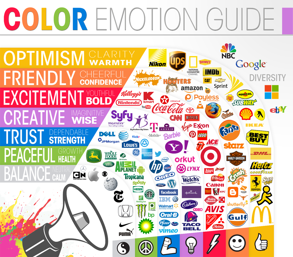
One step further, here is another version with a little more nuance, from Web Designer Depot.
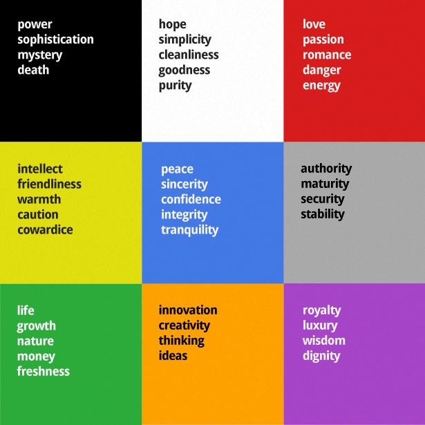
Of course, colors can and do get interpreted in different ways. However, they can also have the power to represent broad ideas for cultural or evolutionary reasons.
In a previous post on the psychology of color, we dive into this in more depth. For example, it explains why the color red stimulates appetite, or why blue brings a sense of productivity and efficiency.
Misc
The Evolution of U.S. Beer Logos
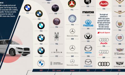
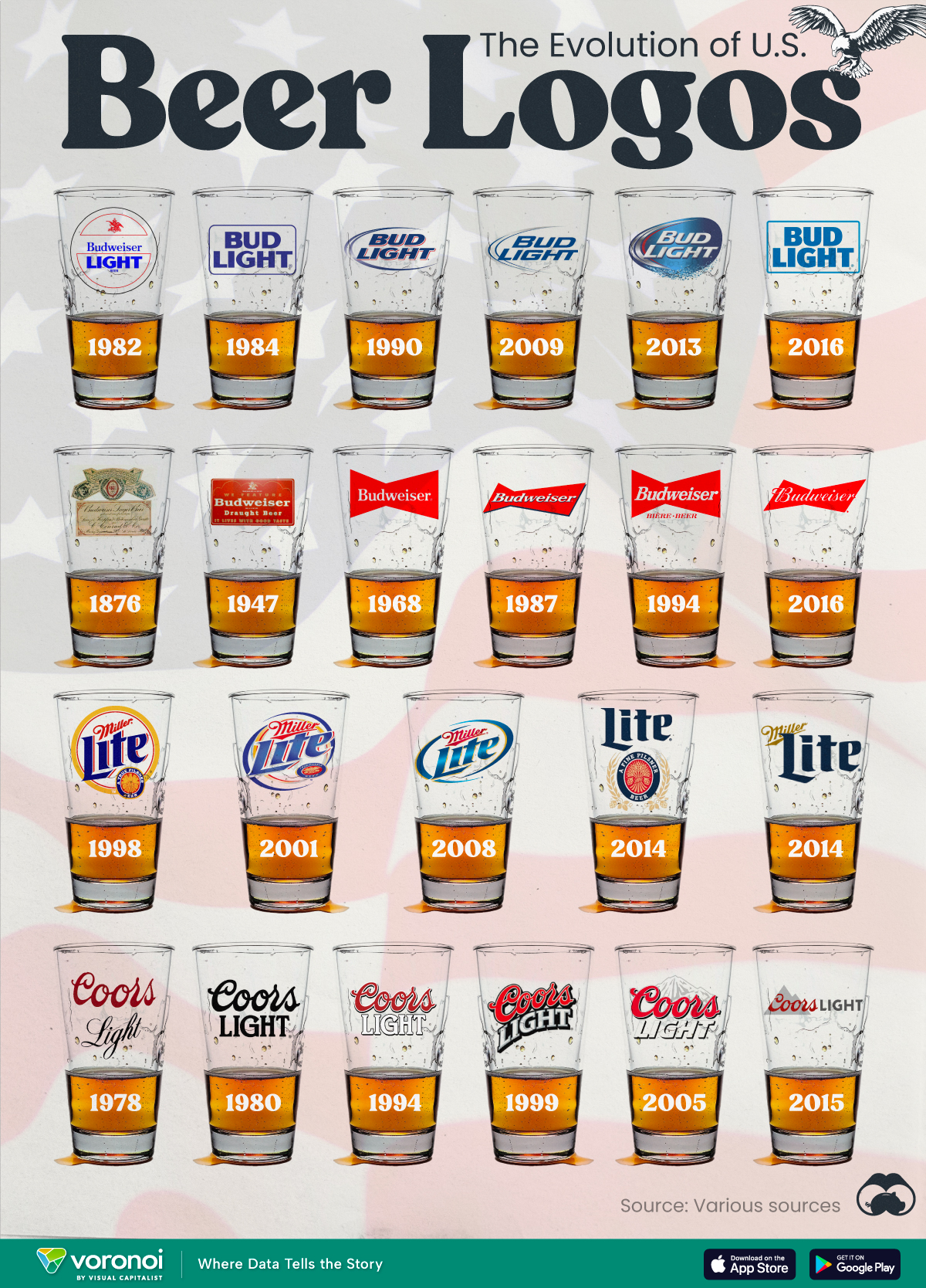
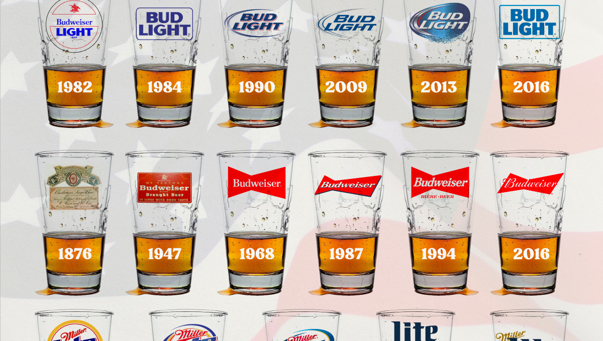
In this graphic, we analyze the evolution of popular U.S. beer logos like Budweiser, Coors Light, Bud Light, and more.
The Evolution of U.S. Beer Logos
This was originally posted on our Voronoi app. Download the app for free on iOS or Android and discover incredible data-driven charts from a variety of trusted sources.
Despite selling a popular product, beer companies have to be creative to stand out in a competitive market.
In this graphic, we analyze the evolution of some U.S. beer logos based on various sources. We chose brands based on a mixture of criteria, including popularity (based on YouGov surveys), availability of logo assets, and those with interesting developments.
Bud Light Back to the ’80s
Despite recent backlash and calls for a boycott after sending a commemorative can to transgender influencer Dylan Mulvaney, Bud Light remains one of America’s best-selling beers.
The brand of light beer, owned by the Anheuser-Busch company, has switched from its more circular logo with italic letters adopted in the 1990s back to the Bud Light badge of the 1980s. It is composed of heavy uppercase lettering, written in two levels in a shade of blue with the inscription placed on a solid white background and enclosed in a thin rectangular frame.
Miller Lite Goes Old School
After following a similar approach to Bud Light’s branding throughout the 2000s, Miller Lite decided to undergo a major rebranding in 2014.
The company returned to its 1970s roots, once again combining a white can with its original blue, gold, and red logo. The redesign was largely considered a success, given that Miller Lite sales immediately increased following the change.
A Symbol of American Brewing
The oldest brand on our U.S. beer list, the Budweiser logo, has undergone more than 15 changes over the years.
The design of two connected triangles represents a red bow tie, as a symbol of American brewing.
The colors of the Budweiser logo include a vibrant red, which helps the logo stand out and be easily recognizable from a distance. Studies also suggest that the color red stimulates appetite. Meanwhile, the white inscription symbolizes purity and cleanliness.
Curious to learn more about the beer market? Check out this graphic about global beer consumption.
-

 Energy6 days ago
Mapped: The Age of Energy Projects in Interconnection Queues, by State
-

 AI2 weeks ago
Visualizing AI Patents by Country
-
 Markets2 weeks ago
Economic Growth Forecasts for G7 and BRICS Countries in 2024
-

 Wealth2 weeks ago
Charted: Which City Has the Most Billionaires in 2024?
-
 Technology2 weeks ago
All of the Grants Given by the U.S. CHIPS Act
-

 Green1 week ago
The Carbon Footprint of Major Travel Methods
-

 United States1 week ago
Visualizing the Most Common Pets in the U.S.
-
 Culture1 week ago
The World’s Top Media Franchises by All-Time Revenue


