Misc
Mapped: Each Region’s Median Age Since 1950


Mapped: Each Region’s Median Age Since 1950
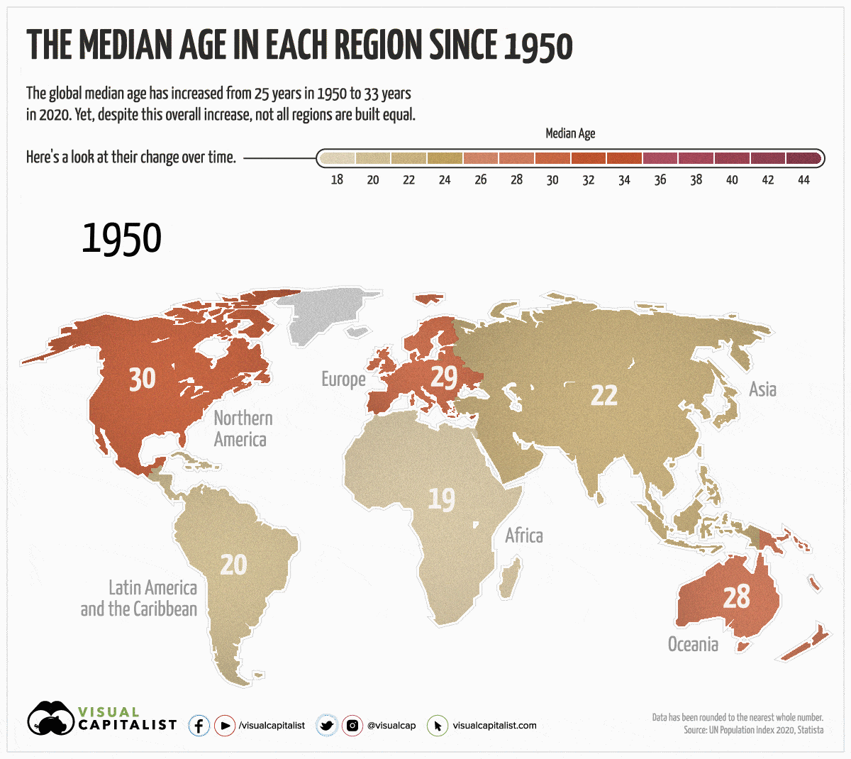
Over the last 70 years, the global population has gotten older. Since 1950, the worldwide median age has gone from 25 years to 33 years.
Yet, despite an overall increase globally, not all regions have aged at the same rate. For instance, Europe’s median age has grown by 14 years, while Africa’s has only increased by 1 year.
Today’s animated map uses data from the UN Population Index to highlight the changes in median age over the last 70 years, and to visualize the differences between each region. We also explain why some regions skew older than others.
Factors that Affect a Region’s Median Age
Before diving into the numbers, it’s important to understand the key factors that influence a region’s median age:
- Fertility Rate
The average number of children that women give birth to in their reproductive years. The higher the fertility rate, the younger a population skews. Since 1950, the global fertility rate has dropped by 50%. - Mortality Rate
The number of deaths in a particular region, usually associated with a certain demographic or period in time. For example, global child mortality (children who have died under five years of age) has been on the decline, which has contributed to an increase in the average life expectancy across the globe. - Migration
International migration may lower a region’s population since migrants are usually younger or working age. In 2019, there were 272 million migrants globally.
The Change in Median Age
As mentioned, not all regions are created equal. Here’s how much the median age has changed in each region since 1950:
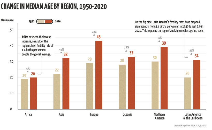
The Highs
Regions that have seen the most growth and generally skew older are Latin America, followed by Europe and Asia.
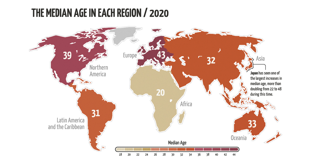
Interestingly, Asia’s notable increase is largely influenced by Japan, which has the oldest population on the planet. The country has seen a significant increase in median age since 1950—it’s gone from 22 to 48 years in 2020. This can be explained by its considerably low fertility rate, which is 1.4 births per woman—that’s less than half the global average.
But why is Japan’s fertility rate so low? There are more women in the workforce than ever before, and they are too busy to take on the burden of running a household. Yet, while women are more prosperous than ever, the workforce in general has taken a hit.
Japan’s recession in the early 1990s led to an increase in temporary jobs, which has had lasting effects on the region’s workforce—in 2019, about 1 in 5 men were working contract jobs with little stability or job growth.
The Lows
In contrast to Asia’s growth, Africa has seen the lowest increase in median age. The region’s population skews young, with over 60% of its population under the age of 25.
Africa’s young population can be explained by its high birth rate of 4.4 births per woman. It also has a relatively low life expectancy, at 65 years for women and 61 years for men. To put things into perspective, the average life expectancy across the globe is 75 years for women and 70 years for men.
Another trend worth noting is Oceania’s relatively small growth. It’s interesting because the region’s fertility rate is almost on par with the global average, at 2.4 births per woman, and the average life expectancy doesn’t differ much from the norm either.
The most likely reason for Oceania’s stagnant growth in median age is its high proportion of migrants. In 2019, the country had 8.9 million international migrants, which is 21% of its overall population. In contrast, migrants only make up 10% of North America’s population.
Unique Challenges for Every Region
Age composition has significant impacts on a region’s labor force, health services, and economic productivity.
Regions with a relatively high median age face several challenges such as shrinking workforce, higher taxes, and increasing healthcare costs. On the other end of the spectrum, regions with a younger population face increased demand for educational services and a lack of employment opportunities.
As our population worldwide continues to grow and age, it’s important to bring attention to issues that impact our global community. World Population Day on July 11, 2020, was established by the UN to try and solve worldwide population issues.
“The 2030 Agenda for Sustainable Development is the world’s blueprint for a better future for all on a healthy planet. On World Population Day, we recognize that this mission is closely interrelated with demographic trends including population growth, aging, migration, and urbanization.”
– UN Secretary-General António Guterres


VC+
VC+: Get Our Key Takeaways From the IMF’s World Economic Outlook
A sneak preview of the exclusive VC+ Special Dispatch—your shortcut to understanding IMF’s World Economic Outlook report.

Have you read IMF’s latest World Economic Outlook yet? At a daunting 202 pages, we don’t blame you if it’s still on your to-do list.
But don’t worry, you don’t need to read the whole April release, because we’ve already done the hard work for you.
To save you time and effort, the Visual Capitalist team has compiled a visual analysis of everything you need to know from the report—and our VC+ Special Dispatch is available exclusively to VC+ members. All you need to do is log into the VC+ Archive.
If you’re not already subscribed to VC+, make sure you sign up now to access the full analysis of the IMF report, and more (we release similar deep dives every week).
For now, here’s what VC+ members get to see.
Your Shortcut to Understanding IMF’s World Economic Outlook
With long and short-term growth prospects declining for many countries around the world, this Special Dispatch offers a visual analysis of the key figures and takeaways from the IMF’s report including:
- The global decline in economic growth forecasts
- Real GDP growth and inflation forecasts for major nations in 2024
- When interest rate cuts will happen and interest rate forecasts
- How debt-to-GDP ratios have changed since 2000
- And much more!

Get the Full Breakdown in the Next VC+ Special Dispatch
VC+ members can access the full Special Dispatch by logging into the VC+ Archive, where you can also check out previous releases.
Make sure you join VC+ now to see exclusive charts and the full analysis of key takeaways from IMF’s World Economic Outlook.
Don’t miss out. Become a VC+ member today.
What You Get When You Become a VC+ Member
VC+ is Visual Capitalist’s premium subscription. As a member, you’ll get the following:
- Special Dispatches: Deep dive visual briefings on crucial reports and global trends
- Markets This Month: A snappy summary of the state of the markets and what to look out for
- The Trendline: Weekly curation of the best visualizations from across the globe
- Global Forecast Series: Our flagship annual report that covers everything you need to know related to the economy, markets, geopolitics, and the latest tech trends
- VC+ Archive: Hundreds of previously released VC+ briefings and reports that you’ve been missing out on, all in one dedicated hub
You can get all of the above, and more, by joining VC+ today.

-

 Mining1 week ago
Gold vs. S&P 500: Which Has Grown More Over Five Years?
-

 Markets2 weeks ago
Ranked: The Most Valuable Housing Markets in America
-

 Money2 weeks ago
Which States Have the Highest Minimum Wage in America?
-

 AI2 weeks ago
Ranked: Semiconductor Companies by Industry Revenue Share
-

 Markets2 weeks ago
Ranked: The World’s Top Flight Routes, by Revenue
-

 Countries2 weeks ago
Population Projections: The World’s 6 Largest Countries in 2075
-

 Markets2 weeks ago
The Top 10 States by Real GDP Growth in 2023
-

 Demographics2 weeks ago
The Smallest Gender Wage Gaps in OECD Countries