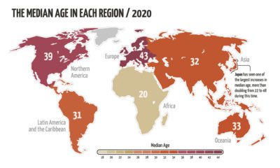

The world’s population is aging, but not at the same rate. This animated map visualizes the changes in median age in every region since 1950.
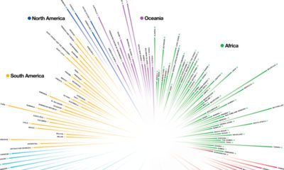

How do countries around the world compare in terms of age? This compelling visualization shows the median age for every country in the world.
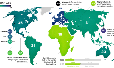

This chart takes a look at the median age of every continent, while also breaking down the youngest and oldest countries in the world.


