Demographics
Interactive: How the U.S. Population Has Changed in 10 Years, by State
var divElement = document.getElementById(‘viz1624579073838’); var vizElement = divElement.getElementsByTagName(‘object’)[0]; vizElement.style.width=’1200px’;vizElement.style.height=’1527px’; var scriptElement = document.createElement(‘script’); scriptElement.src = ‘https://public.tableau.com/javascripts/api/viz_v1.js’; vizElement.parentNode.insertBefore(scriptElement, vizElement);
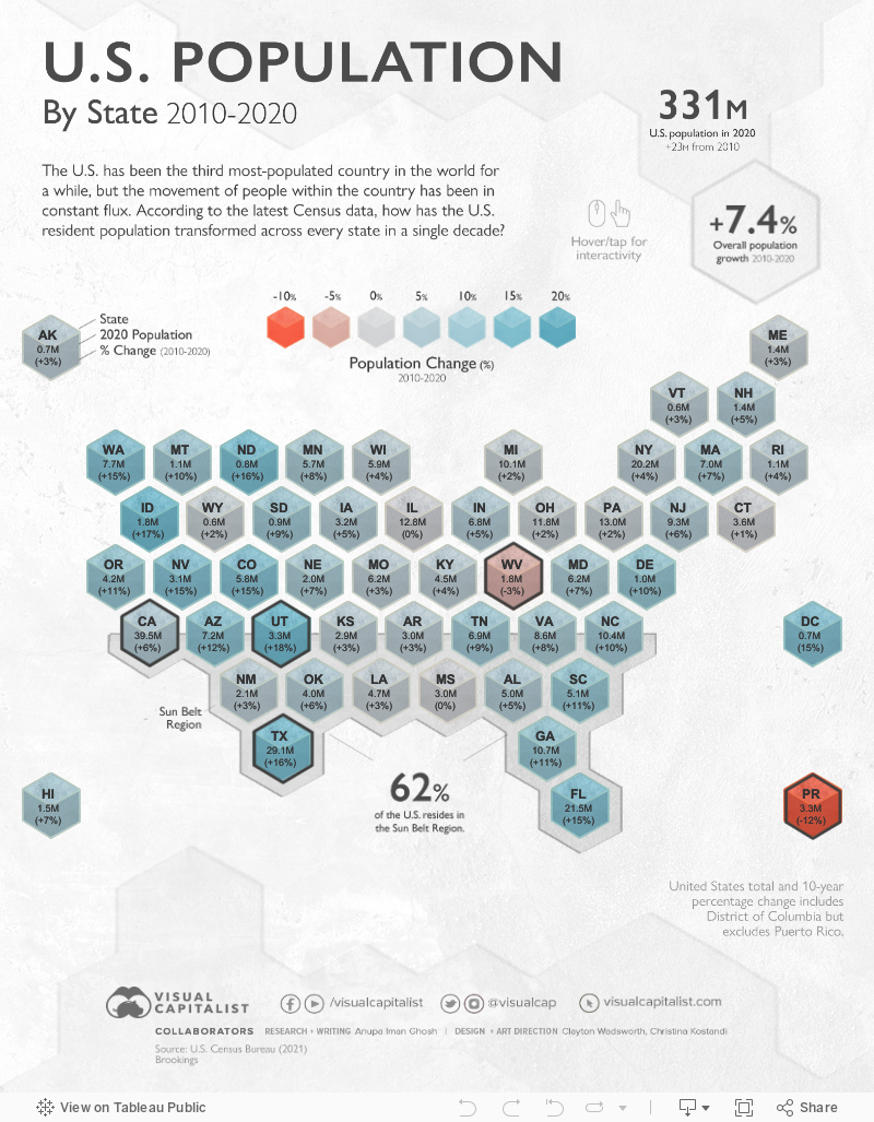
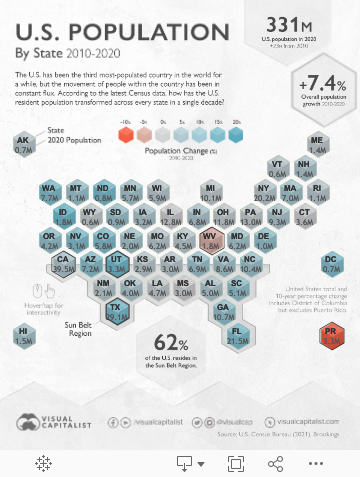


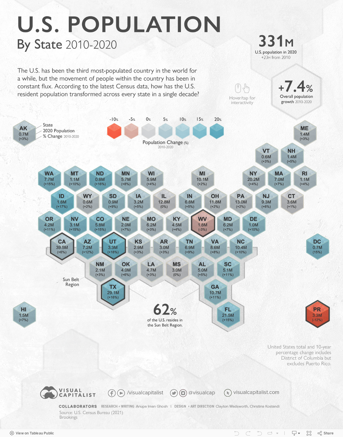
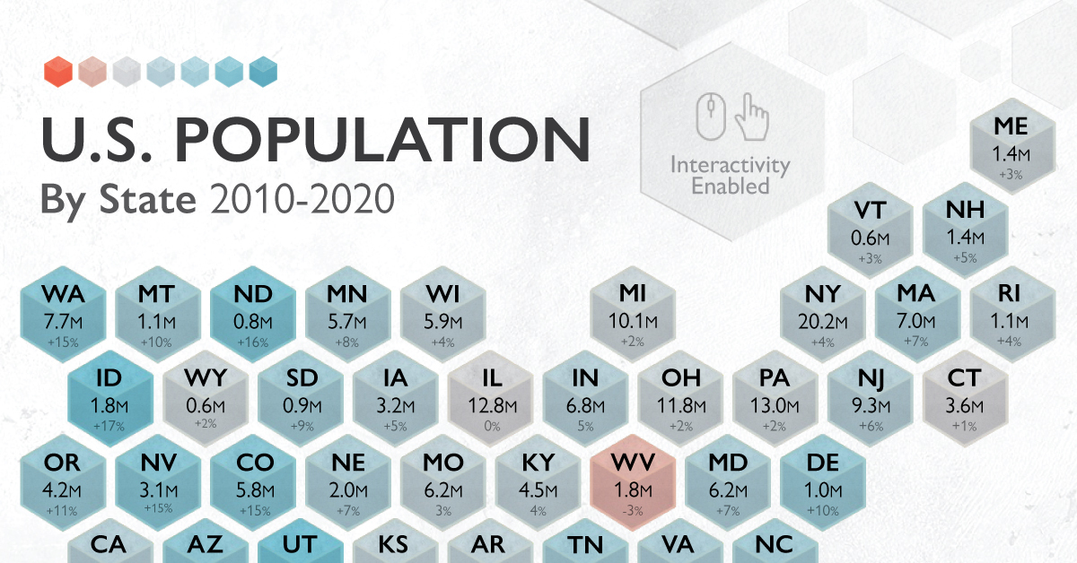
U.S. Population Change in the Last Decade, by State
The U.S. is the third most-populated country in the world, behind only two Asian giants of China and India respectively. But within the country, a lot can change in 10 years, and populations are especially mutable in nature.
As people moved in and out of certain areas for both lifestyle and economic reasons, which U.S. state populations fluctuated the most?
Drawing from the latest Census Bureau data, we look at how each state’s resident populations evolved over the past decade. But first, a blast from the past.
Historical Trends: U.S. Population Since the 1930s
Population growth trends in the U.S. have been closely tied to the economic ebbs and flows experienced by the nation. In one stark example, the country’s 10-year population growth rate plummeted to just 7.3% due to the Great Depression.
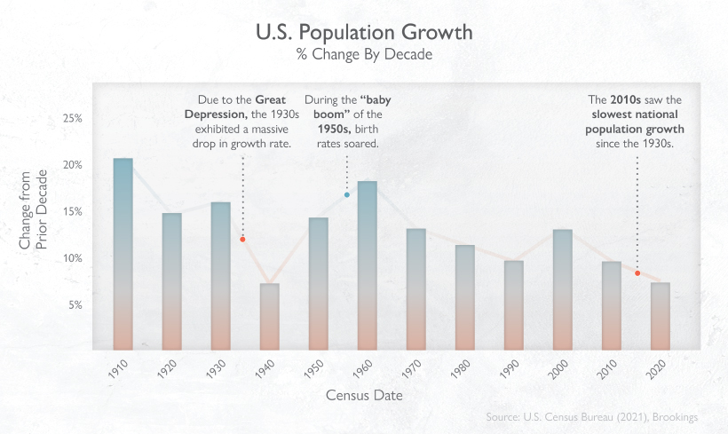
This was later offset by the post-WWII “Baby Boom”, during which birth rates soared once more, bumping up the population 10-year growth rate to 18.5% in the 1950s. The Baby Boomer generation now wields the most influence over the U.S. economy and society thanks to the favorable economic conditions in which they were born.
However, U.S. population growth rates recently hit new lows—the slower pace in the 2010s is rivalling that of the 1930s. According to Brookings, there area few factors at play:
- Falling fertility rate
- An increase in deaths (aging population, overdose deaths)
- Lower immigration rate
With all this in mind, how does the current landscape of the U.S. population by state look?
The Entire U.S. Population by State in 2020
The U.S. experienced 7.4% population growth between 2010-2020, which equates to the addition of 22.7 million people.
An impressive one-tenth of this growth occurred in California, and it remains the most populous state, rising above 39.5 million people in 2020. The SoCal megaregion—Los Angeles and San Diego—alone contributes more than $1.4 trillion to global economic output.
| Area | 2020 Census Resident Population | Numeric Change (2010-2020) | % Change (2010-2020) |
|---|---|---|---|
| Alabama | 5,024,279 | 244,543 | 5.1% |
| Alaska | 733,391 | 23,160 | 3.3% |
| Arizona | 7,151,502 | 759,485 | 11.9% |
| Arkansas | 3,011,524 | 95,606 | 3.3% |
| California | 39,538,223 | 2,284,267 | 6.1% |
| Colorado | 5,773,714 | 744,518 | 14.8% |
| Connecticut | 3,605,944 | 31,847 | 0.9% |
| Delaware | 989,948 | 92,014 | 10.2% |
| District of Columbia (Territory) | 689,545 | 87,822 | 14.6% |
| Florida | 21,538,187 | 2,736,877 | 14.6% |
| Georgia | 10,711,908 | 1,024,255 | 10.6% |
| Hawaii | 1,455,271 | 94,970 | 7.0% |
| Idaho | 1,839,106 | 271,524 | 17.3% |
| Illinois | 12,812,508 | -18,124 | -0.1% |
| Indiana | 6,785,528 | 301,726 | 4.7% |
| Iowa | 3,190,369 | 144,014 | 4.7% |
| Kansas | 2,937,880 | 84,762 | 3.0% |
| Kentucky | 4,505,836 | 166,469 | 3.8% |
| Louisiana | 4,657,757 | 124,385 | 2.7% |
| Maine | 1,362,359 | 33,998 | 2.6% |
| Maryland | 6,177,224 | 403,672 | 7.0% |
| Massachusetts | 7,029,917 | 482,288 | 7.4% |
| Michigan | 10,077,331 | 193,691 | 2.0% |
| Minnesota | 5,706,494 | 402,569 | 7.6% |
| Mississippi | 2,961,279 | -6,018 | -0.2% |
| Missouri | 6,154,913 | 165,986 | 2.8% |
| Montana | 1,084,225 | 94,810 | 9.6% |
| Nebraska | 1,961,504 | 135,163 | 7.4% |
| Nevada | 3,104,614 | 404,063 | 15.0% |
| New Hampshire | 1,377,529 | 61,059 | 4.6% |
| New Jersey | 9,288,994 | 497,100 | 5.7% |
| New Mexico | 2,117,522 | 58,343 | 2.8% |
| New York | 20,201,249 | 823,147 | 4.2% |
| North Carolina | 10,439,388 | 903,905 | 9.5% |
| North Dakota | 779,094 | 106,503 | 15.8% |
| Ohio | 11,799,448 | 262,944 | 2.3% |
| Oklahoma | 3,959,353 | 208,002 | 5.5% |
| Oregon | 4,237,256 | 406,182 | 10.6% |
| Pennsylvania | 13,002,700 | 300,321 | 2.4% |
| Puerto Rico (Territory) | 3,285,874 | -439,915 | -11.8% |
| Rhode Island | 1,097,379 | 44,812 | 4.3% |
| South Carolina | 5,118,425 | 493,061 | 10.7% |
| South Dakota | 886,667 | 72,487 | 8.9% |
| Tennessee | 6,910,840 | 564,735 | 8.9% |
| Texas | 29,145,505 | 3,999,944 | 15.9% |
| Utah | 3,271,616 | 507,731 | 18.4% |
| Vermont | 643,077 | 17,336 | 2.8% |
| Virginia | 8,631,393 | 630,369 | 7.9% |
| Washington | 7,705,281 | 980,741 | 14.6% |
| West Virginia | 1,793,716 | -59,278 | -3.2% |
| Wisconsin | 5,893,718 | 206,732 | 3.6% |
| Wyoming | 576,851 | 13,225 | 2.3% |
| U.S. Total | 331,449,281 | 22,703,743 | 7.4% |
*Note: U.S. total and 10-year percentage change includes District of Columbia but excludes Puerto Rico
Overall, there’s been a significant shift in population towards the Sun Belt region (stretching from Southeast to Southwest), where 62% of the U.S. now resides. Let’s take a closer look at the biggest gainers and decliners over time.
Gainers: Utah, Texas
Utah saw the quickest population growth rate of 18.4% in the last decade. Drawn in by strong economic prospects, net migration into the state is balancing out a decline in births. What’s interesting is that 80% of Utah’s population is concentrated in the Wasatch Front – a metro area anchored by Salt Lake City and the chain of cities and towns running north and south of Utah’s largest city.
A little further south, Texas swelled by almost 4 million residents in the last 10 years. Much of this growth took place in the “Texas Triangle”, which contains Dallas, Houston, San Antonio, and Austin. This booming region of the country contributes over $1.2 trillion to global economic output.
Decliners: West Virginia, Puerto Rico
West Virginia lost the most people in a decade, seeing a numeric population decline of 59,278. This may be explained by an aging population—16% of West Virginians are 65 years old and above.
When territories are also taken into account, Puerto Rico saw the biggest percentage decline of 11.8%, or close to 44,000 people over 10 years. Many of them moved into the mainland, and especially into Florida, after two hurricanes hit the island in 2017.
Full Speed Ahead: States Competing On Forward Momentum
By 2025, California will be home to five of the fastest-growing urban U.S. cities. The unstoppable growth of the tech industry in Silicon Valley is partly behind this, as many people flock to the West Coast to fill the shoes of highly skilled jobs required.
But could Silicon Valley one day lose its steam? Current and projected population growth in Texas is bolstering its tech potential too—in fact, it’s been dubbed the next “Silicon Hills”, with many tech companies from SpaceX to Oracle choosing to camp out in Austin instead.


Demographics
The Countries That Have Become Sadder Since 2010
Tracking Gallup survey data for more than a decade reveals some countries are witnessing big happiness declines, reflecting their shifting socio-economic conditions.


The Countries That Have Become Sadder Since 2010
This was originally posted on our Voronoi app. Download the app for free on iOS or Android and discover incredible data-driven charts from a variety of trusted sources.
Can happiness be quantified?
Some approaches that try to answer this question make a distinction between two differing components of happiness: a daily experience part, and a more general life evaluation (which includes how people think about their life as a whole).
The World Happiness Report—first launched in 2012—has been making a serious go at quantifying happiness, by examining Gallup poll data that asks respondents in nearly every country to evaluate their life on a 0–10 scale. From this they extrapolate a single “happiness score” out of 10 to compare how happy (or unhappy) countries are.
More than a decade later, the 2024 World Happiness Report continues the mission. Its latest findings also include how some countries have become sadder in the intervening years.
Which Countries Have Become Unhappier Since 2010?
Afghanistan is the unhappiest country in the world right now, and is also 60% unhappier than over a decade ago, indicating how much life has worsened since 2010.
In 2021, the Taliban officially returned to power in Afghanistan, after nearly two decades of American occupation in the country. The Islamic fundamentalist group has made life harder, especially for women, who are restricted from pursuing higher education, travel, and work.
On a broader scale, the Afghan economy has suffered post-Taliban takeover, with various consequent effects: mass unemployment, a drop in income, malnutrition, and a crumbling healthcare system.
| Rank | Country | Happiness Score Loss (2010–24) | 2024 Happiness Score (out of 10) |
|---|---|---|---|
| 1 | 🇦🇫 Afghanistan | -2.6 | 1.7 |
| 2 | 🇱🇧 Lebanon | -2.3 | 2.7 |
| 3 | 🇯🇴 Jordan | -1.5 | 4.2 |
| 4 | 🇻🇪 Venezuela | -1.3 | 5.6 |
| 5 | 🇲🇼 Malawi | -1.2 | 3.4 |
| 6 | 🇿🇲 Zambia | -1.2 | 3.5 |
| 7 | 🇧🇼 Botswana | -1.2 | 3.4 |
| 8 | 🇾🇪 Yemen | -1.0 | 3.6 |
| 9 | 🇪🇬 Egypt | -1.0 | 4.0 |
| 10 | 🇮🇳 India | -0.9 | 4.1 |
| 11 | 🇧🇩 Bangladesh | -0.9 | 3.9 |
| 12 | 🇨🇩 DRC | -0.7 | 3.3 |
| 13 | 🇹🇳 Tunisia | -0.7 | 4.4 |
| 14 | 🇨🇦 Canada | -0.6 | 6.9 |
| 15 | 🇺🇸 U.S. | -0.6 | 6.7 |
| 16 | 🇨🇴 Colombia | -0.5 | 5.7 |
| 17 | 🇵🇦 Panama | -0.5 | 6.4 |
| 18 | 🇵🇰 Pakistan | -0.5 | 4.7 |
| 19 | 🇿🇼 Zimbabwe | -0.5 | 3.3 |
| 20 | 🇮🇪 Ireland | -0.5 | 6.8 |
| N/A | 🌍 World | +0.1 | 5.5 |
Nine countries in total saw their happiness score drop by a full point or more, on the 0–10 scale.
Noticeably, many of them have seen years of social and economic upheaval. Lebanon, for example, has been grappling with decades of corruption, and a severe liquidity crisis since 2019 that has resulted in a banking system collapse, sending poverty levels skyrocketing.
In Jordan, unprecedented population growth—from refugees leaving Iraq and Syria—has aggravated unemployment rates. A somewhat abrupt change in the line of succession has also raised concerns about political stability in the country.

-

 Brands6 days ago
How Tech Logos Have Evolved Over Time
-

 Demographics2 weeks ago
The Smallest Gender Wage Gaps in OECD Countries
-

 Economy2 weeks ago
Where U.S. Inflation Hit the Hardest in March 2024
-

 Green2 weeks ago
Top Countries By Forest Growth Since 2001
-

 United States2 weeks ago
Ranked: The Largest U.S. Corporations by Number of Employees
-

 Maps2 weeks ago
The Largest Earthquakes in the New York Area (1970-2024)
-

 Green2 weeks ago
Ranked: The Countries With the Most Air Pollution in 2023
-

 Green2 weeks ago
Ranking the Top 15 Countries by Carbon Tax Revenue