Inequality
Visualizing the Extreme Concentration of Global Wealth
In recent decades, extreme world poverty has declined significantly and many millions of people have joined the swelling ranks of the middle class – particularly in China.
While these economic shifts are positive, it’s the other end of the global wealth spectrum that attracts the most attention. A high degree of wealth creation is amassed by those at the top of the economic pyramid.
The Top-Heavy Wealth Spectrum
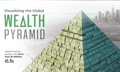
Today, slightly less than 1% of the world’s adult population occupies the $1M+ wealth range. Despite their small numbers, this elite group collectively controls 46% of the world’s wealth, valued at approximately $129 trillion.
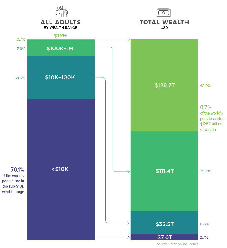
On the flip side of the equation, 70% of world’s population fall into the sub-$10K wealth band. This majority of people around the world collectively control a mere 2.7% of the world’s wealth.
Even as “the rich get richer”, there is good news for the majority. The percentage of people in that lowest wealth band has been shrinking over the years.
Moneyed Metropolises
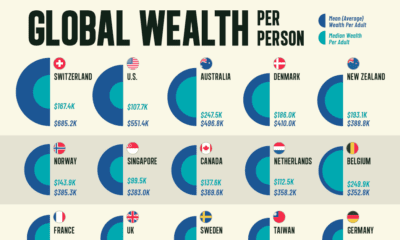
Not only is money concentrated among a small portion of the population, those people tend to gravitate towards global cities such as London, Hong Kong, and New York.
In fact, 70% of ultra high net worth individuals (UHNWIs) – persons with investable assets of $30 million or more – reside in just ten cities around the world.
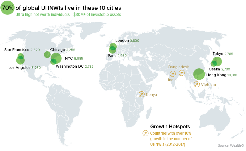
According to Credit Suisse, emerging markets now account for 22% of growth in the UHNWIs category – up from just 6% growth in 2000 – with China alone adding over 16,000 UHNWIs to the mix. Many members of this elite class may generate their wealth in emerging economies around the world, but as we can see from the map above, the world’s richest people end up very concentrated, geographically speaking.
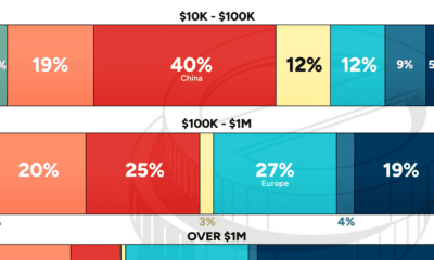
Global Wealth, by Continent
As the visualization below demonstrates, wealth accumulates in Europe and North America. This trend is so pronounced that it only becomes evident once the scale is adjusted to see the detail in the upper percentiles.
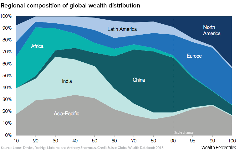
One thing is for certain – the world is changing quickly, and just as this graph would have looked very different 20 years ago, global wealth will almost certainly look different in 20 years time.


Money
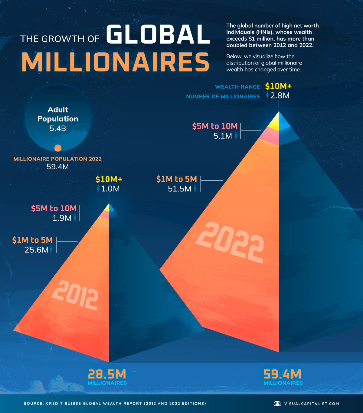
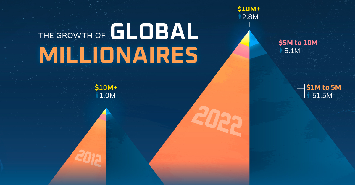
Visualizing the World’s Growing Millionaire Population (2012-2022)
The world’s millionaire population has more than doubled in the last decade between 2012 and 2022. We visualize these numbers here.
Visualizing the World’s Growing Millionaire Population
Reaping the rewards of tech revolutions, market booms, and more, the last decade has seen a remarkable increase in the global number of millionaires.
In 2022, 1.1% of all of the world’s adults were millionaires, up from 0.6% in 2012.
In today’s visualization, we dive into the world’s growing millionaire population using data from this year’s Global Wealth Report by Credit Suisse.
The Global Millionaire Population, Then and Now
In 2022, total millionaire wealth stood at $208.3 trillion, accounting for 45.8% of global wealth. That represents a 138% increase from 2011, when millionaires held $87.5 trillion in wealth.
While the rise can be attributed to a number of factors, financial assets have accounted for most of the increase in total wealth since the 2008 Financial Crisis, according to Credit Suisse.
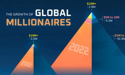
Here’s a look at the explosive growth in the number of millionaires from 2012 to 2022:
| Wealth range | Number of adults (2012) | Number of adults (2022) |
|---|---|---|
| $1-5M | 25.6 million | 51.5 million |
| $5-10M | 1.9 million | 5.1 million |
| >$10M | 1.0 million | 2.8 million |
At the very apex of these pyramids, the number of ultra-high-net-worth individuals (all holding $50 million or more in wealth) has nearly tripled over the last decade.
Where are the world’s millionaires mostly found?
- 42%: North America
- 27%: Europe
- 16%: Asia-Pacific (ex. China and India)
- 10%: China
- 5%: Rest of the World
In total, the world’s millionaire population amounted to 59.4 million adults in 2022.
Despite inflation, interest rates, and current market conditions hampering wealth creation for many in 2022 and 2023, Credit Suisse forecasts that the number of millionaires will still grow to 86 million by 2027, a 45% increase from 2022.
The Outlook for Wealth Inequality
Although wealth inequality fell slightly in 2022, a significant chunk of overall global wealth still belongs to the wealthiest parts of the population.
In stark contrast to millionaires, 52.5% of the world’s adults had less than $10,000 in wealth, and combined for just 1.2% of global wealth.
From a big picture perspective, however, worldwide wealth inequality has trended downward over the last two decades. That is, before the 2020–2021 period when the wealth gap was exacerbated due to the pandemic and the subsequent boom in share and house prices.
Looking ahead to 2027, Credit Suisse forecasts that the share of adults with less than $10,000 in wealth will fall, with more adults moving into the middle and upper income levels. It’ll be interesting to see if global wealth inequality continues its long-term downward trajectory.
Where does this data come from?
Source: Credit Suisse Global Wealth Report (2022 and 2012 versions)

-

 Education1 week ago
How Hard Is It to Get Into an Ivy League School?
-

 Technology2 weeks ago
Ranked: Semiconductor Companies by Industry Revenue Share
-

 Markets2 weeks ago
Ranked: The World’s Top Flight Routes, by Revenue
-

 Demographics2 weeks ago
Population Projections: The World’s 6 Largest Countries in 2075
-

 Markets2 weeks ago
The Top 10 States by Real GDP Growth in 2023
-

 Demographics2 weeks ago
The Smallest Gender Wage Gaps in OECD Countries
-

 Economy2 weeks ago
Where U.S. Inflation Hit the Hardest in March 2024
-

 Environment2 weeks ago
Top Countries By Forest Growth Since 2001