Education
All the Contents of the Universe, in One Graphic


All the Contents of the Universe, in One Graphic
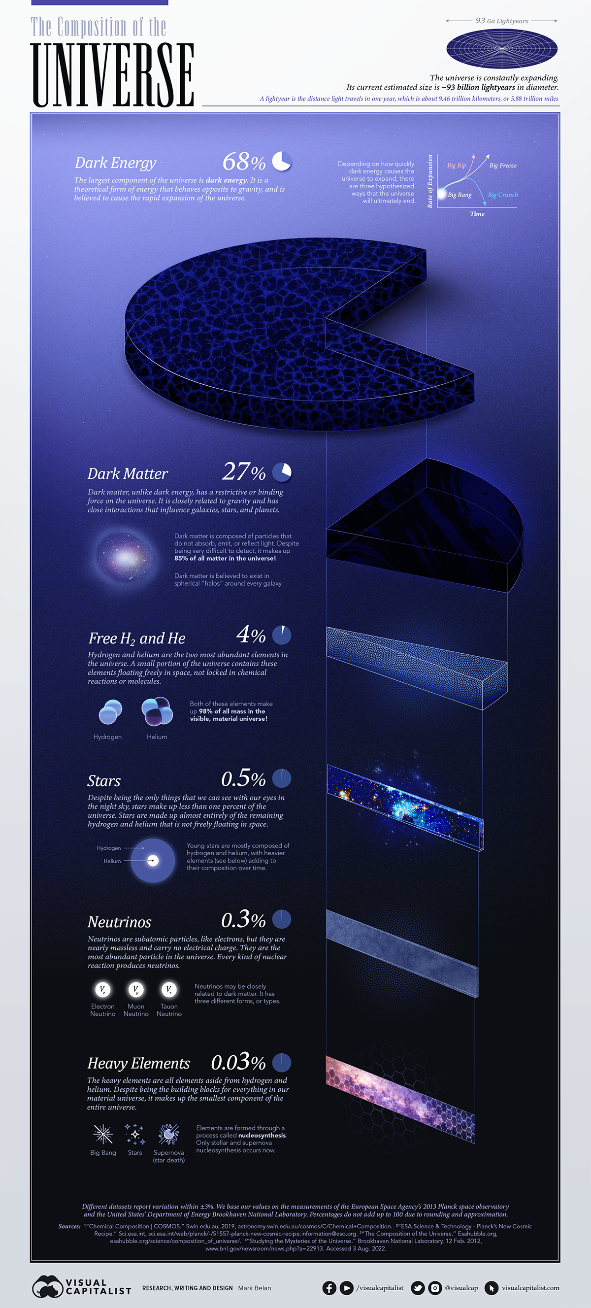
Scientists agree that the universe consists of three distinct parts: everyday visible (or measurable) matter, and two theoretical components called dark matter and dark energy.
These last two are theoretical because they have yet to be directly measured—but even without a full understanding of these mysterious pieces to the puzzle, scientists can infer that the universe’s composition can be broken down as follows:
| Component | Value | ||||
|---|---|---|---|---|---|
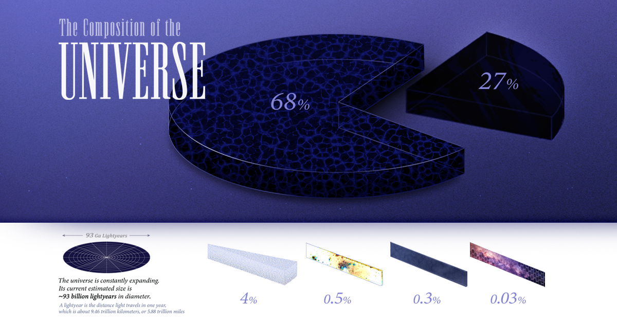
| Dark energy | 68% | ||||
| Dark matter | 27% | ||||
| Free hydrogen and helium | 4% | ||||
| Stars | 0.5% | ||||
| Neutrinos | 0.3% | ||||
| Heavy elements | 0.03% |
Let’s look at each component in more detail.
Dark Energy
Dark energy is the theoretical substance that counteracts gravity and causes the rapid expansion of the universe. It is the largest part of the universe’s composition, permeating every corner of the cosmos and dictating how it behaves and how it will eventually end.
Dark Matter
Dark matter, on the other hand, has a restrictive force that works closely alongside gravity. It is a sort of “cosmic cement” responsible for holding the universe together. Despite avoiding direct measurement and remaining a mystery, scientists believe it makes up the second largest component of the universe.
Free Hydrogen and Helium
Free hydrogen and helium are elements that are free-floating in space. Despite being the lightest and most abundant elements in the universe, they make up roughly 4% of its total composition.
Stars, Neutrinos, and Heavy Elements
All other hydrogen and helium particles that are not free-floating in space exist in stars.
Stars are one of the most populous things we can see when we look up at the night sky, but they make up less than one percent—roughly 0.5%—of the cosmos.
Neutrinos are subatomic particles that are similar to electrons, but they are nearly weightless and carry no electrical charge. Although they erupt out of every nuclear reaction, they account for roughly 0.3% of the universe.
Heavy elements are all other elements aside from hydrogen and helium.
Elements form in a process called nucleosynthesis, which takes places within stars throughout their lifetimes and during their explosive deaths. Almost everything we see in our material universe is made up of these heavy elements, yet they make up the smallest portion of the universe: a measly 0.03%.
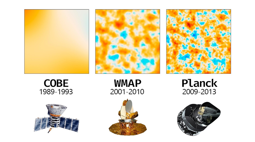
How Do We Measure the Universe?
In 2009, the European Space Agency (ESA) launched a space observatory called Planck to study the properties of the universe as a whole.
Its main task was to measure the afterglow of the explosive Big Bang that originated the universe 13.8 billion years ago. This afterglow is a special type of radiation called cosmic microwave background radiation (CMBR).
Temperature can tell scientists much about what exists in outer space. When investigating the “microwave sky”, researchers look for fluctuations (called anisotropy) in the temperature of CMBR. Instruments like Planck help reveal the extent of irregularities in CMBR’s temperature, and inform us of different components that make up the universe.
You can see below how the clarity of CMBR changes over time with multiple space missions and more sophisticated instrumentation.
What Else is Out There?
Scientists are still working to understand the properties that make up dark energy and dark matter.
NASA is currently planning a 2027 launch of the Nancy Grace Roman Space Telescope, an infrared telescope that will hopefully help us in measuring the effects of dark energy and dark matter for the first time.
As for what’s beyond the universe? Scientists aren’t sure.
There are hypotheses that there may be a larger “super universe” that contains us, or we may be a part of one “island” universe set apart from other island multiverses. Unfortunately we aren’t able to measure anything that far yet. Unravelling the mysteries of the deep cosmos, at least for now, remains a local endeavor.


Misc
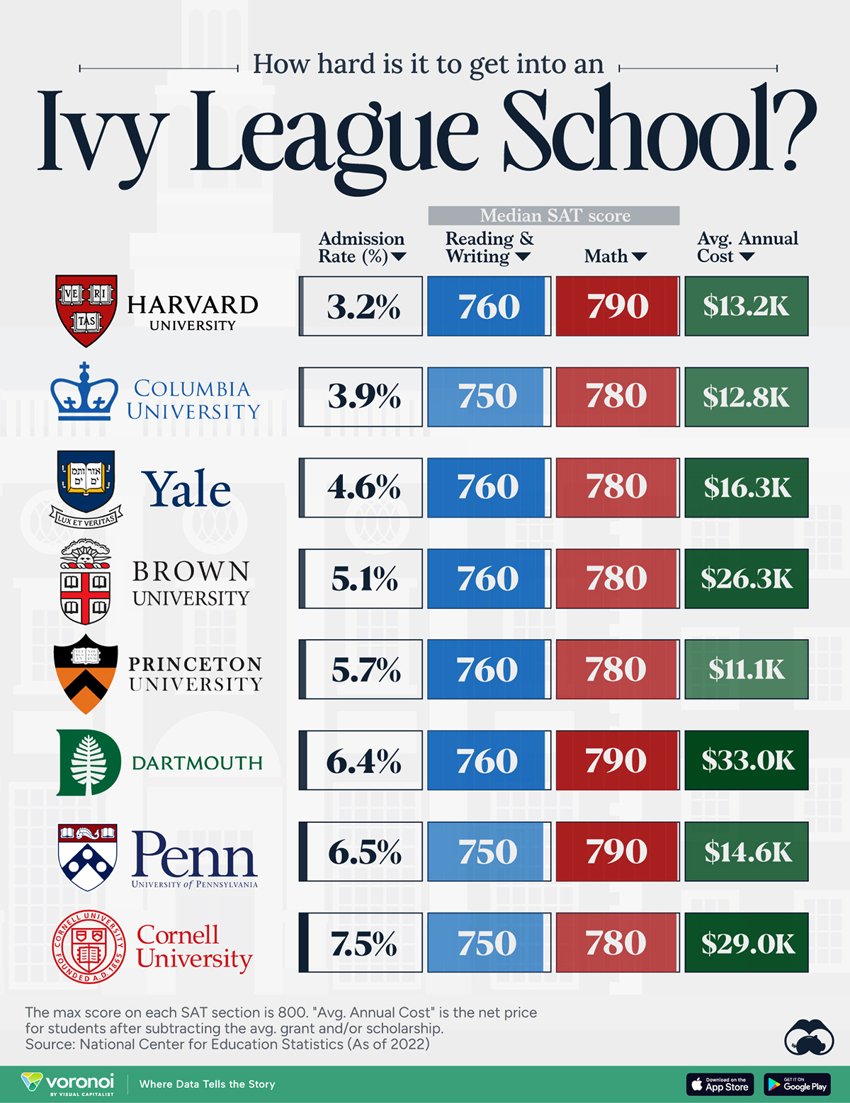
How Hard Is It to Get Into an Ivy League School?
We detail the admission rates and average annual cost for Ivy League schools, as well as the median SAT scores required to be accepted.
How Hard Is It to Get Into an Ivy League School?
This was originally posted on our Voronoi app. Download the app for free on iOS or Android and discover incredible data-driven charts from a variety of trusted sources.
Ivy League institutions are renowned worldwide for their academic excellence and long-standing traditions. But how hard is it to get into one of the top universities in the U.S.?
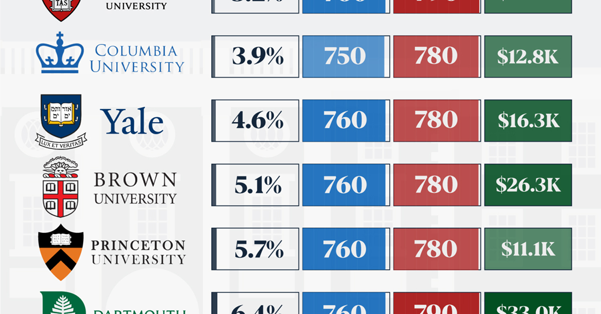
In this graphic, we detail the admission rates and average annual cost for Ivy League schools, as well as the median SAT scores required to be accepted. The data comes from the National Center for Education Statistics and was compiled by 24/7 Wall St.
Note that “average annual cost” represents the net price a student pays after subtracting the average value of grants and/or scholarships received.
Harvard is the Most Selective
The SAT is a standardized test commonly used for college admissions in the United States. It’s taken by high school juniors and seniors to assess their readiness for college-level academic work.
When comparing SAT scores, Harvard and Dartmouth are among the most challenging universities to gain admission to. The median SAT scores for their students are 760 for reading and writing and 790 for math. Still, Harvard has half the admission rate (3.2%) compared to Dartmouth (6.4%).
| School | Admission rate (%) | SAT Score: Reading & Writing | SAT Score: Math | Avg Annual Cost* |
|---|---|---|---|---|
| Harvard University | 3.2 | 760 | 790 | $13,259 |
| Columbia University | 3.9 | 750 | 780 | $12,836 |
| Yale University | 4.6 | 760 | 780 | $16,341 |
| Brown University | 5.1 | 760 | 780 | $26,308 |
| Princeton University | 5.7 | 760 | 780 | $11,080 |
| Dartmouth College | 6.4 | 760 | 790 | $33,023 |
| University of Pennsylvania | 6.5 | 750 | 790 | $14,851 |
| Cornell University | 7.5 | 750 | 780 | $29,011 |
*Costs after receiving federal financial aid.
Additionally, Dartmouth has the highest average annual cost at $33,000. Princeton has the lowest at $11,100.
While student debt has surged in the United States in recent years, hitting $1.73 trillion in 2023, the worth of obtaining a degree from any of the schools listed surpasses mere academics. This is evidenced by the substantial incomes earned by former students.
Harvard grads, for example, have the highest average starting salary in the country, at $91,700.

-

 Misc1 week ago
How Hard Is It to Get Into an Ivy League School?
-

 Technology2 weeks ago
Ranked: Semiconductor Companies by Industry Revenue Share
-

 Markets2 weeks ago
Ranked: The World’s Top Flight Routes, by Revenue
-

 Countries2 weeks ago
Population Projections: The World’s 6 Largest Countries in 2075
-

 Markets2 weeks ago
The Top 10 States by Real GDP Growth in 2023
-

 Demographics2 weeks ago
The Smallest Gender Wage Gaps in OECD Countries
-

 United States2 weeks ago
Where U.S. Inflation Hit the Hardest in March 2024
-

 Environment2 weeks ago
Top Countries By Forest Growth Since 2001