Energy
Which Companies Are Responsible For the Most Carbon Emissions?
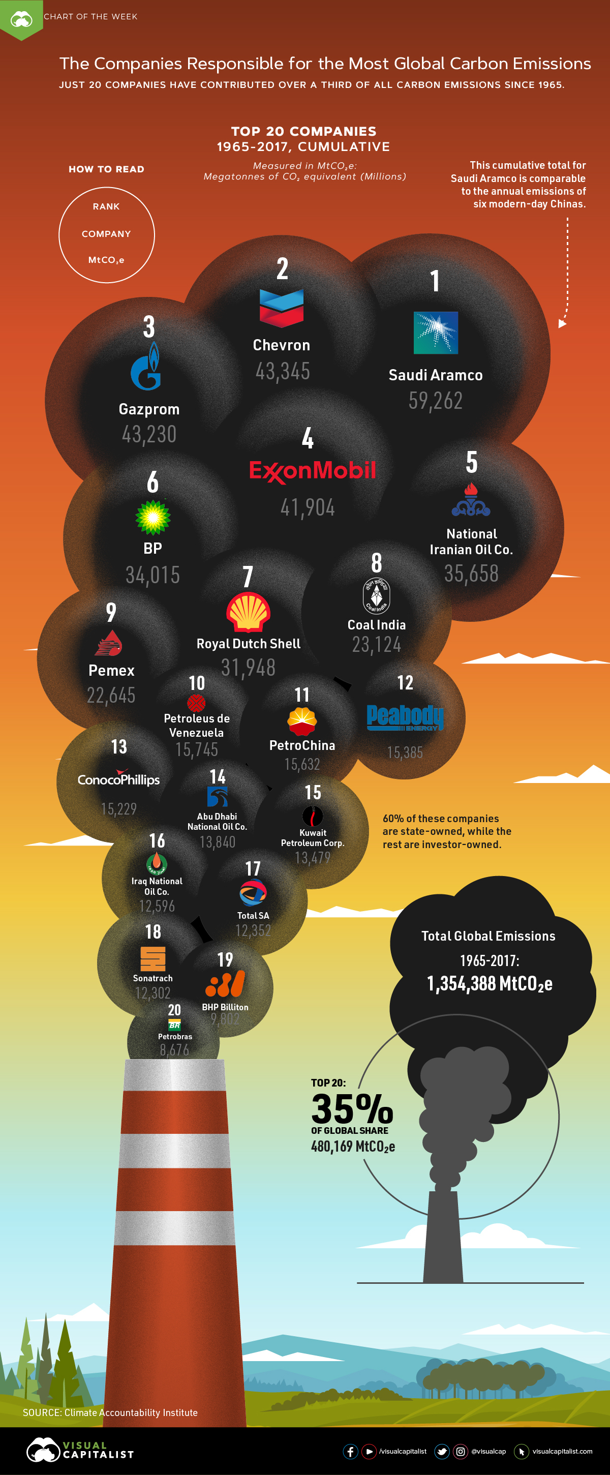
20 Companies Responsible For the Most Carbon Emissions?
Since 1965, it’s estimated over 1.35 trillion metric tons of greenhouse gases have been released into the atmosphere—and over a third can be traced back to just 20 companies.
This week’s chart draws on a dataset from the Climate Accountability Institute, and highlights the companies which have been responsible for the most carbon emissions in the past half-century.
Note: Carbon emissions are measured in MtCO₂e: Megatonnes of CO₂ equivalent (Millions).
The Sum of their Carbon Emissions
Between 1965-2017, the top 20 companies have contributed 480,169 MtCO₂e in total carbon emissions, or 35% of cumulative global emissions. This whopping amount is mostly from the combustion of their products—each company on this chart deals in fossil fuels.
The largest contributor? Saudi Aramco, the national petroleum and natural gas company of Saudi Arabia. Saudi Aramco actually comes in first on another list as well—it’s the most profitable company, making over $304 million daily.
However, this financial gain came at a significant cost: the state-owned giant’s operations have resulted in 59,262 MtCO₂e in carbon emissions since 1965. To put that into perspective, this total is more than six times China’s emissions in 2017 alone (9,838 MtCO₂e).
Explore the full list of companies by location, who owns them, and their total 1965–2017 emissions count below:
| Company | Country | Ownership | All Emissions, MtCO₂e |
|---|---|---|---|
| Saudi Aramco | 🇸🇦 Saudi Arabia | State-owned | 59,262 |
| Chevron | 🇺🇸 U.S. | Investor-owned | 43,345 |
| Gazprom | 🇷🇺 Russia | State-owned | 43,230 |
| Exxon Mobil | 🇺🇸 U.S. | Investor-owned | 41,904 |
| National Iranian Oil Co. | 🇮🇷 Iran | State-owned | 35,658 |
| BP | 🇬🇧 UK | Investor-owned | 34,015 |
| Royal Dutch Shell | 🇳🇱 Netherlands | Investor-owned | 31,948 |
| Coal India | 🇮🇳 India | State-owned | 23,124 |
| Pemex | 🇲🇽 Mexico | State-owned | 22,645 |
| Petroleus de Venezuela | 🇻🇪 Venezuela | State-owned | 15,745 |
| PetroChina | 🇨🇳 China | State-owned | 15,632 |
| Peabody Energy | 🇺🇸 U.S. | Investor-owned | 15,385 |
| ConocoPhillips | 🇺🇸 U.S. | Investor-owned | 15,229 |
| Abu Dhabi National Oil Co. | 🇦🇪 UAE | State-owned | 13,840 |
| Kuwait Petroleum Corp. | 🇰🇼 Kuwait | State-owned | 13,479 |
| Iraq National Oil Co. | 🇮🇶 Iraq | State-owned | 12,596 |
| Total SA | 🇫🇷 France | Investor-owned | 12,352 |
| Sonatrach | 🇩🇿 Algeria | State-owned | 12,302 |
| BHP Billiton | 🇦🇺 Australia | Investor-owned | 9,802 |
| Petrobras | 🇧🇷 Brazil | State-owned | 8,676 |
| Total Emissions | 480,169 MtCO₂e |
A Greener Business Model?
According to the researchers, all the companies that show up in today’s chart bear some responsibility for knowingly accelerating the climate crisis even after proven scientific evidence.
In fact, U.S.-based Exxon Mobil is currently on trial for misleading investors: the company downplayed the effect of climate change on its profitability, while internal calculations proved to be much larger. It also sowed public doubt on the immense impacts of rising greenhouse gas levels on the planet.
Growing sustainability and environmental concerns threaten the viability of old business models for these corporations, causing many to pivot away from the fossil fuel focus. Take BP for example—originally named British Petroleum, the company embraced “Beyond Petroleum” as its new rallying cry. More recently, it launched a carbon footprint calculator and is committed to keeping its carbon emissions flat into 2025.
The first step to reducing your emissions is to know where you stand. Find out your #carbonfootprint with our new calculator & share your pledge today!
— BP (@BP_plc) October 22, 2019
However, the Climate Accountability Institute argues that more can still be done, with the researchers calling for these companies to reduce their fossil fuel production in the near future.
Continued pressure on these “Big Oil” companies to peak their carbon emissions, and urgently increase their renewable energy investment, may help curb the climate crisis before it’s too late.
Correction: A previous version of this article mistakenly reported the total cumulative value of carbon emissions in millions instead of trillions. Both the article and graphic have been updated to reflect the changes accurately.


Energy
Mapped: The Age of Energy Projects in Interconnection Queues, by State
This map shows how many energy projects are in interconnection queues by state and how long these projects have been queued up, on average.
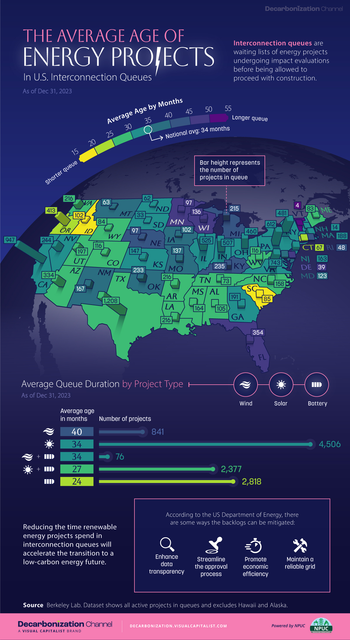
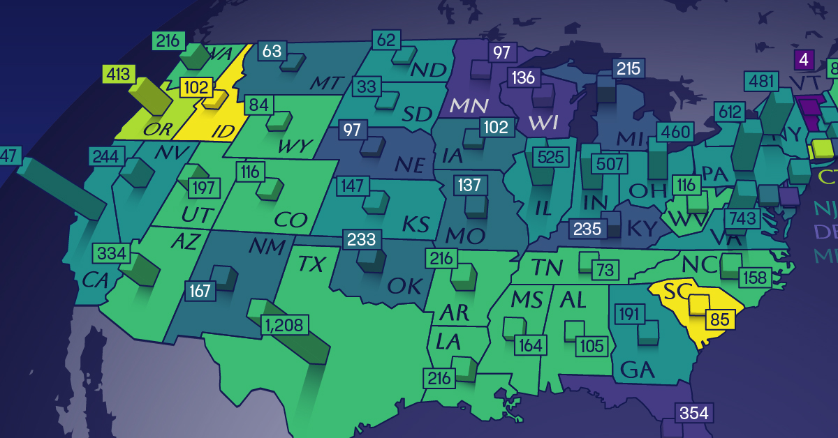
Age of Energy Projects in Interconnection Queues, by State
This was originally posted on our Voronoi app. Download the app for free on iOS or Android and discover incredible data-driven charts from a variety of trusted sources.
By the end of 2023, more than 11,000 energy projects were in interconnection queues in the United States, waiting for a green-light from regional grid operators to proceed with construction.
This map, created in partnership with the National Public Utilities Council, maps out the average age of active energy projects in interconnection queues by state, using data from Berkeley Lab.
Interconnection Queues, Explained
Interconnection queues are lists of energy projects that have made interconnection requests to their regional grid operators. Once submitted, these requests formally initiate the impact study process that each project goes through before grid connection, forming waiting lists for approval known as interconnection queues.
In recent years, both the number and generation capacity of queued projects have surged in the United States, along with the length of time spent in queue.
According to Berkeley Lab, the amount of generation capacity entering queues each year has risen by more than 550% from 2015 to 2023, with average queue duration rising from 3 years to 5 years the same period.
As a result of the growing backlog, a large proportion of projects ultimately withdraw from queues, leading to only 19% of applications reaching commercial operations.
The Backlog: Number of Projects and Average Wait Times
Of the 11,000 active projects in U.S. queues at the end of 2023, Texas, California, and Virginia had the most in queue; 1,208, 947, and 743, respectively.
When looking at the average ages of these projects, all three states hovered around the national average of 34 months (2.83 years), with Texas sporting 28 months, California 33, and Virginia 34.
Vermont, Minnesota, Wisconsin, and Florida, on the other hand, had the highest average queue durations; 54, 49, 47, and 46 months, respectively.
Average Queue Duration by Project Type
At the end of 2023, more than 95% of the generation capacity in active interconnection queues was for emission-free resources. The table below provides a breakdown.
| Project Type | Average Queue Duration (As of 12/31/2023) | Number of Projects in Queue |
|---|---|---|
| Wind | 40 months | 841 |
| Solar | 34 months | 4,506 |
| Wind+Battery | 34 months | 76 |
| Solar+Battery | 27 months | 2,377 |
| Battery | 24 months | 2,818 |
Wind projects had the highest wait times at the end of 2023 with an average age of 40 months (3.33 years). Solar projects, on the other hand, made up more than 40% of projects in queue.
Overall, reducing the time that these renewable energy projects spend in queues can accelerate the transition to a low-carbon energy future.
According to the U.S. Department of Energy, enhancing data transparency, streamlining approval processes, promoting economic efficiency, and maintaining a reliable grid are some of the ways this growing backlog can be mitigated.

-

 Technology6 days ago
All of the Grants Given by the U.S. CHIPS Act
-

 Uranium2 weeks ago
The World’s Biggest Nuclear Energy Producers
-

 Education2 weeks ago
How Hard Is It to Get Into an Ivy League School?
-

 Debt2 weeks ago
How Debt-to-GDP Ratios Have Changed Since 2000
-

 Sports2 weeks ago
The Highest Earning Athletes in Seven Professional Sports
-

 Science2 weeks ago
Visualizing the Average Lifespans of Mammals
-

 Brands1 week ago
How Tech Logos Have Evolved Over Time
-

 Energy1 week ago
Ranked: The Top 10 EV Battery Manufacturers in 2023