Energy
Commodities: The Top Asset Class of 2018 So Far
Commodities: The Top Asset Class of 2018 So Far
Is the commodity supercycle coming back from the dead?
For now, such a claim could perhaps be considered both bold and premature – but there does seem to be some compelling evidence that is mounting to back it up.
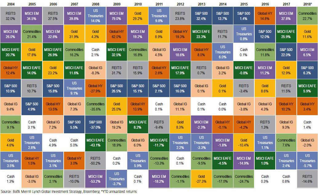
The Asset Quilt
According to the most recent “Asset Quilt of Total Returns” put together by Bank of America Merrill Lynch, commodities are the top returning asset class of 2018 so far. The chart, which shows the total returns of asset classes over the years, has commodities at an annualized return of 22.7% year-to-date.
Right behind it is gold, which sits at 11.6% on an annualized basis:
| Rank | Asset Class | Total Returns (2018*) |
|---|---|---|
| #1 | Commodities | 22.7% |
| #2 | Gold | 11.6% |
| #3 | Equities (Emerging Markets) | 6.5% |
| #4 | Equities (S&P 500) | 6.3% |
| #5 | Equities (Europe, Australasia, Far East) | 5.9% |
| #6 | Global Bonds (High Yield) | 3.4% |
| #7 | Cash | 1.4% |
| #8 | Global Bonds (Investment Grade) | -2.0% |
| #9 | U.S. Treasuries | -5.7% |
| #10 | Real Estate | -14.6% |
*These returns are annualized in order to compare them with past years
Interestingly, commodities haven’t been on top of BAML’s chart since the years 2000 and 2002, which were at the beginning of the last commodity supercycle.
A Deeper Dive
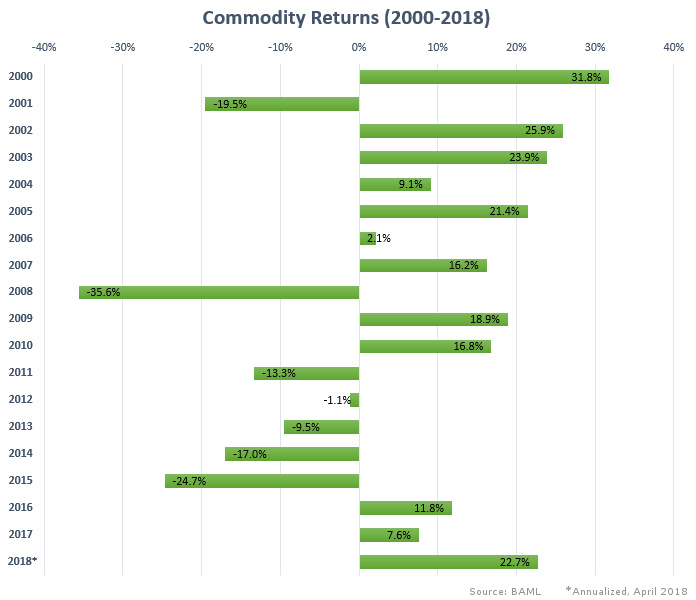
Here is how commodities have fared from 2000 to 2018, based on annual returns. If the commodity sector keeps the pace for the rest of 2018, this will be the best year for the asset class since 2003.
For various reasons, commodities have bounced back in the last three years.
The return of oil prices have helped to resurrect the sector. Ironically, the anticipated metal demand from renewable energy – which will be used to wean society off of fossil fuel consumption – is also a massive driver behind commodities right now.
Not only are base metals like copper, aluminum, and nickel essential for the “electrification of everything”, but lesser-known materials like lithium, cobalt, rare earths, vanadium, uranium, and graphite all play essential roles as well. They do everything from enabling lithium-ion batteries and vanadium flow batteries, to making possible the permanent magnets that generate electricity from wind turbines.
The environment for investing in commodities is the best since 2004-2008.
– Goldman Sachs, February 2018
Not surprisingly, here are how metal and energy commodities have performed since January 1, 2016:
| Commodity | Price Change (Since Jan 1, 2016) |
|---|---|
| Vanadium | 459% |
| Cobalt | 277% |
| Palladium | 88% |
| Oil (WTI) | 86% |
| Nickel | 72% |
| Aluminum | 70% |
| Copper | 46% |
| Gold | 26% |
| Silver | 24% |
| Natural Gas | 21% |
| Platinum | 7% |
| Coal | -8% |
| Uranium | -40% |
Some minor metals, like vanadium, have increased by over 400% in price in the last two years. That begs the question: how much room could there possibly be for price appreciation left?
Supercycle Potential
As Frank Holmes of U.S. Global Investors described in a recent post, the last boom was so prolific that investing in an index tracking commodities (such as the S&P GSCI) in 2000 would have resulted in the equivalent of 10% annual returns for ten years.
He also shared this chart, which shows the ratio in value between commodities and the S&P 500:
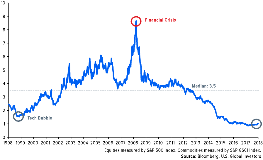
In other words, commodities seem to be more undervalued than any time in the past 20 years, at least relative to equity indices such as the S&P 500.
Even if the above ratio comes back up to the median of 3.5, it’s clear that there could still be vast amounts of opportunity available in the sector for investors.


Energy
Charted: 4 Reasons Why Lithium Could Be the Next Gold Rush
Visual Capitalist has partnered with EnergyX to show why drops in prices and growing demand may make now the right time to invest in lithium.
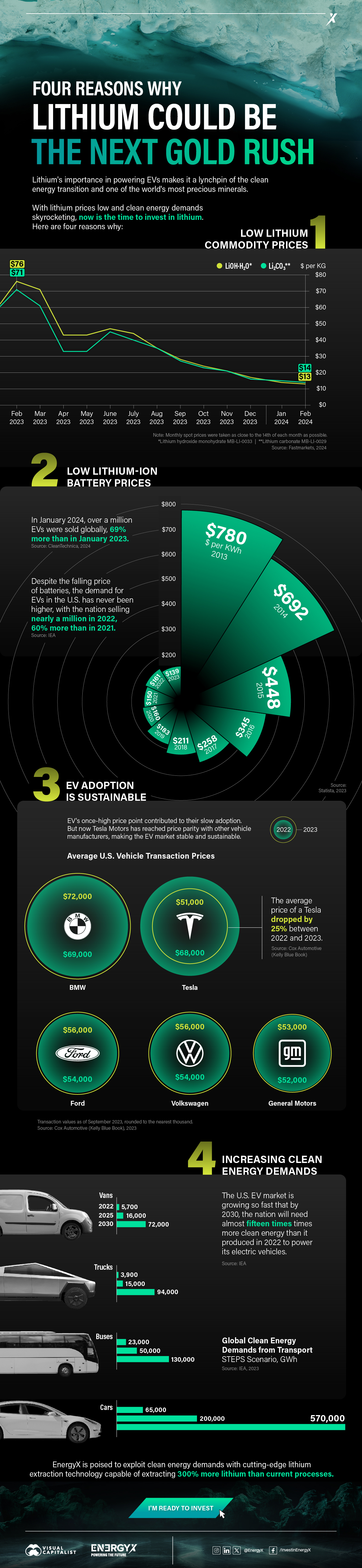
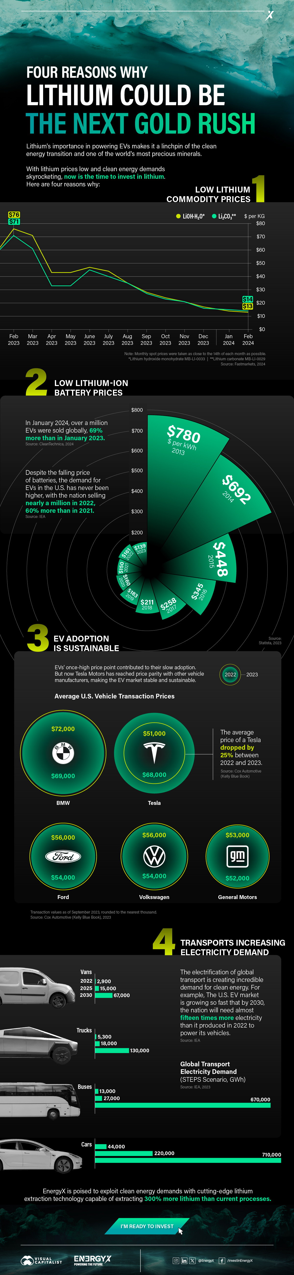
4 Reasons Why You Should Invest in Lithium
Lithium’s importance in powering EVs makes it a linchpin of the clean energy transition and one of the world’s most precious minerals.
In this graphic, Visual Capitalist partnered with EnergyX to explore why now may be the time to invest in lithium.
1. Lithium Prices Have Dropped
One of the most critical aspects of evaluating an investment is ensuring that the asset’s value is higher than its price would indicate. Lithium is integral to powering EVs, and, prices have fallen fast over the last year:
| Date | LiOH·H₂O* | Li₂CO₃** |
|---|---|---|
| Feb 2023 | $76 | $71 |
| March 2023 | $71 | $61 |
| Apr 2023 | $43 | $33 |
| May 2023 | $43 | $33 |
| June 2023 | $47 | $45 |
| July 2023 | $44 | $40 |
| Aug 2023 | $35 | $35 |
| Sept 2023 | $28 | $27 |
| Oct 2023 | $24 | $23 |
| Nov 2023 | $21 | $21 |
| Dec 2023 | $17 | $16 |
| Jan 2024 | $14 | $15 |
| Feb 2024 | $13 | $14 |
Note: Monthly spot prices were taken as close to the 14th of each month as possible.
*Lithium hydroxide monohydrate MB-LI-0033
**Lithium carbonate MB-LI-0029
2. Lithium-Ion Battery Prices Are Also Falling
The drop in lithium prices is just one reason to invest in the metal. Increasing economies of scale, coupled with low commodity prices, have caused the cost of lithium-ion batteries to drop significantly as well.
In fact, BNEF reports that between 2013 and 2023, the price of a Li-ion battery dropped by 82%.
| Year | Price per KWh |
|---|---|
| 2023 | $139 |
| 2022 | $161 |
| 2021 | $150 |
| 2020 | $160 |
| 2019 | $183 |
| 2018 | $211 |
| 2017 | $258 |
| 2016 | $345 |
| 2015 | $448 |
| 2014 | $692 |
| 2013 | $780 |

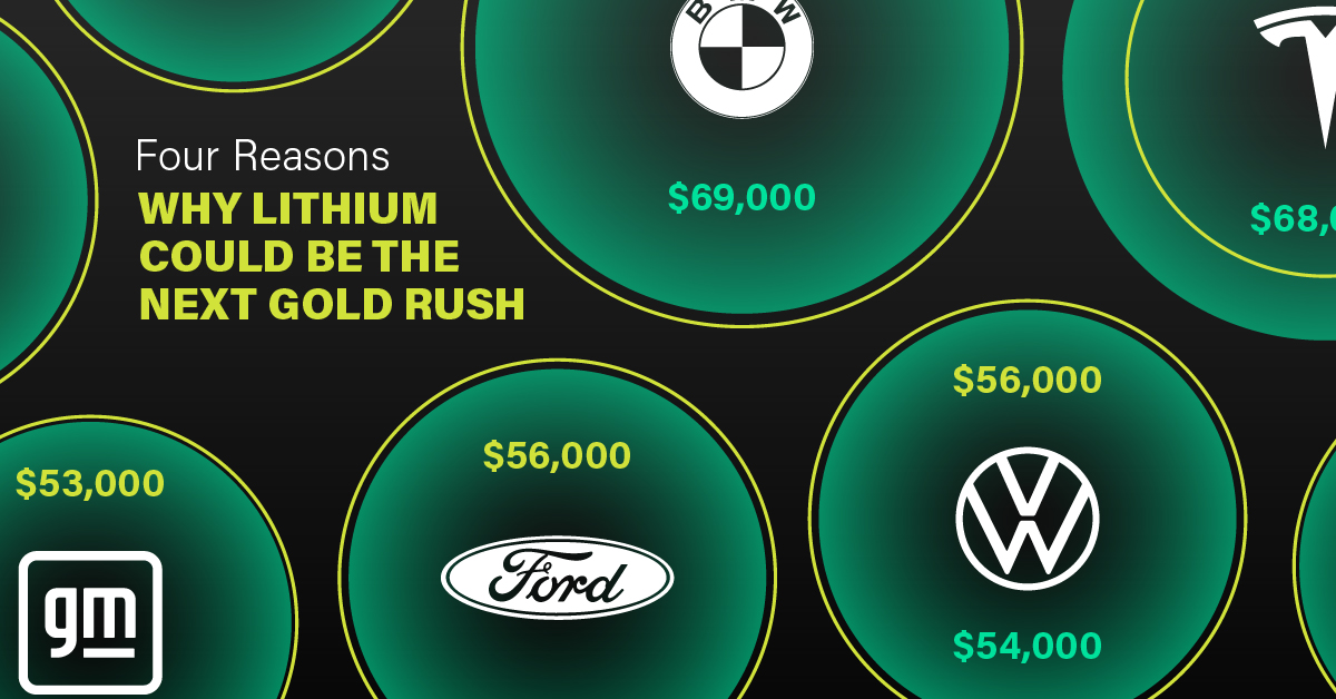
3. EV Adoption is Sustainable
One of the best reasons to invest in lithium is that EVs, one of the main drivers behind the demand for lithium, have reached a price point similar to that of traditional vehicle.
According to the Kelly Blue Book, Tesla’s average transaction price dropped by 25% between 2022 and 2023, bringing it in line with many other major manufacturers and showing that EVs are a realistic transport option from a consumer price perspective.
| Manufacturer | September 2022 | September 2023 |
|---|---|---|
| BMW | $69,000 | $72,000 |
| Ford | $54,000 | $56,000 |
| Volkswagon | $54,000 | $56,000 |
| General Motors | $52,000 | $53,000 |
| Tesla | $68,000 | $51,000 |
4. Electricity Demand in Transport is Growing
As EVs become an accessible transport option, there’s an investment opportunity in lithium. But possibly the best reason to invest in lithium is that the IEA reports global demand for the electricity in transport could grow dramatically by 2030:
| Transport Type | 2022 | 2025 | 2030 |
|---|---|---|---|
| Buses 🚌 | 23,000 GWh | 50,000 GWh | 130,000 GWh |
| Cars 🚙 | 65,000 GWh | 200,000 GWh | 570,000 GWh |
| Trucks 🛻 | 4,000 GWh | 15,000 GWh | 94,000 GWh |
| Vans 🚐 | 6,000 GWh | 16,000 GWh | 72,000 GWh |
The Lithium Investment Opportunity
Lithium presents a potentially classic investment opportunity. Lithium and battery prices have dropped significantly, and recently, EVs have reached a price point similar to other vehicles. By 2030, the demand for clean energy, especially in transport, will grow dramatically.
With prices dropping and demand skyrocketing, now is the time to invest in lithium.
EnergyX is poised to exploit lithium demand with cutting-edge lithium extraction technology capable of extracting 300% more lithium than current processes.

-

 Lithium6 days ago
Ranked: The Top 10 EV Battery Manufacturers in 2023
Asia dominates this ranking of the world’s largest EV battery manufacturers in 2023.
-

 Energy2 weeks ago
The World’s Biggest Nuclear Energy Producers
China has grown its nuclear capacity over the last decade, now ranking second on the list of top nuclear energy producers.
-

 Energy1 month ago
The World’s Biggest Oil Producers in 2023
Just three countries accounted for 40% of global oil production last year.
-
 Energy1 month ago
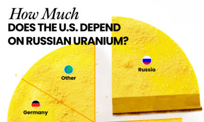
How Much Does the U.S. Depend on Russian Uranium?
Currently, Russia is the largest foreign supplier of nuclear power fuel to the U.S.
-
 Uranium2 months ago
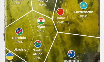
Charted: Global Uranium Reserves, by Country
We visualize the distribution of the world’s uranium reserves by country, with 3 countries accounting for more than half of total reserves.
-
 Energy3 months ago
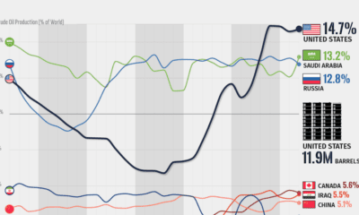
Visualizing the Rise of the U.S. as Top Crude Oil Producer
Over the last decade, the United States has established itself as the world’s top producer of crude oil, surpassing Saudi Arabia and Russia.

-

 Brands6 days ago
How Tech Logos Have Evolved Over Time
-

 Economy2 weeks ago
Where U.S. Inflation Hit the Hardest in March 2024
-

 Green2 weeks ago
Top Countries By Forest Growth Since 2001
-

 United States2 weeks ago
Ranked: The Largest U.S. Corporations by Number of Employees
-

 Maps2 weeks ago
The Largest Earthquakes in the New York Area (1970-2024)
-

 Green2 weeks ago
Ranked: The Countries With the Most Air Pollution in 2023
-

 Green2 weeks ago
Ranking the Top 15 Countries by Carbon Tax Revenue
-

 Markets2 weeks ago
U.S. Debt Interest Payments Reach $1 Trillion