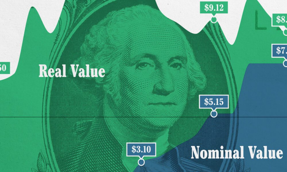
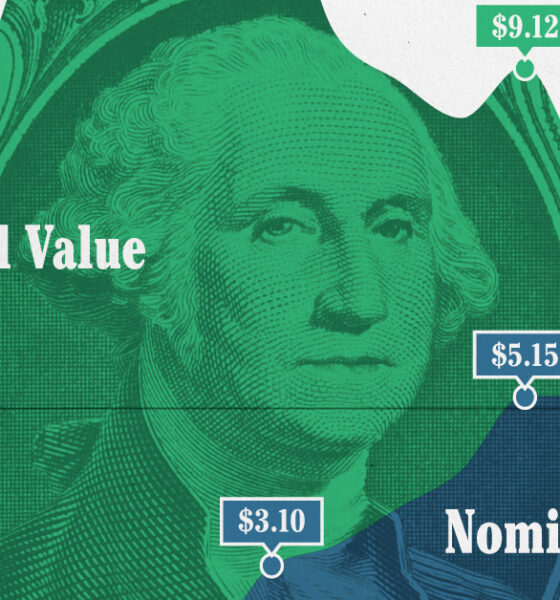
This graphic compares the nominal vs. inflation-adjusted value of the U.S. minimum wage, from 1940 to 2023.
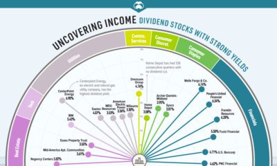

Some companies are cutting or suspending dividends. Which dividend stocks can investors consider for stable distributions and strong yields?
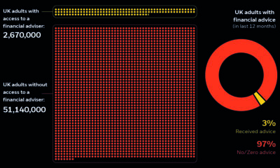

The UK has a financial adviser gap, leaving about 51 million adults without advice. Learn how wealthtech makes investing accessible for everyone.
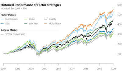

Factor investing has demonstrated its potential to outperform the general market for years. In this infographic, learn how to apply it in your portfolio.
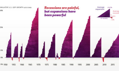

The economic cycle is a series of peaks and valleys. Analyzing economic data going back to 1950 helps put recessions into perspective.
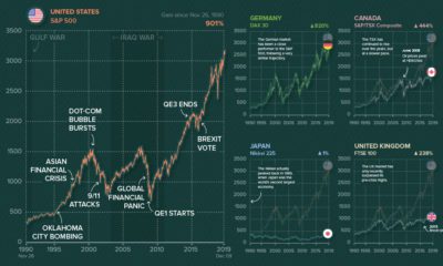

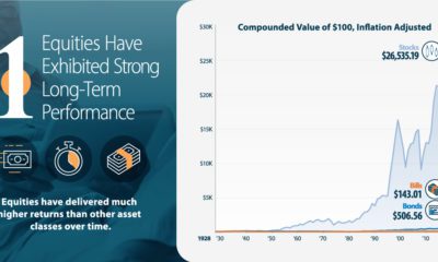
Ever wonder what other major stock markets would look like, if they were on the same scale of the S&P 500? We chart them all over...
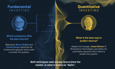

The world is awash in data that can offer valuable investment insights. Quantamental investing blends two investment approaches to tackle a complex world.


See how consumer credit has evolved through the ages — from its ancient origins, to the use of game-changing technologies like artificial intelligence.


This video highlights the basics of the stock market, how they work, and also the history of how the first markets got started.
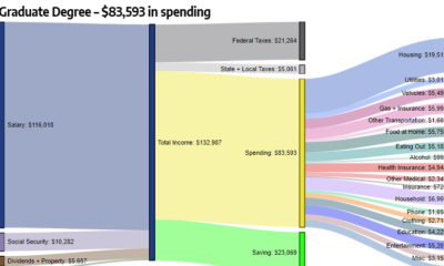

How do different types of education (high school, bachelor's degree, etc.) correspond to level of income and household expenditures?

With life expectancies increasing, will you outlive your savings? Learn how allocating more of your portfolio to equities may reduce longevity risk.


