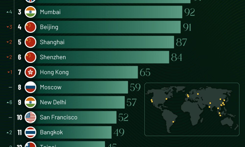
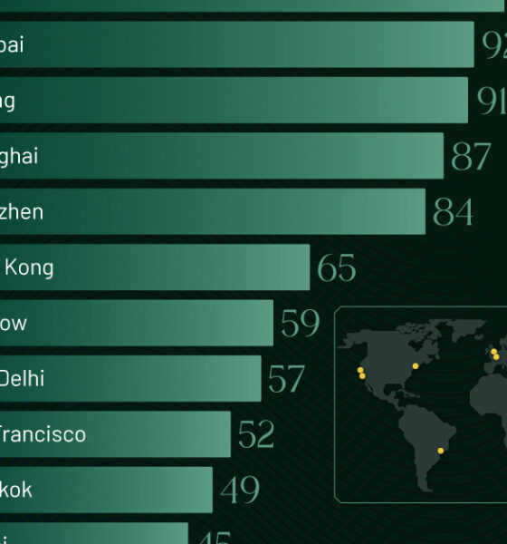
Just two countries account for half of the top 20 cities with the most billionaires. And the majority of the...
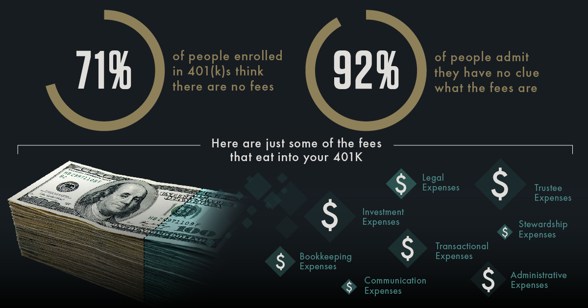
For most workers, a 401(k) plan is the most important tool for retirement saving - yet, 92% of Americans don't know about the massive fees they...
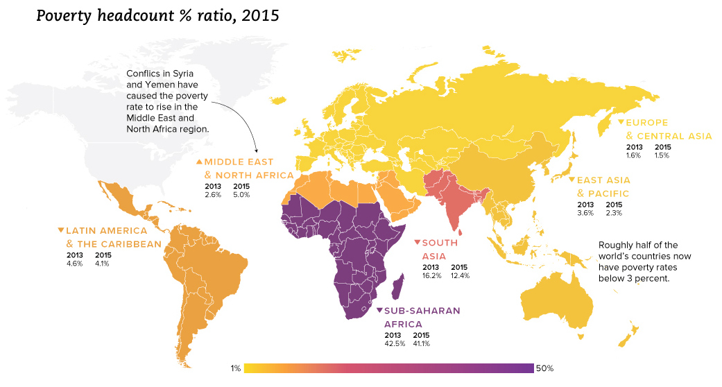
We look at the latest data from the World Bank, which reveals a drop in extreme poverty of 1 billion people globally since the year 1990.
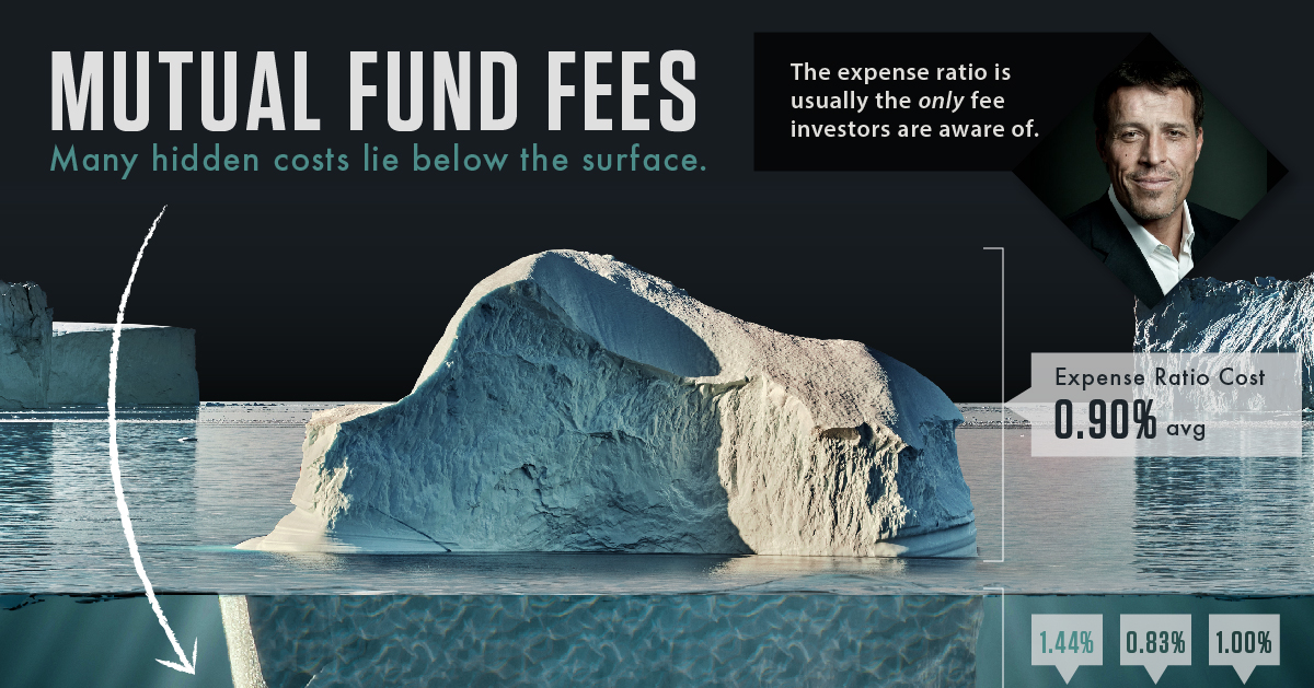
Fees are a silent killer that slowly erodes the value of a portfolio. Instead, it lines the pockets of brokers, fund managers, and big name Wall...
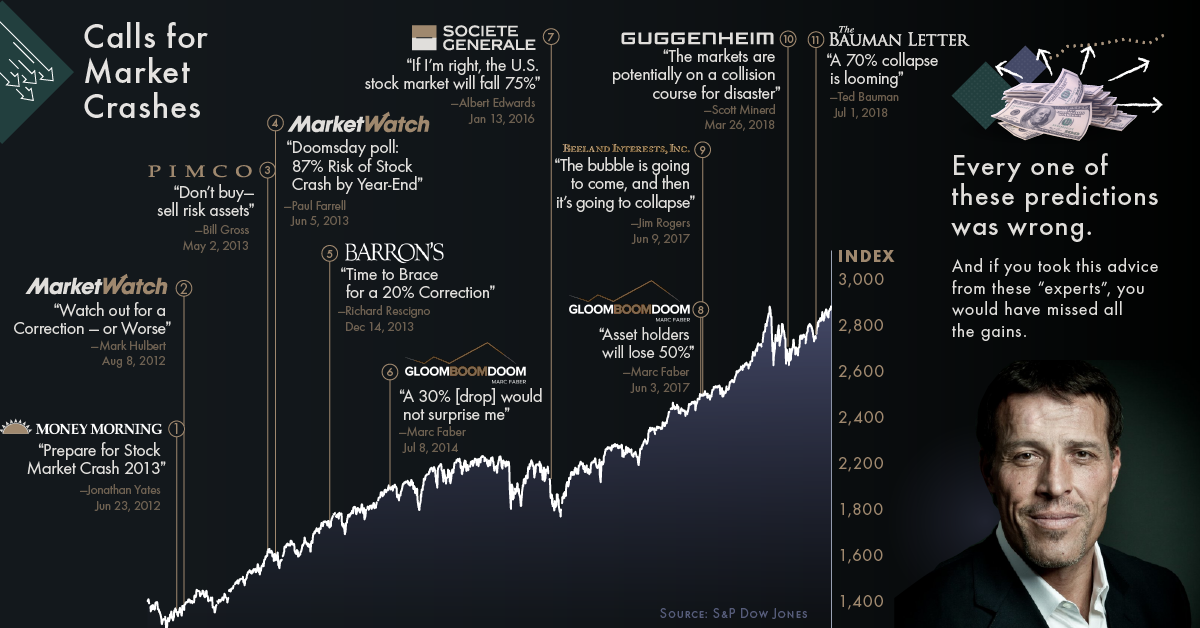
These key insights from the world’s top investors – like Ray Dalio and John Bogle – will free you from your fear of stock market crashes.
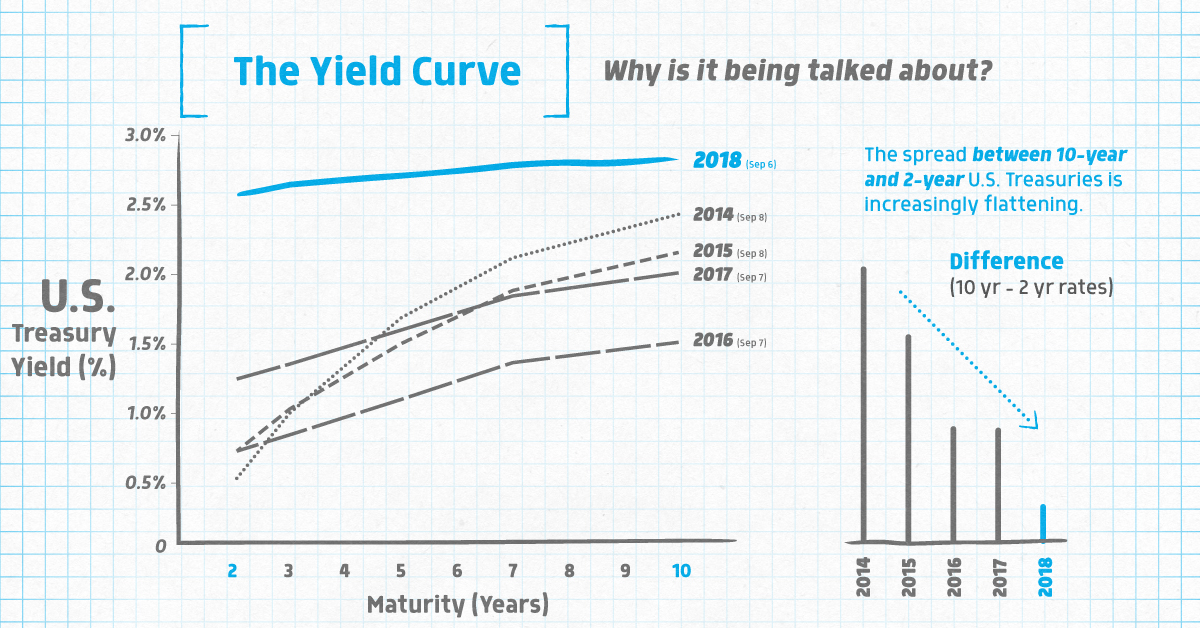
The financial world is abuzz about something called the yield curve - this infographic explains what it is, and why an inversion matters to markets.
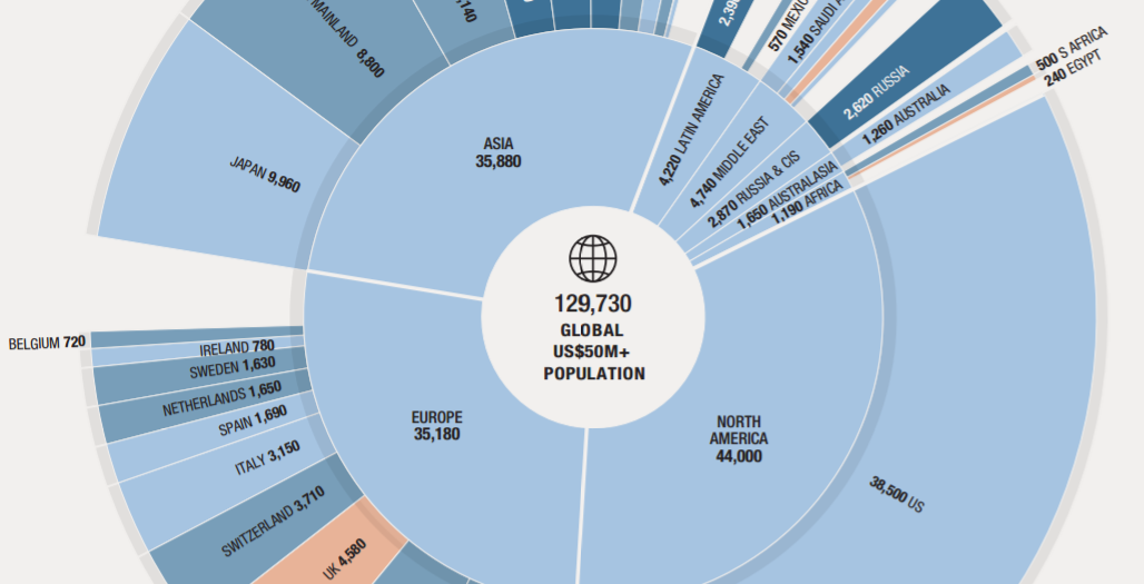
This nifty visualization from Knight Frank breaks down the world's population of ultra-wealthy ($50mm+) people by country and region.
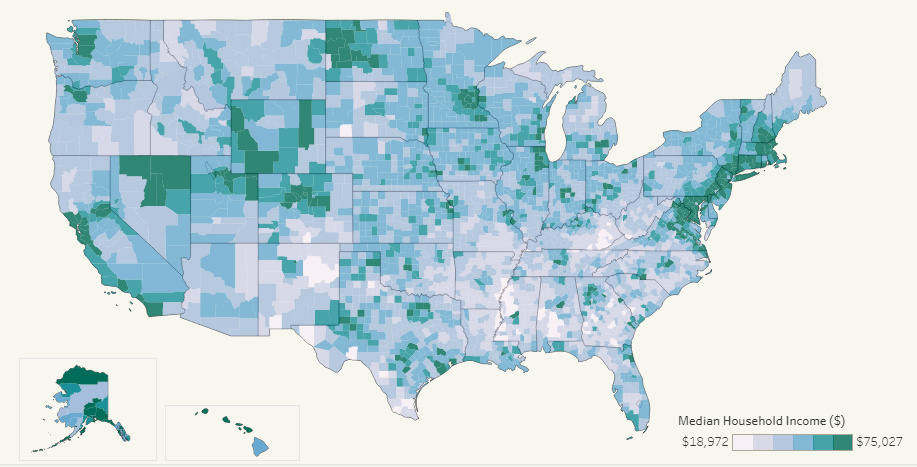
This interactive map allows you to pull data on median household income for all 3,000+ U.S. counties in existence, allowing for some interesting insights.
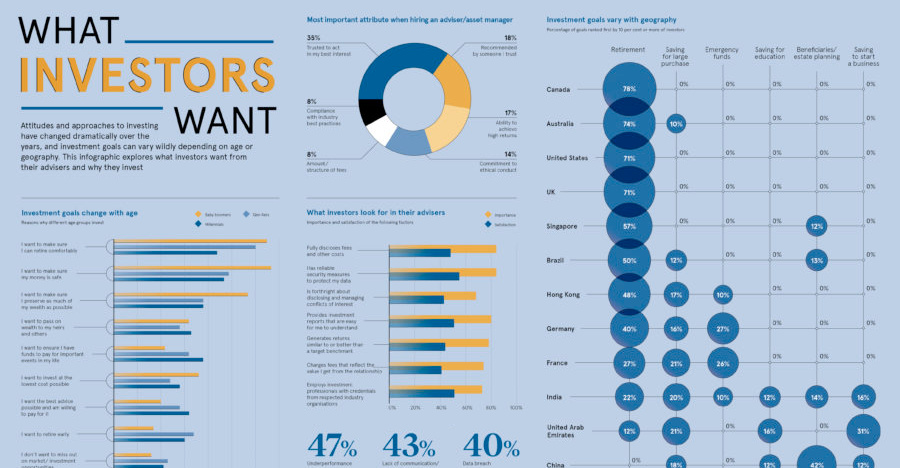
Are all investors saving for retirement, or do they have other investment goals in mind? Here's a look at goals sorted by geography and generation.
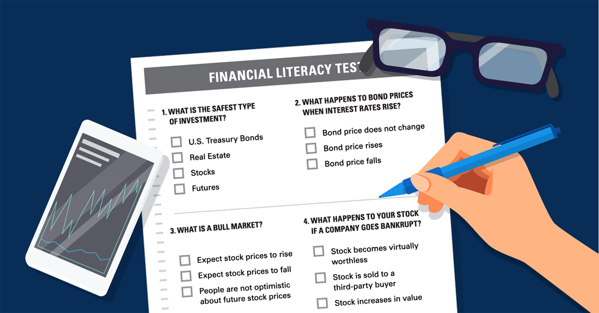
See how financially literate you are by answering this very short quiz. Can you get more than two questions right? (If so, you beat the average...
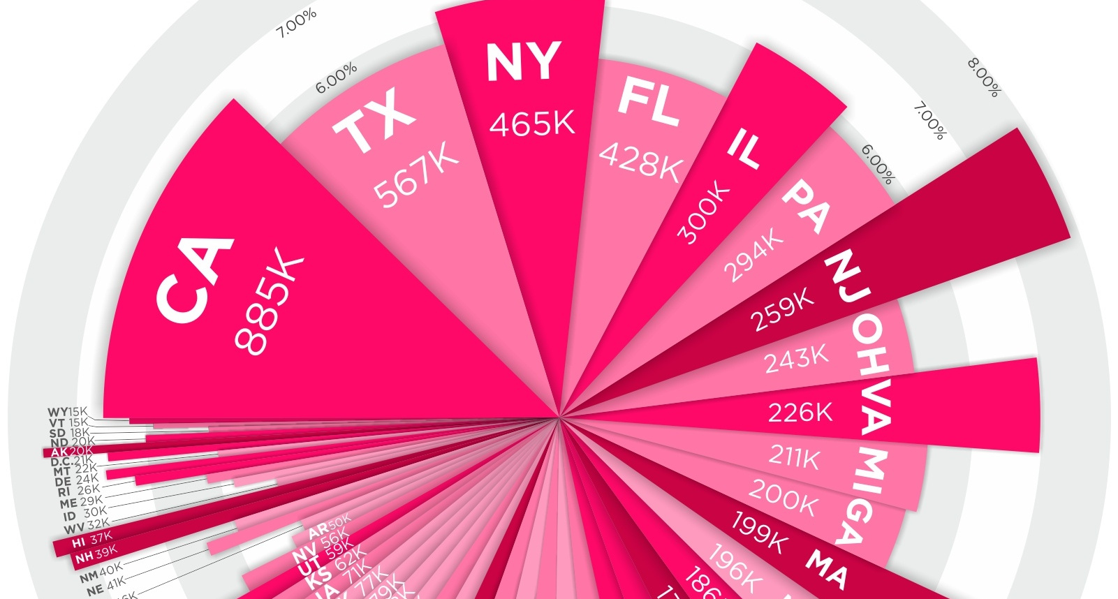
Where do millionaires live in the country? See millionaires by state - in terms of absolute numbers and percentage concentration - in this compelling visual.


