Personal Finance
World’s Ultra-Wealthy Population, in One Chart
The World’s Ultra-Wealthy Population, in One Chart
Reaching the status of “millionaire” used to be a big deal.
But with rising inflation, a higher cost of living in cities, and changing perceptions around wealth, the six zero milestone doesn’t mean as much anymore.
Heck, there are over 16 million millionaires globally, and 4.3 million in the United States alone. Therefore, to really get a sense of the makeup of the world’s ultra-wealthy population, we need a more exclusive and finely-tuned indicator.
The $50 million Benchmark
Today’s infographic comes to us from the Knight Frank Wealth Report 2018, which you should absolutely check out if global wealth is a topic of interest to you.
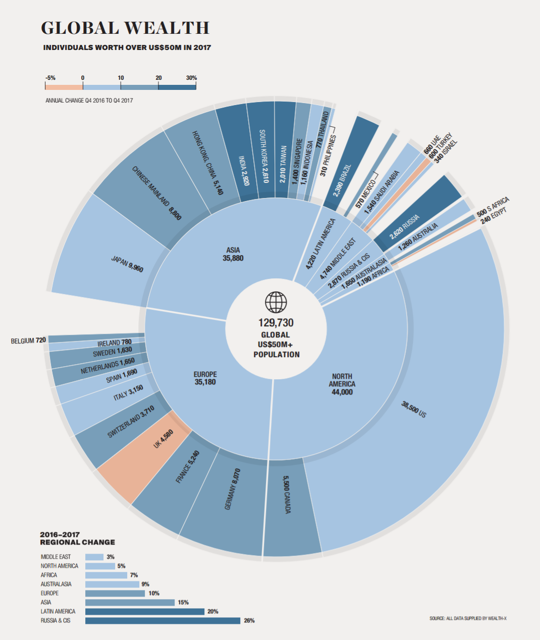
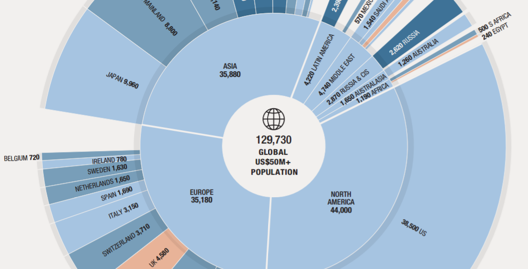
The visualization breaks down the world’s 129,730 people that have fortunes of US$50 million and above. It’s a much narrower measure, representing just the upper echelon (top 1%) of the world’s millionaire population.
The graphic sorts these ultra-wealthy people by country and region, but also breaks down the change in population between 2016 (Q4) and 2017 (Q4).
The Ultra-Wealthy by Region
Here’s the $50 million and above population sorted by region:
| Rank | Region | Ultra-wealthy pop (>$50mm) | 1-yr growth rate |
|---|---|---|---|
| #1 | North America | 44,000 | +5% |
| #2 | Asia | 35,880 | +15% |
| #3 | Europe | 35,180 | +10% |
| #4 | Middle East | 4,740 | +3% |
| #5 | Latin America | 4,220 | +20% |
| #6 | Russia & CIS | 2,870 | +26% |
| #7 | Australasia | 1,650 | +9% |
| #8 | Africa | 1,190 | +7% |
| Total | 129,730 |
North America still reigns supreme, but Asia is fast catching up and has already surpassed Europe in this measure of wealth. It’s worth noting that in the one-year span between 2016 (Q4) and 2017 (Q4), the ultra-wealthy population for Asia grew a solid 15%.
It’s also surprising to see that Latin America and Russia & CIS are experiencing such high rates of growth in their >$50 million populations, as well.
Top 10 Ultra-Wealthy Countries
By absolute population, here are the top 10 countries for the ultra-wealthy, based on the above data:
| Rank | Country | Ultra-wealthy pop (>$50mm) | % of global total |
|---|---|---|---|
| #1 | United States | 38,500 | 29.7% |
| #2 | Japan | 9,960 | 7.7% |
| #3 | Mainland China | 8,800 | 6.8% |
| #4 | Germany | 8,070 | 6.2% |
| #5 | Canada | 5,500 | 4.2% |
| #6 | France | 5,240 | 4.0% |
| #7 | Hong Kong, China | 5,140 | 4.0% |
| #8 | United Kingdom | 4,580 | 3.5% |
| #9 | Switzerland | 3,710 | 2.9% |
| #10 | Italy | 3,150 | 2.4% |
The U.S. holds about 30% of the world’s ultra-wealthy population, while China adds up to nearly 11% when including both Mainland China and Hong Kong in the calculations.
Switzerland (8.4 million people) punches above its weight class, hitting the #9 spot globally, while Canada takes the #5 spot despite having fewer people (36 million) than the majority of the countries on the list.


Money
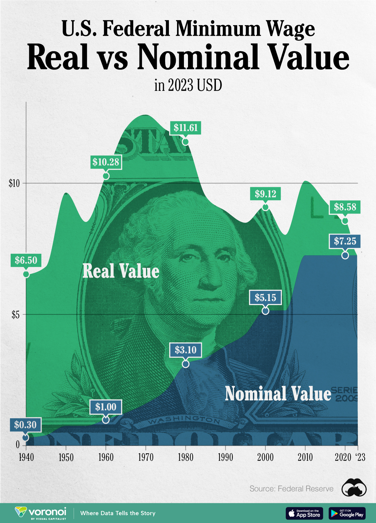
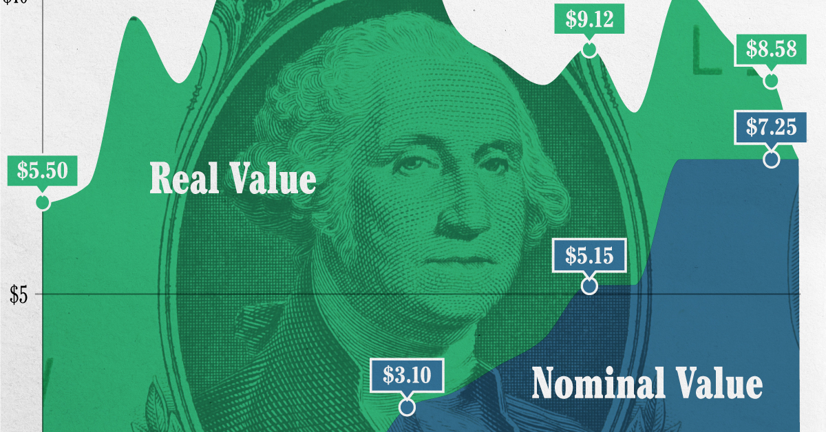
Chart: The Declining Value of the U.S. Federal Minimum Wage
This graphic compares the nominal vs. inflation-adjusted value of the U.S. minimum wage, from 1940 to 2023.
The Declining Value of the U.S. Federal Minimum Wage
This was originally posted on our Voronoi app. Download the app for free on iOS or Android and discover incredible data-driven charts from a variety of trusted sources.
This graphic illustrates the history of the U.S. federal minimum wage using data compiled by Statista, in both nominal and real (inflation-adjusted) terms. The federal minimum wage was raised to $7.25 per hour in July 2009, where it has remained ever since.
Nominal vs. Real Value
The data we used to create this graphic can be found in the table below.
| Year | Nominal value ($/hour) | Real value ($/hour) |
|---|---|---|
| 1940 | 0.3 | 6.5 |
| 1945 | 0.4 | 6.82 |
| 1950 | 0.75 | 9.64 |
| 1955 | 0.75 | 8.52 |
| 1960 | 1 | 10.28 |
| 1965 | 1.25 | 12.08 |
| 1970 | 1.6 | 12.61 |
| 1975 | 2.1 | 12.04 |
| 1980 | 3.1 | 11.61 |
| 1985 | 3.35 | 9.51 |
| 1990 | 3.8 | 8.94 |
| 1995 | 4.25 | 8.49 |
| 2000 | 5.15 | 9.12 |
| 2005 | 5.15 | 8.03 |
| 2010 | 7.25 | 10.09 |
| 2015 | 7.25 | 9.3 |
| 2018 | 7.25 | 8.78 |
| 2019 | 7.25 | 8.61 |
| 2020 | 7.25 | 8.58 |
| 2021 | 7.25 | 8.24 |
| 2022 | 7.25 | 7.61 |
| 2023 | 7.25 | 7.25 |
What our graphic shows is how inflation has eroded the real value of the U.S. minimum wage over time, despite nominal increases.
For instance, consider the year 1960, when the federal minimum wage was $1 per hour. After accounting for inflation, this would be worth around $10.28 today!
The two lines converge at 2023 because the nominal and real value are identical in present day terms.
Many States Have Their Own Minimum Wage
According to the National Conference of State Legislatures (NCSL), 30 states and Washington, D.C. have implemented a minimum wage that is higher than $7.25.
The following states have adopted the federal minimum: Georgia, Idaho, Indiana, Iowa, Kansas, Kentucky, New Hampshire, North Carolina, North Dakota, Oklahoma, Pennsylvania, Texas, Utah, Wisconsin, and Wyoming.
Meanwhile, the states of Alabama, Louisiana, Mississippi, South Carolina, and Tennessee have no wage minimums, but have to follow the federal minimum.
How Does the U.S. Minimum Wage Rank Globally?
If you found this topic interesting, check out Mapped: Minimum Wage Around the World to see which countries have the highest minimum wage in monthly terms, as of January 2023.

-

 Energy1 week ago
The World’s Biggest Nuclear Energy Producers
-

 Money2 weeks ago
Which States Have the Highest Minimum Wage in America?
-

 Technology2 weeks ago
Ranked: Semiconductor Companies by Industry Revenue Share
-

 Markets2 weeks ago
Ranked: The World’s Top Flight Routes, by Revenue
-

 Countries2 weeks ago
Population Projections: The World’s 6 Largest Countries in 2075
-

 Markets2 weeks ago
The Top 10 States by Real GDP Growth in 2023
-

 Demographics2 weeks ago
The Smallest Gender Wage Gaps in OECD Countries
-

 United States2 weeks ago
Where U.S. Inflation Hit the Hardest in March 2024