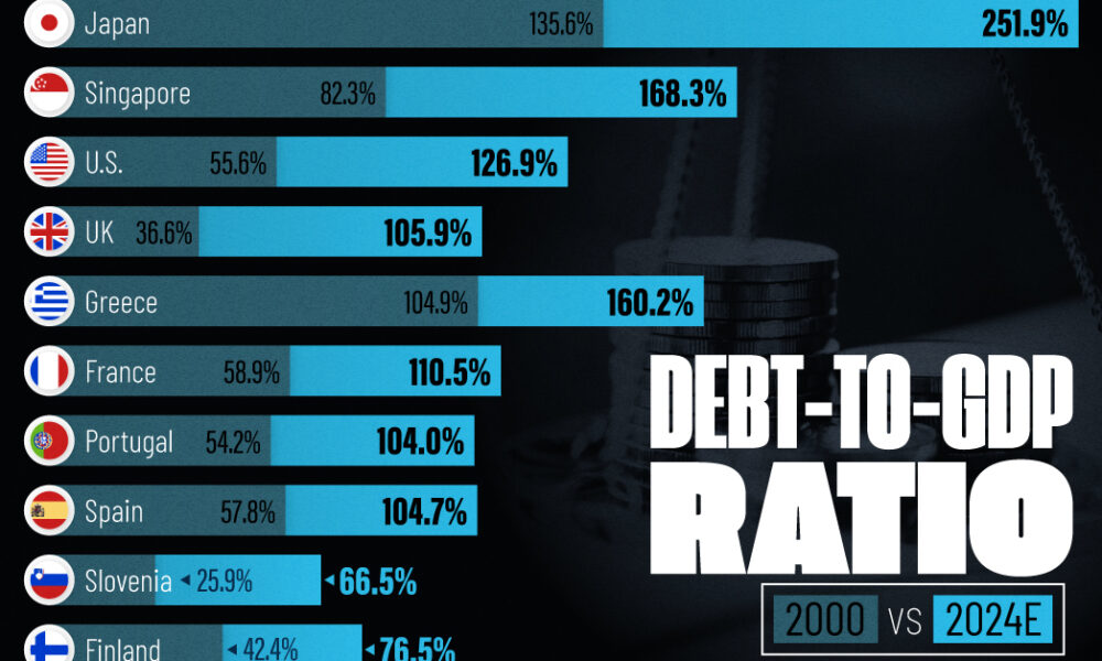
See how much the debt-to-GDP ratios of advanced economies have grown (or shrank) since the year 2000.
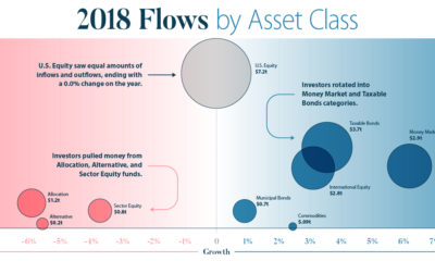

This infographic breaks down investment flows into funds (mutual funds, ETFs, etc.) over the course of 2018 to show how and when investors changed strategies.
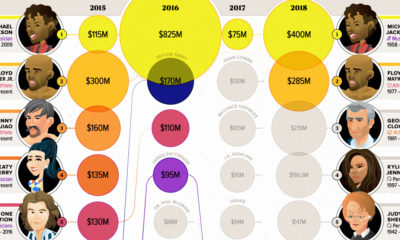

Celebrity status can be a powerful tool for building a fortune. These infographics visualize the world's top earning celebrities, both living and dead.

Since the invention of banking, the global financial system has increasingly become more centralized. Here are the big flaws it has, as a result.
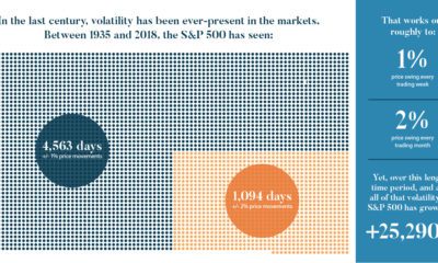

We look at the last century of markets to discover five important lessons about volatility. Here's what you should know about volatility going forward.
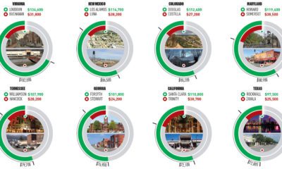

This infographic uses the measure of median household income to contrast the wealthiest and poorest counties in every U.S. state.
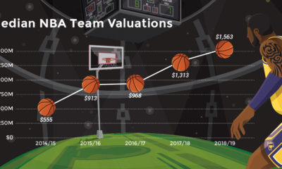

Buoyed by hefty broadcast agreements and superstars like LeBron James, NBA team valuations are hitting new heights. Let's break down the data by team.
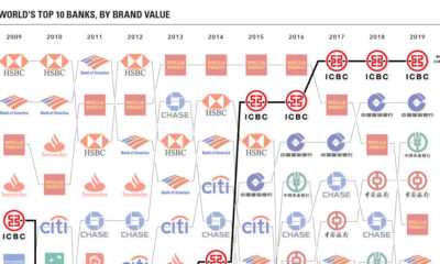

These charts visualize the most valuable bank brands around the world, while also showing the rise of China's financial services sector over time.
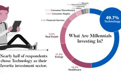

A survey of 9,800 millennials reveals what investing habits will define a generation set to receive a $30 trillion wealth transfer in the coming years.
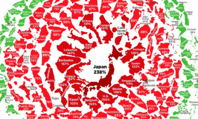

See the latest levels of government debt, based on the IMF's most recent data. Where does your country sit in the snowball?
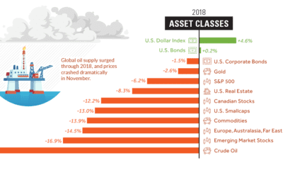

Investors saw a sea of red in 2018 - here's a visual recap of how markets performed, including the big winners and losers from a volatile...


