Markets
Why Markets are Worried About the Yield Curve
Explainer: Why Markets are Worried About the Yield Curve
If you pay any attention to financial media, chances are that you’ve heard increased chatter about the flattening “yield curve” in the past few weeks.
For professional investors, talking about the yield curve is close to second nature – but to most regular folks, the words probably sound very abstract or esoteric.
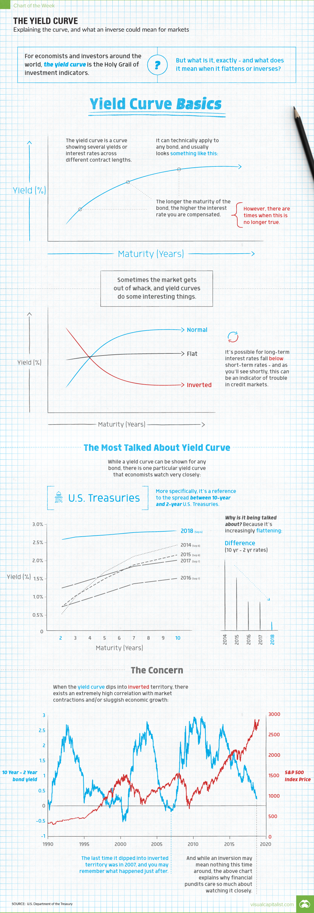
What’s a Yield Curve?
The yield curve is a curve showing several yields or interest rates across different bond contract lengths.
In a normal credit environment, the premise is that yields are higher for longer maturity bonds.
In a way, this is similar to what you’d expect if you went to the bank and put your money into a time deposit. For example, if you put your money in for five years, you’d expect a higher return per year than if you put your money in for six months.
Why? You’re taking on more risk, and therefore deserve a higher rate of compensation.
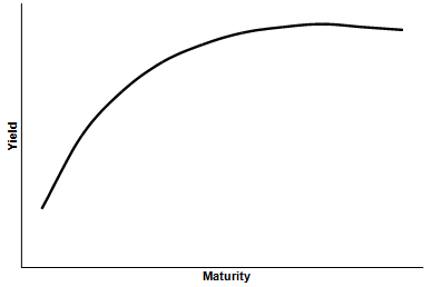
Out of Whack
Sometimes the market gets out of whack, and yield curves do some interesting things.
As you can see above, sometimes long-term interest rates can be equal to those of short-term rates. This is called a “flat” yield curve.
Or, when long-term rates fall below short-term rates, that is an “inverted” yield curve. As you’ll see shortly, this can be a signal of trouble in credit markets and the greater economy as a whole.
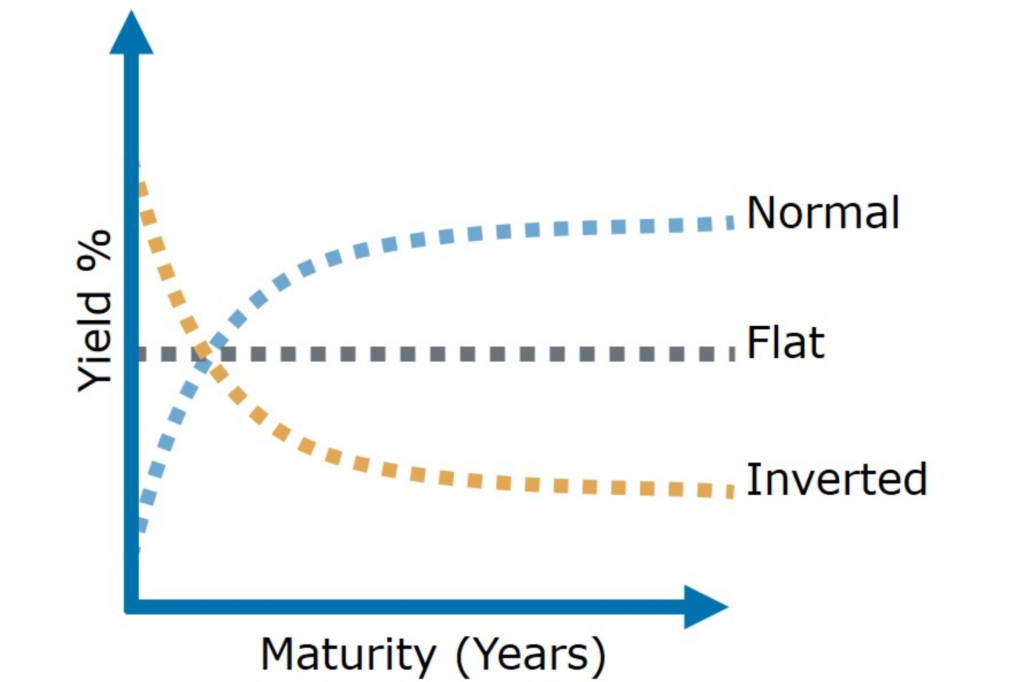
The Curve Everyone is Talking about
While a yield curve can be shown for any bond, there is one particular yield curve that you’ll often see referenced by financial journalists and analysts.
That would be the yield curve for U.S. Treasuries, the bonds issued by the U.S. federal government to fund its activities. More specifically, the difference between 10-year and 2-year bonds has been a historical indicator of the health of the economy and markets.
And despite this curve looking pretty normal since the financial crisis, it has been flattening over time:
| 2-yr | 3-yr | 5-yr | 7-yr | 10-yr | Difference (10yr - 2yr) | |
|---|---|---|---|---|---|---|
| 2014 | 0.54% | 1.02% | 1.72% | 2.16% | 2.48% | 1.94% |
| 2015 | 0.74% | 1.05% | 1.53% | 1.92% | 2.20% | 1.46% |
| 2016 | 0.74% | 0.86% | 1.12% | 1.39% | 1.54% | 0.80% |
| 2017 | 1.27% | 1.38% | 1.63% | 1.88% | 2.05% | 0.78% |
| 2018 | 2.64% | 2.71% | 2.76% | 2.83% | 2.88% | 0.24% |
Source: U.S. Treasury Dept (Each year’s data corresponds to this day in September)
In 2014, the difference for 10-year and 2-year bonds was 1.94%. Today, the difference is just 0.24%!
Why It Matters
There are various interpretations out there of what an inverted yield curve could mean for markets.
There are also pundits out there who say things are different this time around. There is some validity to this, as things are never cut and dry in economics. Besides, this wouldn’t be the first time that global credit markets have acted in strange ways since the crisis.
That all said, the reason the inverted yield curve is a topic of conversation is simple: inverted yield curves have preceded every post-war U.S. recession.
So now you know what the fuss is about – and maybe, just maybe, you’re more inclined to dive deeper into the exciting world of yield curves.


Economy
Economic Growth Forecasts for G7 and BRICS Countries in 2024
The IMF has released its economic growth forecasts for 2024. How do the G7 and BRICS countries compare?
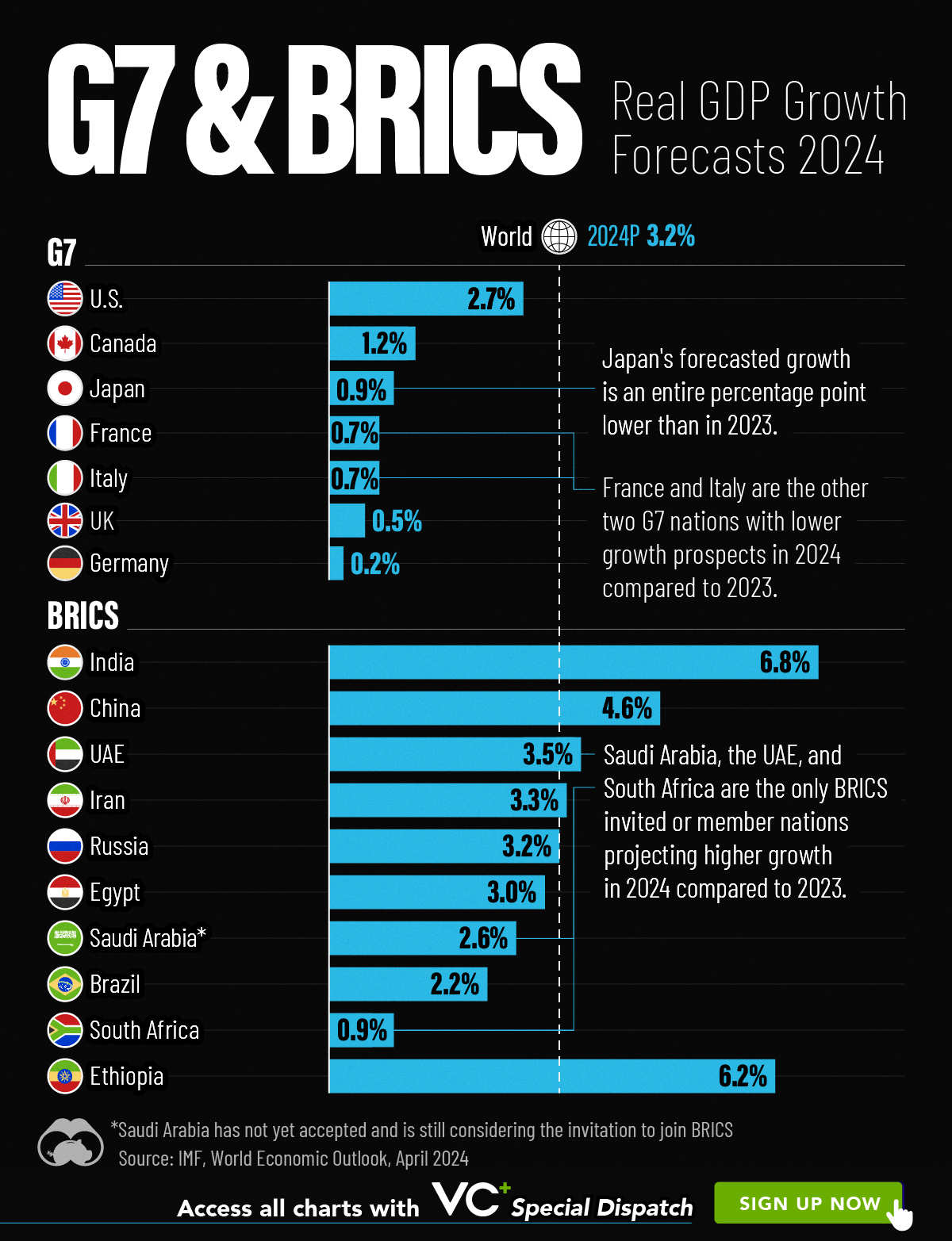
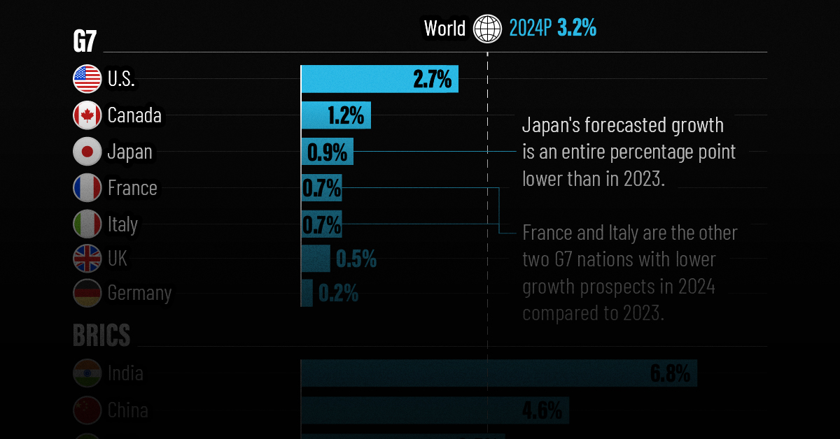
G7 & BRICS Real GDP Growth Forecasts for 2024
The International Monetary Fund’s (IMF) has released its real gross domestic product (GDP) growth forecasts for 2024, and while global growth is projected to stay steady at 3.2%, various major nations are seeing declining forecasts.
This chart visualizes the 2024 real GDP growth forecasts using data from the IMF’s 2024 World Economic Outlook for G7 and BRICS member nations along with Saudi Arabia, which is still considering an invitation to join the bloc.
Get the Key Insights of the IMF’s World Economic Outlook
Want a visual breakdown of the insights from the IMF’s 2024 World Economic Outlook report?
This visual is part of a special dispatch of the key takeaways exclusively for VC+ members.
Get the full dispatch of charts by signing up to VC+.
Mixed Economic Growth Prospects for Major Nations in 2024
Economic growth projections by the IMF for major nations are mixed, with the majority of G7 and BRICS countries forecasted to have slower growth in 2024 compared to 2023.
Only three BRICS-invited or member countries, Saudi Arabia, the UAE, and South Africa, have higher projected real GDP growth rates in 2024 than last year.
| Group | Country | Real GDP Growth (2023) | Real GDP Growth (2024P) |
|---|---|---|---|
| G7 | 🇺🇸 U.S. | 2.5% | 2.7% |
| G7 | 🇨🇦 Canada | 1.1% | 1.2% |
| G7 | 🇯🇵 Japan | 1.9% | 0.9% |
| G7 | 🇫🇷 France | 0.9% | 0.7% |
| G7 | 🇮🇹 Italy | 0.9% | 0.7% |
| G7 | 🇬🇧 UK | 0.1% | 0.5% |
| G7 | 🇩🇪 Germany | -0.3% | 0.2% |
| BRICS | 🇮🇳 India | 7.8% | 6.8% |
| BRICS | 🇨🇳 China | 5.2% | 4.6% |
| BRICS | 🇦🇪 UAE | 3.4% | 3.5% |
| BRICS | 🇮🇷 Iran | 4.7% | 3.3% |
| BRICS | 🇷🇺 Russia | 3.6% | 3.2% |
| BRICS | 🇪🇬 Egypt | 3.8% | 3.0% |
| BRICS-invited | 🇸🇦 Saudi Arabia | -0.8% | 2.6% |
| BRICS | 🇧🇷 Brazil | 2.9% | 2.2% |
| BRICS | 🇿🇦 South Africa | 0.6% | 0.9% |
| BRICS | 🇪🇹 Ethiopia | 7.2% | 6.2% |
| 🌍 World | 3.2% | 3.2% |
China and India are forecasted to maintain relatively high growth rates in 2024 at 4.6% and 6.8% respectively, but compared to the previous year, China is growing 0.6 percentage points slower while India is an entire percentage point slower.
On the other hand, four G7 nations are set to grow faster than last year, which includes Germany making its comeback from its negative real GDP growth of -0.3% in 2023.
Faster Growth for BRICS than G7 Nations
Despite mostly lower growth forecasts in 2024 compared to 2023, BRICS nations still have a significantly higher average growth forecast at 3.6% compared to the G7 average of 1%.
While the G7 countries’ combined GDP is around $15 trillion greater than the BRICS nations, with continued higher growth rates and the potential to add more members, BRICS looks likely to overtake the G7 in economic size within two decades.
BRICS Expansion Stutters Before October 2024 Summit
BRICS’ recent expansion has stuttered slightly, as Argentina’s newly-elected president Javier Milei declined its invitation and Saudi Arabia clarified that the country is still considering its invitation and has not joined BRICS yet.
Even with these initial growing pains, South Africa’s Foreign Minister Naledi Pandor told reporters in February that 34 different countries have submitted applications to join the growing BRICS bloc.
Any changes to the group are likely to be announced leading up to or at the 2024 BRICS summit which takes place October 22-24 in Kazan, Russia.
Get the Full Analysis of the IMF’s Outlook on VC+
This visual is part of an exclusive special dispatch for VC+ members which breaks down the key takeaways from the IMF’s 2024 World Economic Outlook.
For the full set of charts and analysis, sign up for VC+.

-

 Markets1 week ago
U.S. Debt Interest Payments Reach $1 Trillion
-

 Business2 weeks ago
Charted: Big Four Market Share by S&P 500 Audits
-

 Real Estate2 weeks ago
Ranked: The Most Valuable Housing Markets in America
-

 Money2 weeks ago
Which States Have the Highest Minimum Wage in America?
-

 AI2 weeks ago
Ranked: Semiconductor Companies by Industry Revenue Share
-

 Markets2 weeks ago
Ranked: The World’s Top Flight Routes, by Revenue
-

 Demographics2 weeks ago
Population Projections: The World’s 6 Largest Countries in 2075
-

 Markets2 weeks ago
The Top 10 States by Real GDP Growth in 2023