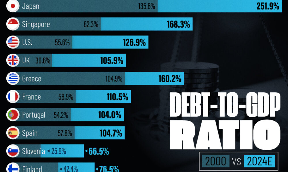
See how much the debt-to-GDP ratios of advanced economies have grown (or shrank) since the year 2000.

It's estimated that 34.5% of young adults (18-34 years old) in the U.S live at home with their parents. Here's how it varies by state, as...

This infographic provides a glimpse into the world of regtech, a booming tech sector that's helping financial firms to comply with onerous regulations.
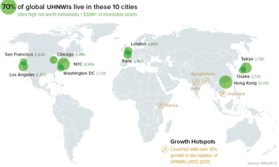

A data-driven snapshot of global wealth distribution. The average person around the world is doing better, but big-picture inequality is still staggering.
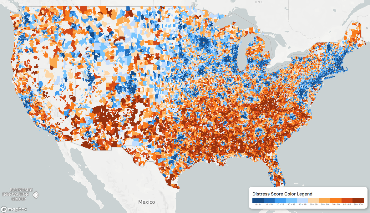
While the U.S. economic picture remains quite rosy, things change quickly when you zoom to the local level. This map shows the country's distressed communities.
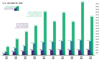

What is the relationship between age and income level? We visualize the data and compare it to commonly held beliefs on the topic.
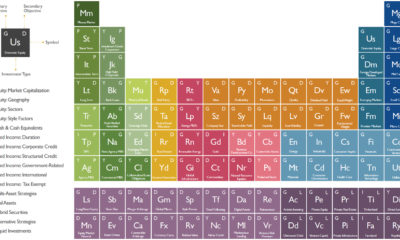

The investment universe is vast - but it's also made up of many smaller components. See it all depicted in this nifty periodic table of investments.
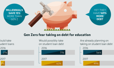

Gen Z saw their older friends take on massive amounts of debt, while struggling to secure stable jobs - and now they are learning from those...
This interactive graphic shows the poverty rate of every state, and also how poverty levels have changed over time according to the U.S. Census Bureau.

Even billionaires need to start somewhere - and often that's with a college education. See which colleges produce the most American billionaires.
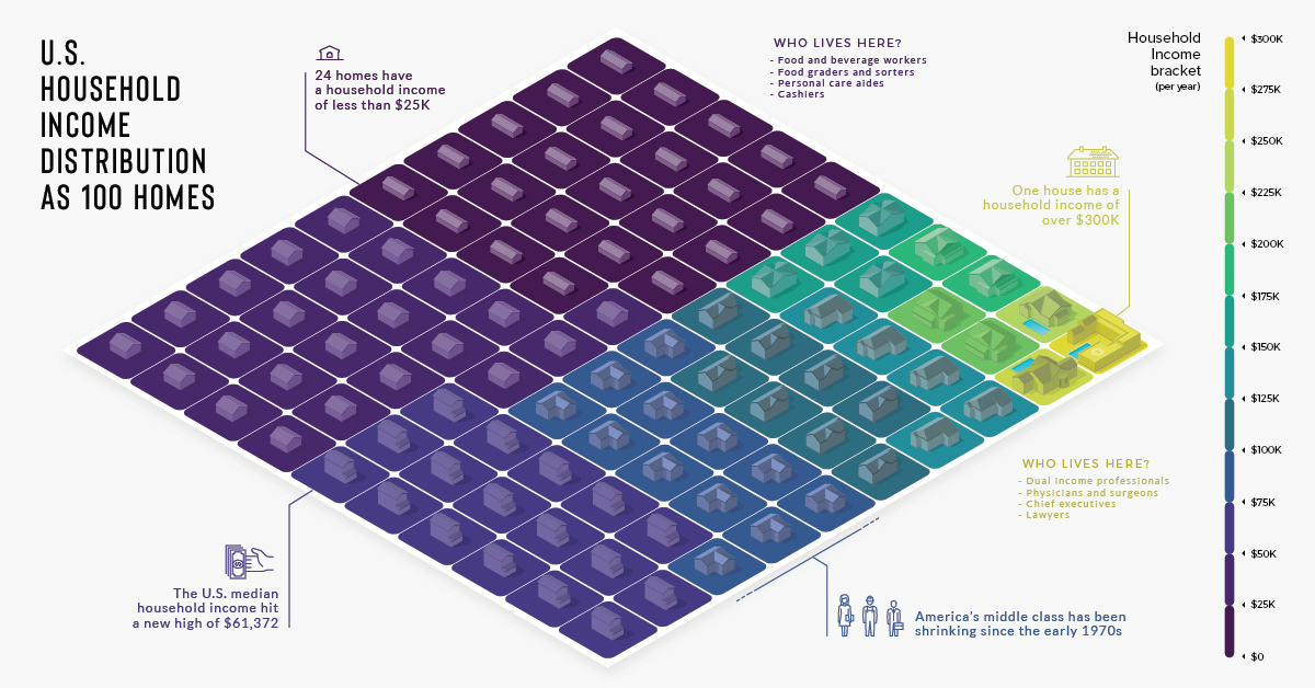
There are over 125 million households in the U.S., each with varying incomes. He's how they look distilled down into a visualization of 100 homes.


