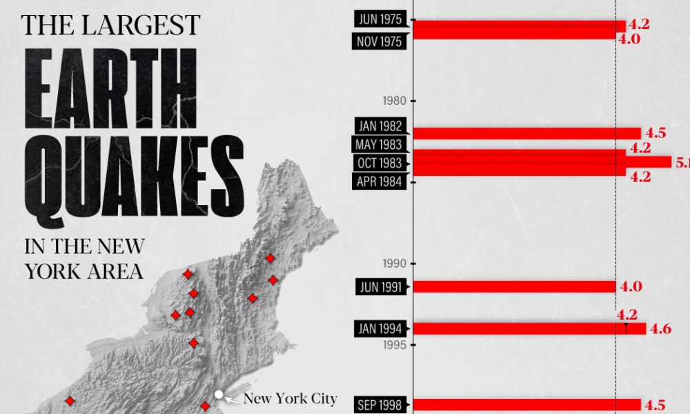
The earthquake that shook buildings across New York in April 2024 was the third-largest quake in the Northeast U.S. over...
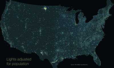

This unique map subtracts population from nighttime light output, giving us a unique perspective into America's rural light pollution hot spots.
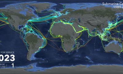

Watch the explosive growth of the global submarine cable network, and learn who's funding the next generation of cables.
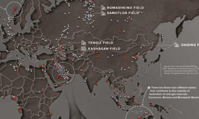

Since 1868, there had been 1,232 oil discoveries over 500 million barrels of oil. This map plots these discoveries to reveal global energy hot spots.
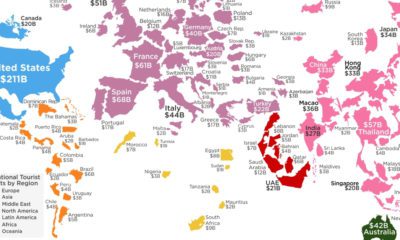

How much do your vacations contribute to your destination of choice? This visualization shows the countries that receive the most tourist spending.
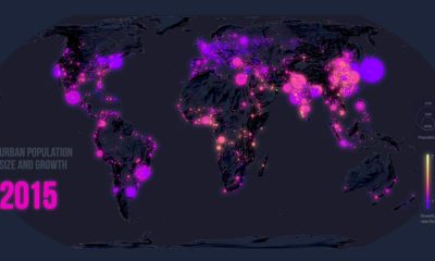

Few global trends have matched the profound impact of urbanization. Today’s map looks back at 70 years of movement in over 1,800 cities.


Crippling student debt in the U.S. has reached a record high of $1.5 trillion nationwide. Today’s map breaks down which states bear the highest burden.
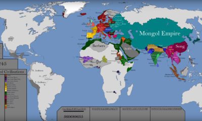

This epic attempt to condense the history of the world — including the rise and fall of empires — fits into a single video.
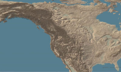

This stunning set of 3d maps purposefully exaggerate the elevation scale to show you the mountains of both the United States and North America.
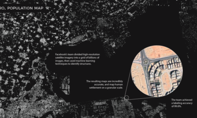

Machine learning technology is allowing researchers at Facebook to map the world population in unprecedented detail.
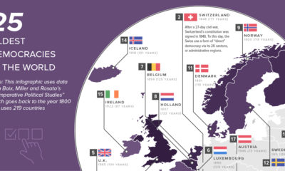

This map shows the 25 oldest democracies in the world, based on how long current democratic governments have been in continuous power.


