Money
How Much Student Debt Does Each State Hold?
How Much Student Debt Does Each State Hold?
Education may be priceless, but the costs of obtaining it are becoming steeper by the day.
Almost half of all university-educated Americans rely on loans to pay for their higher education, with very few graduating debt-free. Total U.S. student debt has more than doubled in the last decade—reaching a record high of $1.5 trillion today.
Today’s data visualization from HowMuch.net breaks down the average student debt per capita, to uncover which states shoulder the highest burden in this growing crisis.
Students are Paying Through the Nose
Before diving into the graphic, let’s take a quick look at why student debt is racking up. The ballooning costs to attend college today compared to thirty years ago is one driving factor.
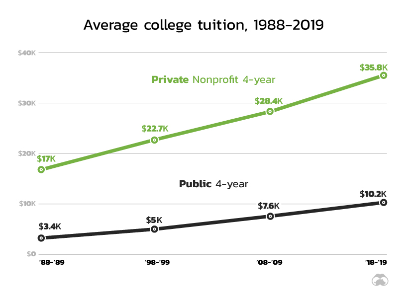
Source: The College Board 2018 report.
What’s more, these figures don’t include the expenses for accommodation and other supplies, which can add another $15,000-$17,000 per year.
The United States of Student Debt
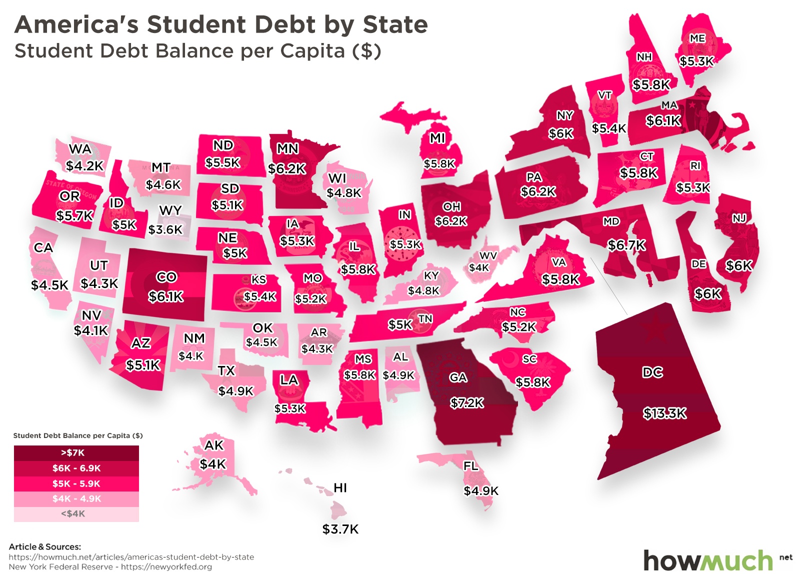
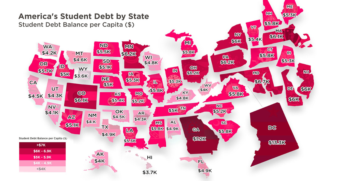
In the state map above, it’s immediately obvious that Washington D.C. tops the list. While the nation’s capital is the most educated metropolitan area in the country, it also suffers from $13,320 in student debt per capita.
At approximately 147% above than the national average of $5,390, Washington D.C.’s debt burden per capita is almost double that of the state in second place. Georgia comes in with $7,250 debt per capita, 34.5% above the national average.
| State | Student Debt per Capita | Difference from Average |
|---|---|---|
| Alabama | $4,920 | -8.7% |
| Alaska | $4,030 | -25.2% |
| Arizona | $5,170 | -4.1% |
| Arkansas | $4,330 | -19.7% |
| California | $4,530 | -16.0% |
| Colorado | $6,180 | 14.7% |
| Connecticut | $5,890 | 9.3% |
| Delaware | $6,040 | 12.1% |
| District Of Columbia | $13,320 | 147.1% |
| Florida | $4,940 | -8.3% |
| Georgia | $7,250 | 34.5% |
| Hawaii | $3,780 | -29.9% |
| Idaho | $5,050 | -6.3% |
| Illinois | $5,800 | 7.6% |
| Indiana | $5,300 | -1.7% |
| Iowa | $5,300 | -1.7% |
| Kansas | $5,480 | 1.7% |
| Kentucky | $4,870 | -9.6% |
| Louisiana | $5,360 | -0.6% |
| Maine | $5,340 | -0.9% |
| Maryland | $6,740 | 25.0% |
| Massachusetts | $6,140 | 13.9% |
| Michigan | $5,800 | 7.6% |
| Minnesota | $6,280 | 16.5% |
| Mississippi | $5,870 | 8.9% |
| Missouri | $5,270 | -2.2% |
| Nebraska | $5,080 | -5.8% |
| Nevada | $4,170 | -22.6% |
| New Hampshire | $5,860 | 8.7% |
| New Jersey | $6,090 | 13.0% |
| New Mexico | $4,070 | -24.5% |
| New York | $6,090 | 13.0% |
| North Carolina | $5,240 | -2.8% |
| North Dakota | $5,510 | 2.2% |
| Ohio | $6,220 | 15.4% |
| Oklahoma | $4,540 | -15.8% |
| Oregon | $5,760 | 6.9% |
| Pennsylvania | $6,210 | 15.2% |
| Rhode Island | $5,390 | 0.0% |
| South Carolina | $5,870 | 8.9% |
| South Dakota | $5,170 | -4.1% |
| Tennessee | $5,050 | -6.3% |
| Texas | $4,970 | -7.8% |
| Utah | $4,350 | -19.3% |
| Vermont | $5,480 | 1.7% |
| Virginia | $5,820 | 8.0% |
| Washington | $4,270 | -20.8% |
| West Virginia | $4,020 | -25.4% |
| Wisconsin | $4,850 | -10.0% |
| Wyoming | $3,610 | -33.0% |
| U.S. Average | $5,390 |
Rounding out the five states with the most student debt per capita are Maryland, Minnesota, and Ohio, in that order. On the flip side, Wyoming has the least debt per capita ($3,610), which is 33.0% lower than the national average. Hawaii follows right behind at $3,780, and 29.9% below the national average.
Interestingly, a growing population on the West Coast helps to lower the debt burden for states like California, even despite the strong presence of prestigious schools. Home to Stanford, USC, UCLA, CalTech, and more, the Golden State surprisingly only has $4,530 in debt per capita.
The Last Straw?
Today’s Americans are more educated than ever before, but the sticker shock is causing some whiplash. This overall trend of spiraling student debt has significant implications on a person’s life trajectory. With many graduates unable to repay their loans on time, more of them are delaying major life milestones, such as starting a family or becoming a homeowner.
In efforts to curb this crisis, many 2020 presidential hopefuls have already started proposing plans to cancel or forgive student debt—with close attention on mid- to low-income households that would benefit the most from reduced loans.


Money
Charted: Which City Has the Most Billionaires in 2024?
Just two countries account for half of the top 20 cities with the most billionaires. And the majority of the other half are found in Asia.


Charted: Which Country Has the Most Billionaires in 2024?
This was originally posted on our Voronoi app. Download the app for free on iOS or Android and discover incredible data-driven charts from a variety of trusted sources.
Some cities seem to attract the rich. Take New York City for example, which has 340,000 high-net-worth residents with investable assets of more than $1 million.
But there’s a vast difference between being a millionaire and a billionaire. So where do the richest of them all live?
Using data from the Hurun Global Rich List 2024, we rank the top 20 cities with the highest number of billionaires in 2024.
A caveat to these rich lists: sources often vary on figures and exact rankings. For example, in last year’s reports, Forbes had New York as the city with the most billionaires, while the Hurun Global Rich List placed Beijing at the top spot.
Ranked: Top 20 Cities with the Most Billionaires in 2024
The Chinese economy’s doldrums over the course of the past year have affected its ultra-wealthy residents in key cities.
Beijing, the city with the most billionaires in 2023, has not only ceded its spot to New York, but has dropped to #4, overtaken by London and Mumbai.
| Rank | City | Billionaires | Rank Change YoY |
|---|---|---|---|
| 1 | 🇺🇸 New York | 119 | +1 |
| 2 | 🇬🇧 London | 97 | +3 |
| 3 | 🇮🇳 Mumbai | 92 | +4 |
| 4 | 🇨🇳 Beijing | 91 | -3 |
| 5 | 🇨🇳 Shanghai | 87 | -2 |
| 6 | 🇨🇳 Shenzhen | 84 | -2 |
| 7 | 🇭🇰 Hong Kong | 65 | -1 |
| 8 | 🇷🇺 Moscow | 59 | No Change |
| 9 | 🇮🇳 New Delhi | 57 | +6 |
| 10 | 🇺🇸 San Francisco | 52 | No Change |
| 11 | 🇹🇭 Bangkok | 49 | +2 |
| 12 | 🇹🇼 Taipei | 45 | +2 |
| 13 | 🇫🇷 Paris | 44 | -2 |
| 14 | 🇨🇳 Hangzhou | 43 | -5 |
| 15 | 🇸🇬 Singapore | 42 | New to Top 20 |
| 16 | 🇨🇳 Guangzhou | 39 | -4 |
| 17T | 🇮🇩 Jakarta | 37 | +1 |
| 17T | 🇧🇷 Sao Paulo | 37 | No Change |
| 19T | 🇺🇸 Los Angeles | 31 | No Change |
| 19T | 🇰🇷 Seoul | 31 | -3 |
In fact all Chinese cities on the top 20 list have lost billionaires between 2023–24. Consequently, they’ve all lost ranking spots as well, with Hangzhou seeing the biggest slide (-5) in the top 20.
Where China lost, all other Asian cities—except Seoul—in the top 20 have gained ranks. Indian cities lead the way, with New Delhi (+6) and Mumbai (+3) having climbed the most.
At a country level, China and the U.S combine to make up half of the cities in the top 20. They are also home to about half of the world’s 3,200 billionaire population.
In other news of note: Hurun officially counts Taylor Swift as a billionaire, estimating her net worth at $1.2 billion.

-

 Debt1 week ago
How Debt-to-GDP Ratios Have Changed Since 2000
-

 Markets2 weeks ago
Ranked: The World’s Top Flight Routes, by Revenue
-

 Demographics2 weeks ago
Population Projections: The World’s 6 Largest Countries in 2075
-

 Markets2 weeks ago
The Top 10 States by Real GDP Growth in 2023
-

 Demographics2 weeks ago
The Smallest Gender Wage Gaps in OECD Countries
-

 Economy2 weeks ago
Where U.S. Inflation Hit the Hardest in March 2024
-

 Green2 weeks ago
Top Countries By Forest Growth Since 2001
-

 United States2 weeks ago
Ranked: The Largest U.S. Corporations by Number of Employees