Money
Which Countries Have the Most Wealth Per Capita?
Which Countries Have the Most Wealth Per Capita?
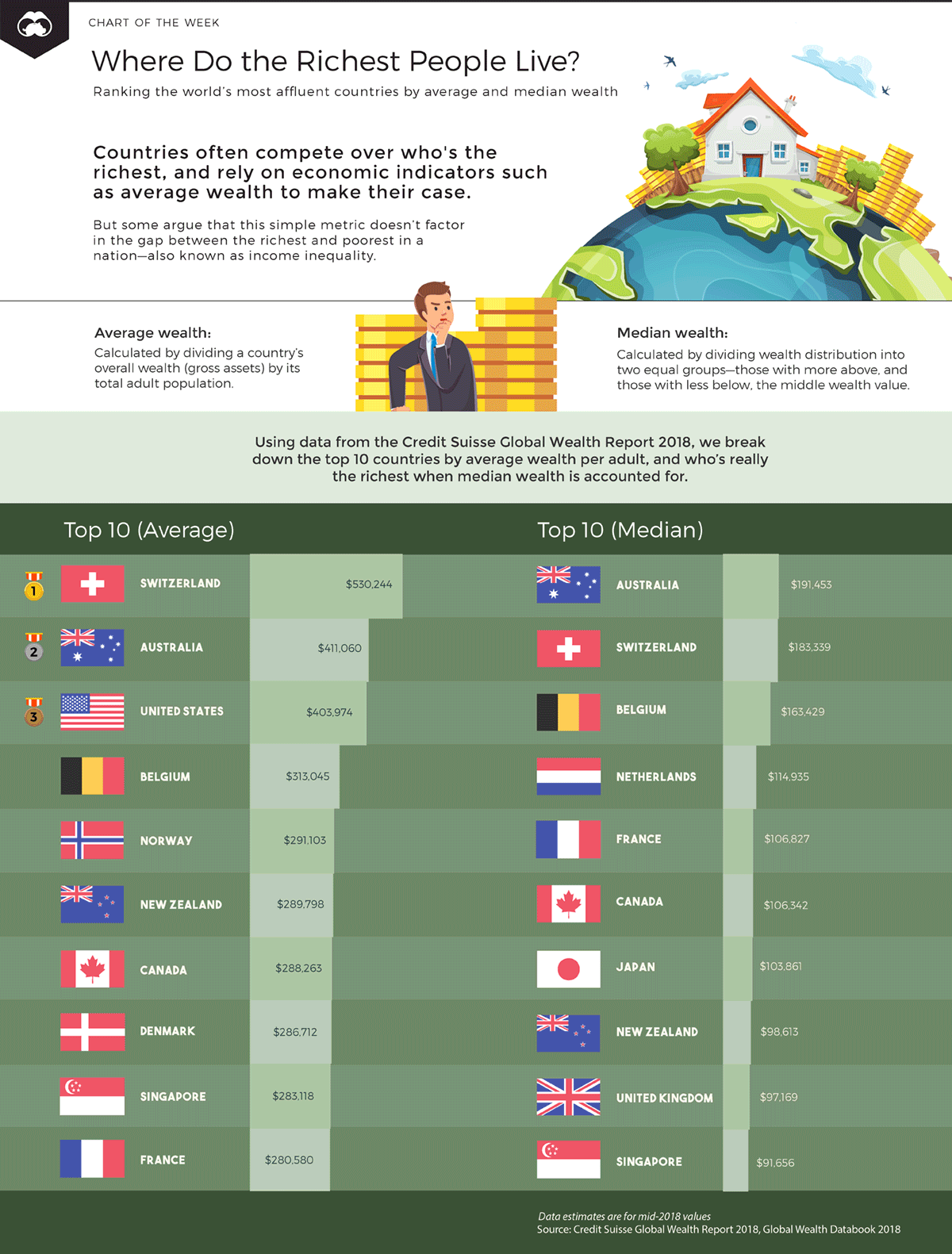
Our animated chart this week uses data from the ninth Credit Suisse Global Wealth report, which ranks countries by average wealth, calculated as gross assets per adult citizen.
While using such a metric certainly gives a quick snapshot of wealth per capita, it doesn’t necessarily show the complete picture.
Some argue, for example, that calculating the mean doesn’t factor in the gap between the richest and poorest in a population—also known as wealth inequality. For this reason, we’ve compared this number to median wealth for each country, providing a separate angle on which countries really have the most wealth per capita.
Mean or Median: Which Makes More Sense?
Below, we’ve visualized a hypothetical example of two groups of people, each earning various sums of money, to show how average (mean) and median calculations make a difference.
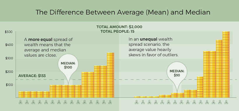
What can we observe in both datasets?
- Total wealth: $2,000
- Total people: 15 people
- Average wealth: $2,000 ÷ 15 = $133
However, that’s where the similarities end. In the first group, wealth is distributed more evenly, with the disparity between the lowest-paid and highest-paid being $300. The median wealth for this group reaches $100, which is close to the average value. In the second group, this gap climbs to $495, and the median wealth drops sharply to only $30.
Scaling up this example to the true wealth of nations, we can see how the median wealth provides a more accurate picture of the typical adult, especially in societies that are less equal.
Let’s see how this shakes out when ranking the world’s most affluent countries.
Ranking Top Contenders on Wealth per Capita
When it comes to wealth per capita, it’s clear that Australia and Switzerland lead the pack. In fact, the data shows that both nations top the lists for both mean and median wealth.
However, both nations also have the highest absolute household debt-to-GDP ratios in the world: in 2018, Switzerland’s levels reached nearly 129%, while Australia followed behind at 120%.
Here is a full ranking of the top 20 countries by mean and median wealth:
| Rank | Country | Mean wealth per adult | Country | Median wealth per adult |
|---|---|---|---|---|
| #1 | 🇨🇭 Switzerland | $530,244 | 🇦🇺 Australia | $191,453 |
| #2 | 🇦🇺 Australia | $411,060 | 🇨🇭 Switzerland | $183,339 |
| #3 | 🇺🇸 United States | $403,974 | 🇧🇪 Belgium | $163,429 |
| #4 | 🇧🇪 Belgium | $313,045 | 🇳🇱 Netherlands | $114,935 |
| #5 | 🇳🇴 Norway | $291,103 | 🇫🇷 France | $106,827 |
| #6 | 🇳🇿 New Zealand | $289,798 | 🇨🇦 Canada | $106,342 |
| #7 | 🇨🇦 Canada | $288,263 | 🇯🇵 Japan | $103,861 |
| #8 | 🇩🇰 Denmark | $286,712 | 🇳🇿 New Zealand | $98,613 |
| #9 | 🇸🇬 Singapore | $283,118 | 🇬🇧 United Kingdom | $97,169 |
| #10 | 🇫🇷 France | $280,580 | 🇸🇬 Singapore | $91,656 |
| #11 | 🇬🇧 United Kingdom | $279,048 | 🇪🇸 Spain | $87,188 |
| #12 | 🇳🇱 Netherlands | $253,205 | 🇳🇴 Norway | $80,054 |
| #13 | 🇸🇪 Sweden | $249,765 | 🇮🇹 Italy | $79,239 |
| #14 | 🇭🇰 Hong Kong | $244,672 | 🇹🇼 Taiwan | $78,177 |
| #15 | 🇮🇪 Ireland | $232,952 | 🇮🇪 Ireland | $72,473 |
| #16 | 🇦🇹 Austria | $231,368 | 🇦🇹 Austria | $70,074 |
| #17 | 🇯🇵 Japan | $227,235 | 🇰🇷 South Korea | $65,463 |
| #18 | 🇮🇹 Italy | $217,727 | 🇺🇸 United States | $61,667 |
| #19 | 🇩🇪 Germany | $214,893 | 🇩🇰 Denmark | $60,999 |
| #20 | 🇹🇼 Taiwan | $212,375 | 🇭🇰 Hong Kong | $58,905 |
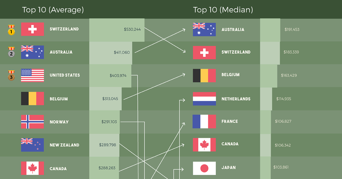
The United States boasts 41% of the world’s millionaires, but it’s clear that the fruits of labor are enjoyed by only a select group—average wealth ($403,974) is almost seven times higher than median wealth ($61,667). This growing inequality gap knocks the country down to 18th place for median wealth.
The Nordic countries of Norway and Denmark can be found in the top ten for average wealth, but they drop to 12th place ($80,054) and 19th place ($60,999) respectively for median wealth. Despite this difference, these countries also provide a strong safety net—including access to healthcare and education—to more vulnerable citizens.
Finally, wealth in Japan is fairly evenly distributed among its large middle class, which lands it in seventh place on the median wealth list at $103,861. One possible reason is that the pay gap ratio between Japanese CEOs and the average worker is much lower than other developed nations.
With reducing income inequality as a priority for many countries around the world, how might this list change in coming years?
Footnote: All data estimates are using mid-2018 values, and reflected in US$.


Money
Charted: Which City Has the Most Billionaires in 2024?
Just two countries account for half of the top 20 cities with the most billionaires. And the majority of the other half are found in Asia.


Charted: Which Country Has the Most Billionaires in 2024?
This was originally posted on our Voronoi app. Download the app for free on iOS or Android and discover incredible data-driven charts from a variety of trusted sources.
Some cities seem to attract the rich. Take New York City for example, which has 340,000 high-net-worth residents with investable assets of more than $1 million.
But there’s a vast difference between being a millionaire and a billionaire. So where do the richest of them all live?
Using data from the Hurun Global Rich List 2024, we rank the top 20 cities with the highest number of billionaires in 2024.
A caveat to these rich lists: sources often vary on figures and exact rankings. For example, in last year’s reports, Forbes had New York as the city with the most billionaires, while the Hurun Global Rich List placed Beijing at the top spot.
Ranked: Top 20 Cities with the Most Billionaires in 2024
The Chinese economy’s doldrums over the course of the past year have affected its ultra-wealthy residents in key cities.
Beijing, the city with the most billionaires in 2023, has not only ceded its spot to New York, but has dropped to #4, overtaken by London and Mumbai.
| Rank | City | Billionaires | Rank Change YoY |
|---|---|---|---|
| 1 | 🇺🇸 New York | 119 | +1 |
| 2 | 🇬🇧 London | 97 | +3 |
| 3 | 🇮🇳 Mumbai | 92 | +4 |
| 4 | 🇨🇳 Beijing | 91 | -3 |
| 5 | 🇨🇳 Shanghai | 87 | -2 |
| 6 | 🇨🇳 Shenzhen | 84 | -2 |
| 7 | 🇭🇰 Hong Kong | 65 | -1 |
| 8 | 🇷🇺 Moscow | 59 | No Change |
| 9 | 🇮🇳 New Delhi | 57 | +6 |
| 10 | 🇺🇸 San Francisco | 52 | No Change |
| 11 | 🇹🇭 Bangkok | 49 | +2 |
| 12 | 🇹🇼 Taipei | 45 | +2 |
| 13 | 🇫🇷 Paris | 44 | -2 |
| 14 | 🇨🇳 Hangzhou | 43 | -5 |
| 15 | 🇸🇬 Singapore | 42 | New to Top 20 |
| 16 | 🇨🇳 Guangzhou | 39 | -4 |
| 17T | 🇮🇩 Jakarta | 37 | +1 |
| 17T | 🇧🇷 Sao Paulo | 37 | No Change |
| 19T | 🇺🇸 Los Angeles | 31 | No Change |
| 19T | 🇰🇷 Seoul | 31 | -3 |
In fact all Chinese cities on the top 20 list have lost billionaires between 2023–24. Consequently, they’ve all lost ranking spots as well, with Hangzhou seeing the biggest slide (-5) in the top 20.
Where China lost, all other Asian cities—except Seoul—in the top 20 have gained ranks. Indian cities lead the way, with New Delhi (+6) and Mumbai (+3) having climbed the most.
At a country level, China and the U.S combine to make up half of the cities in the top 20. They are also home to about half of the world’s 3,200 billionaire population.
In other news of note: Hurun officially counts Taylor Swift as a billionaire, estimating her net worth at $1.2 billion.

-

 Science1 week ago
Visualizing the Average Lifespans of Mammals
-

 Markets2 weeks ago
The Top 10 States by Real GDP Growth in 2023
-

 Demographics2 weeks ago
The Smallest Gender Wage Gaps in OECD Countries
-

 United States2 weeks ago
Where U.S. Inflation Hit the Hardest in March 2024
-

 Green2 weeks ago
Top Countries By Forest Growth Since 2001
-

 United States2 weeks ago
Ranked: The Largest U.S. Corporations by Number of Employees
-

 Maps2 weeks ago
The Largest Earthquakes in the New York Area (1970-2024)
-

 Green2 weeks ago
Ranked: The Countries With the Most Air Pollution in 2023