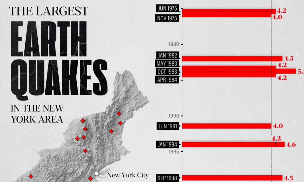
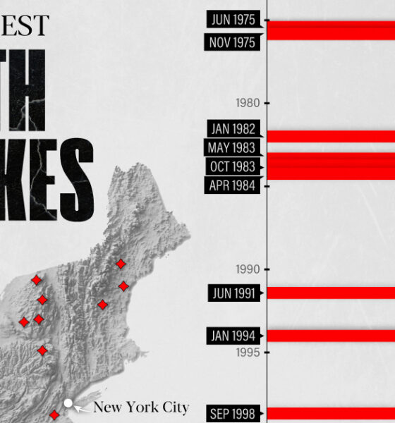
The earthquake that shook buildings across New York in April 2024 was the third-largest quake in the Northeast U.S. over...

This striking map depicts all the stars and celestial bodies that are visible in the night sky, all on one giant backdrop.

What did ancient maps look like, before we had access to airplanes and satellites? See the evolution of the world map in this nifty infographic.
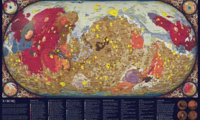

For centuries, humankind has looked at Mars from afar. In the past 75 years, space exploration has made it possible to create a map of Mars...
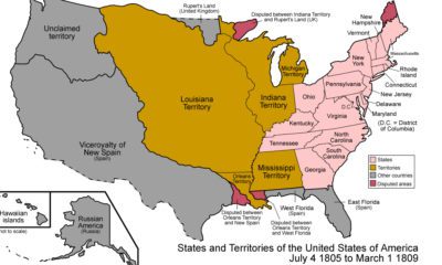

From the Thirteen Colonies to present-day USA, this animation is a detailed look at how borders have shifted throughout the nation's history.
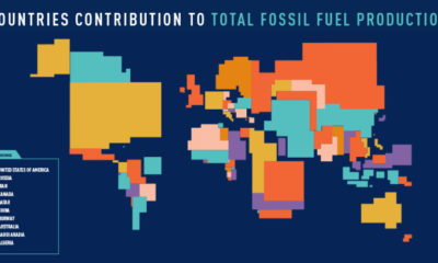

These four animated cartograms show the nations leading the world in fossil fuel production, in terms of oil, gas, coal, and total hydrocarbons.
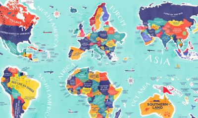

From Colombia to China, explore this map to uncover the diverse histories and cultures represented in the literal translation of each country's name.
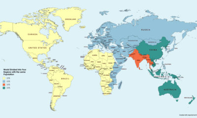

This simple map visualization will change how you think about global population, and how people are distributed throughout the planet.
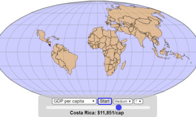

How does the world map change if it gets assembled based on the size of economies, in ascending order of GDP or GDP per capita?
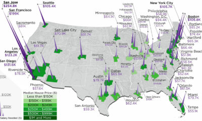

The annual salary needed to buy a home in the U.S. ranges from $38k to $255k, depending on the metropolitan area you are looking in.
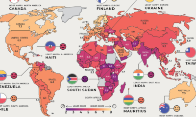

Where are the happiest, least happy, and fastest improving countries worldwide? We've broken down this annual ranking by region to answer that question.