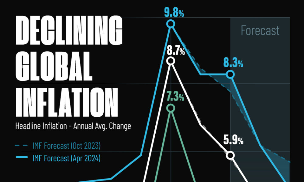
Here are IMF forecasts for global inflation rates up to 2026, highlighting a slow descent of price pressures amid resilient...
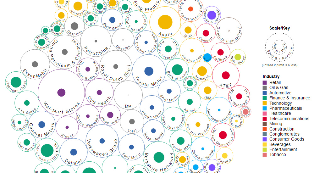
This data visualization compares the revenue and profit numbers for the top 100 companies by market valuation in the world.
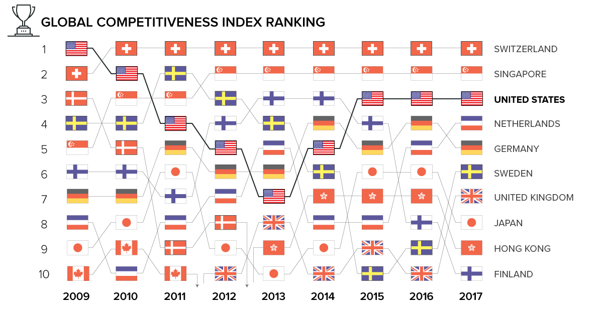
What makes a country competitive on the world stage? Today's animation and interactive charts show global competitiveness over time, and how it's measured.
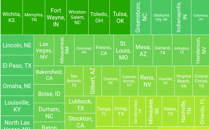
With rental prices rising sharply across the U.S., these interactive graphics show the trade-off between the cost and size in the 100 largest metro areas.
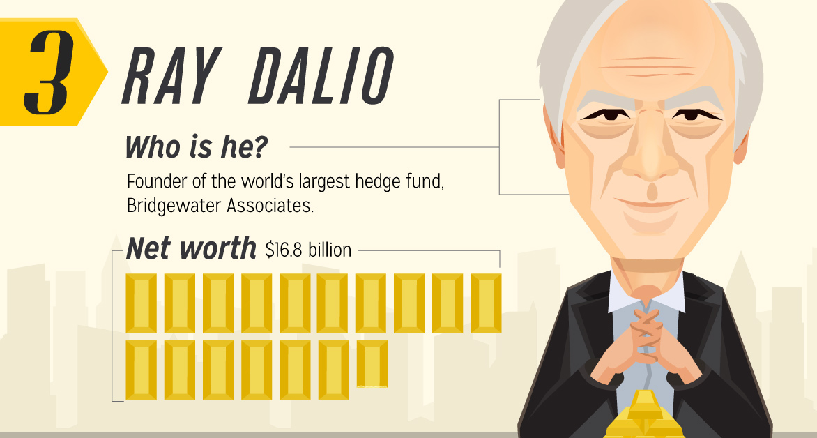
Billionaire investors like Ray Dalio are stocking up on gold. Here's the ideas and strategies on gold from four elite investors, and what we can learn.
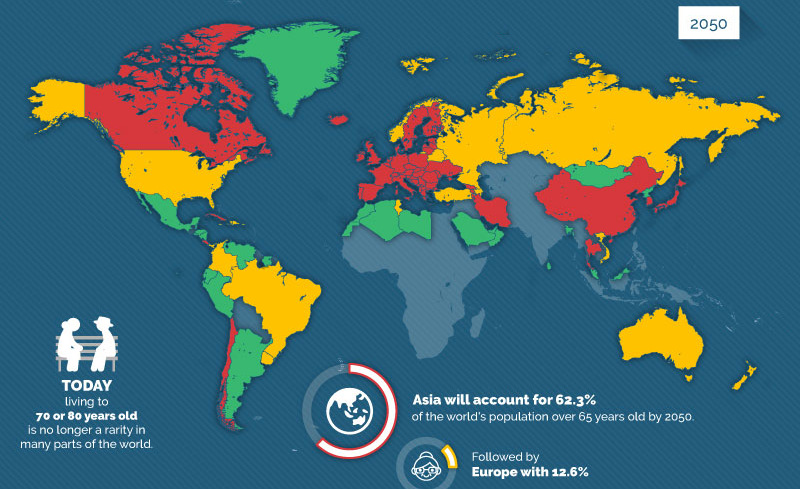
The percentage of the global population that is 65+ will double from 10% to 20% by 2050, creating potential economic headwinds especially for millennials.
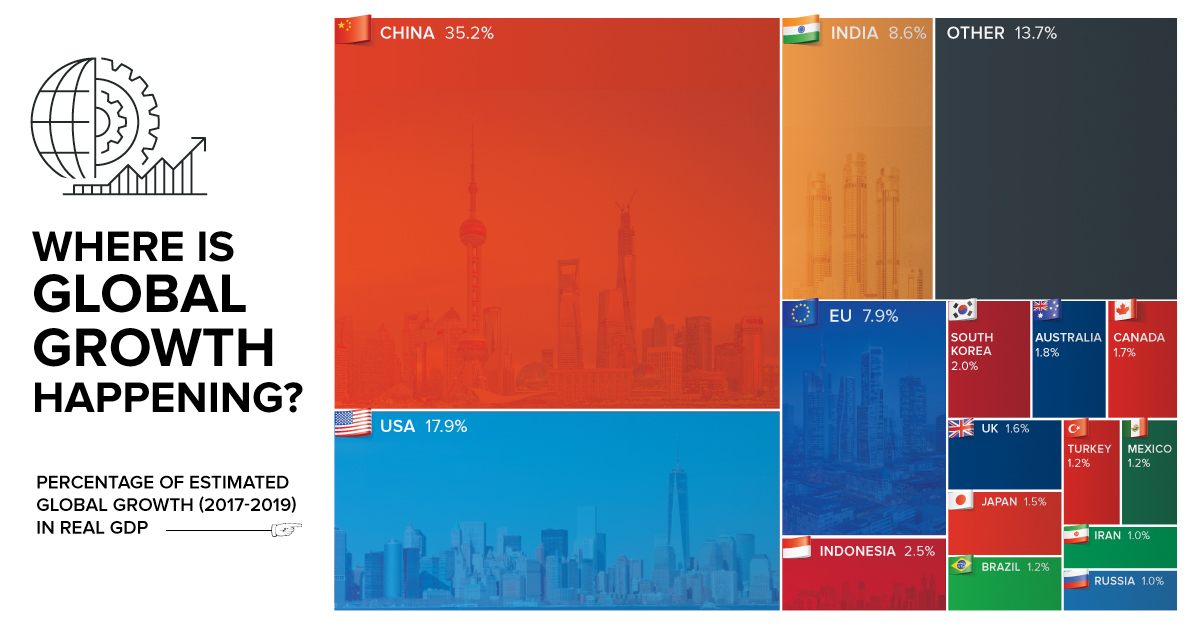
By 2019, the global economy is projected to expand another $6.5 trillion. Today's chart shows which countries will help to fuel this global growth.

Millions, billions, trillions - these are abstract numbers. Here's what $20 trillion of U.S. debt looks like in terms of cold hard cash.
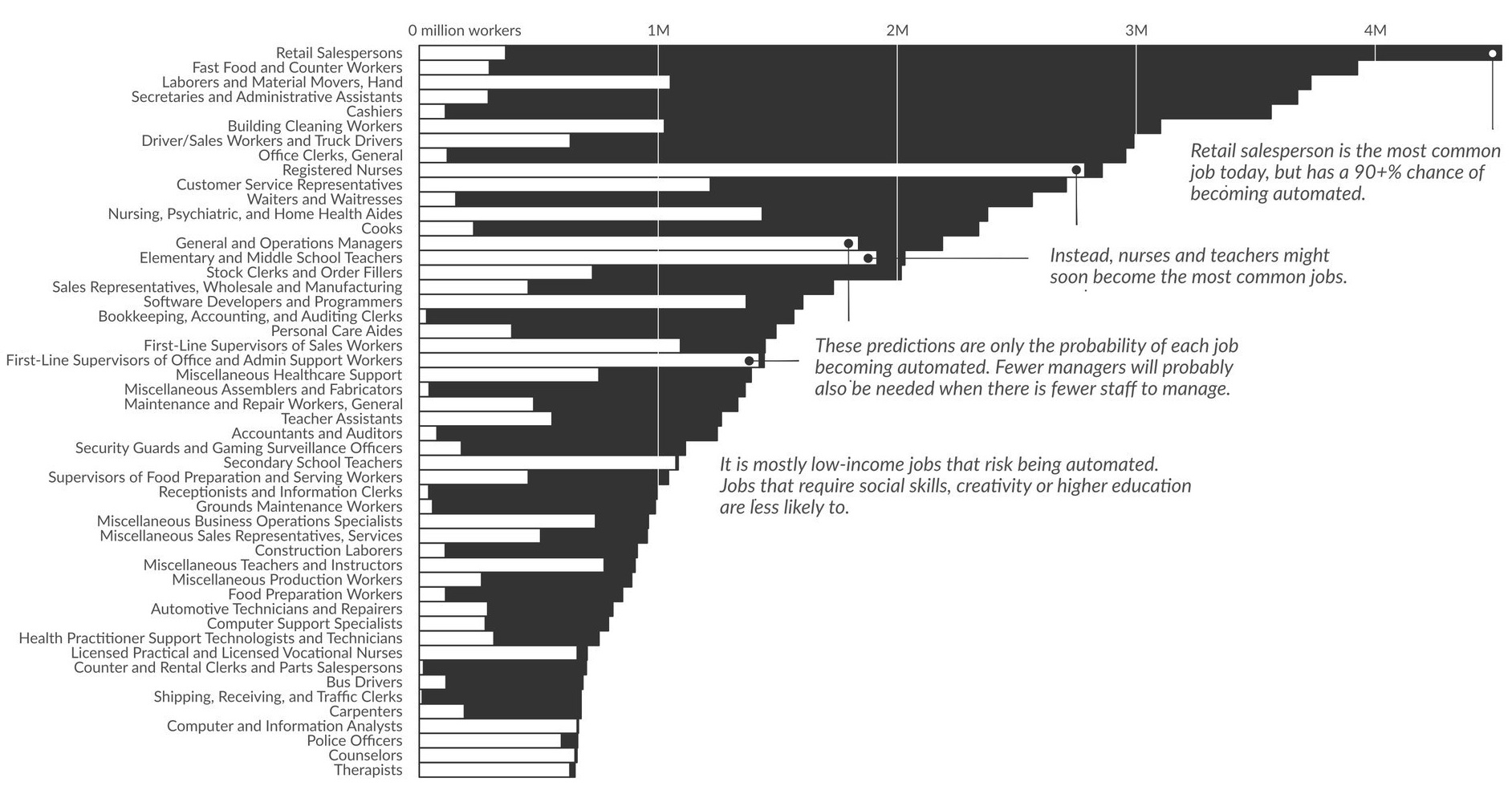
What types of jobs will be lost to automation? This data visualization applies probabilities from a well-cited study to current U.S. job numbers.
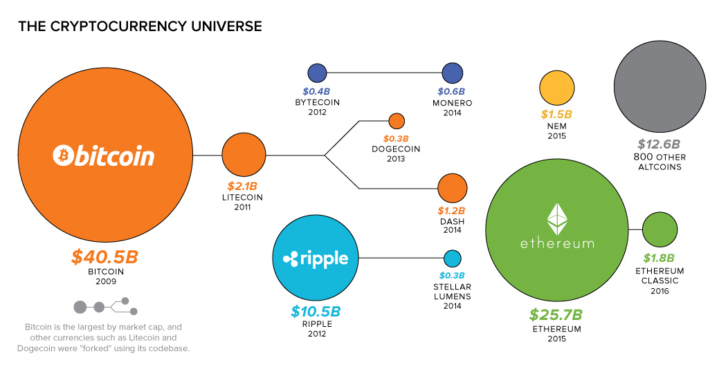
Bitcoin's rise has been meteoric, but it's not the only crypto game in town. Investors should be aware of altcoins such as Ethereum, Ripple, and others...
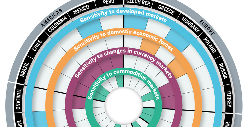
While they all have high expectations for economic growth, the risks facing emerging markets are very different. This visualization breaks it all down.


