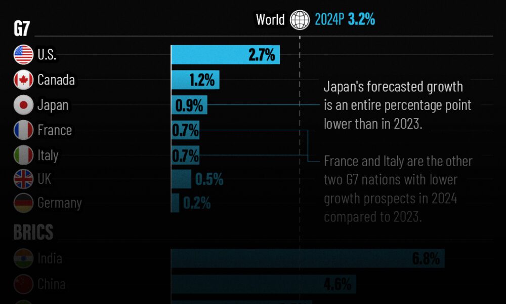
The IMF has released its economic growth forecasts for 2024. How do the G7 and BRICS countries compare?
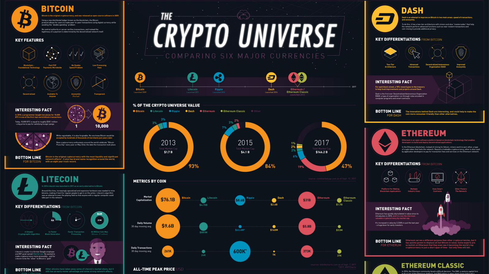
What's the difference between Bitcoin, Ethereum, Dash, Ripple, and Litecoin? This infographic breaks it all down, as well as many other key metrics.

Markets are complex systems - and there is mounting evidence that they have reached a critical state. See how and why the next 'avalanche' could be...
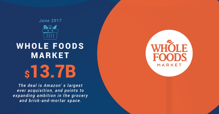
How is Amazon building a massive online store that is everything to everyone? Look no further than the list of Amazon's biggest acquisitions for the answer.
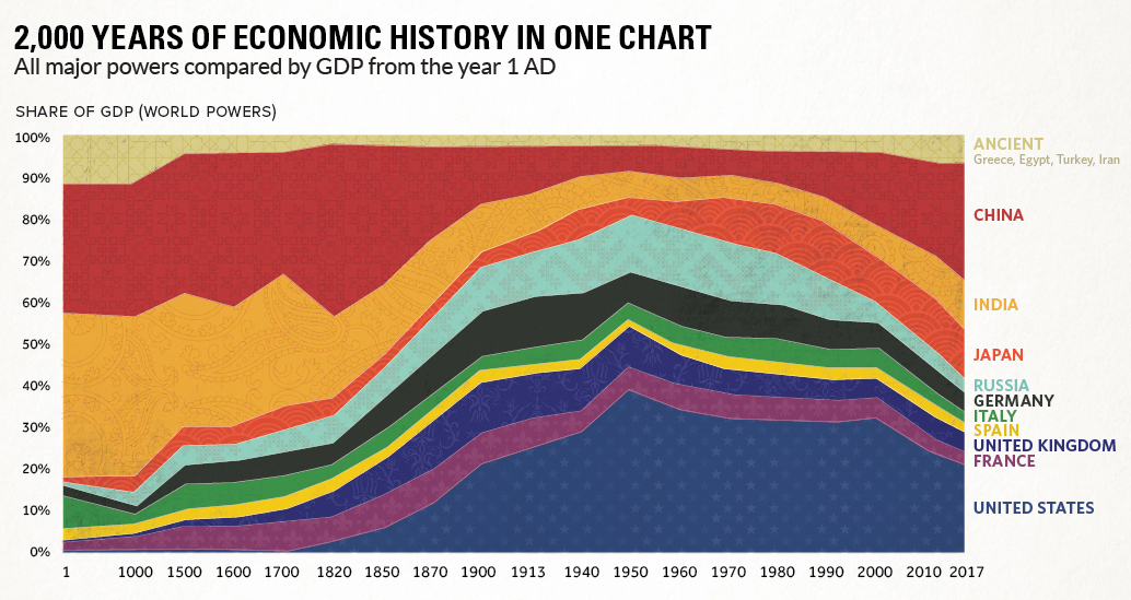
This chart compares the economies of major powers from 1AD all the way until today, showing the impact of the Industrial Revolution and re-emergence of Asia.

Here are four 'tried and true' real estate investing strategies that can be used to make money in the housing market.
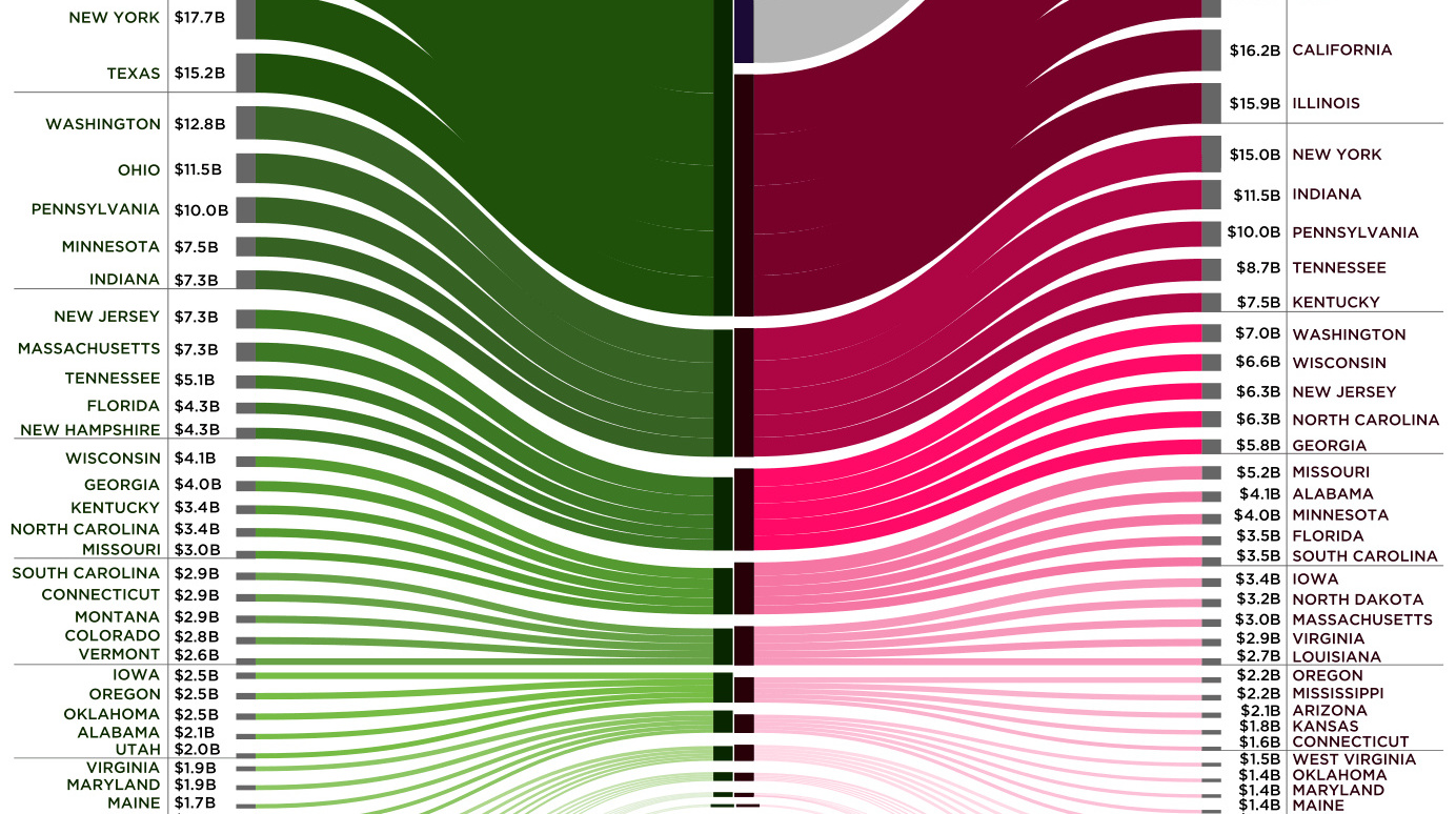
Canada is the largest international trade partner for most U.S. states - use this visualization to see how connected every state is to neighbors to the...
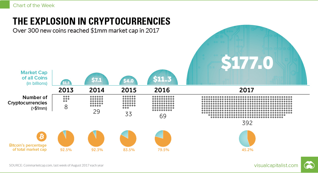
In 12 months, the number of cryptocurrencies worth >$1mm has soared by 468%. Meanwhile, the total value of all currencies together has skyrocketed by 1,466%.
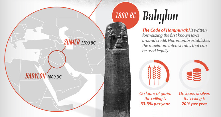
From the writings of antiquity to the innovations that fueled the modern debt boom, we look at the history of consumer credit in this massive infographic.

We break down the world's most valuable sports teams, how the list has changed over time, and how much winning championships helps to build franchise value.
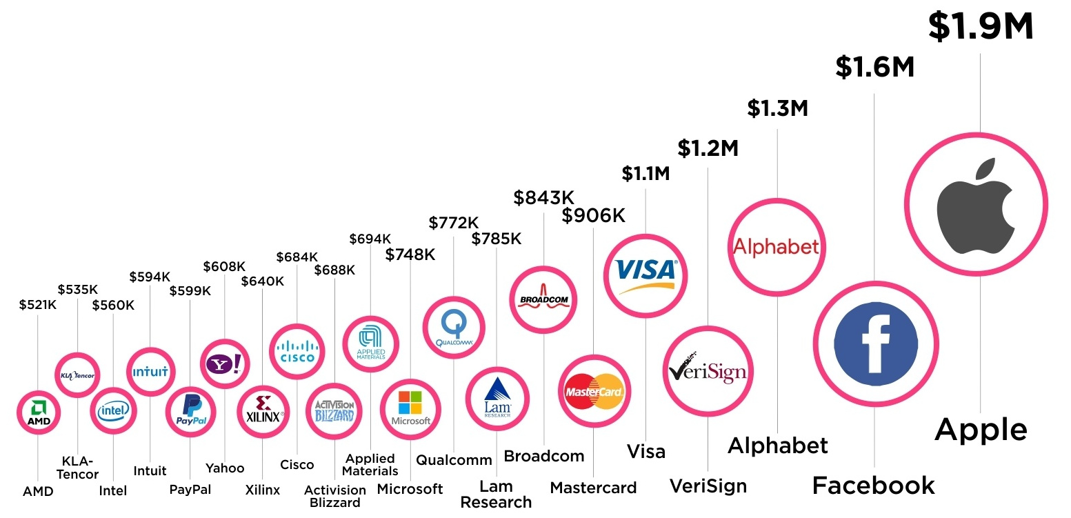
Here's how much tech companies make per person on staff - Apple, Facebook, and Alphabet all make well over $1 million in revenue per employee.


