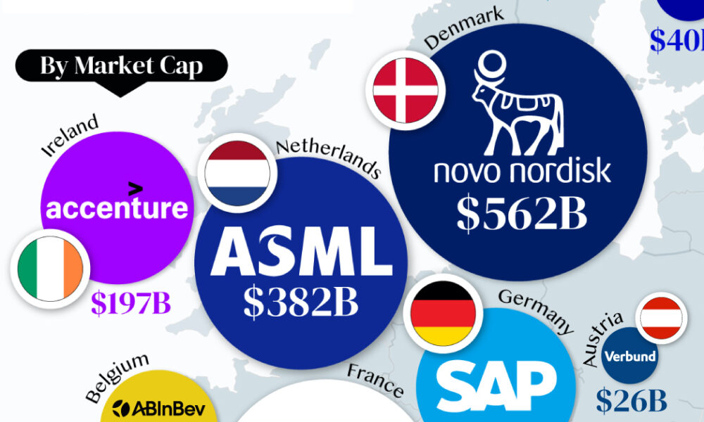
From semiconductor equipment manufacturers to supercar makers, the EU's most valuable companies run the gamut of industries.
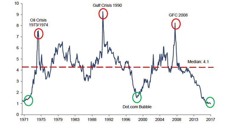
Here's how all major commodities have done so far this year, as well as one chart that shows why they could still be very cheap for...
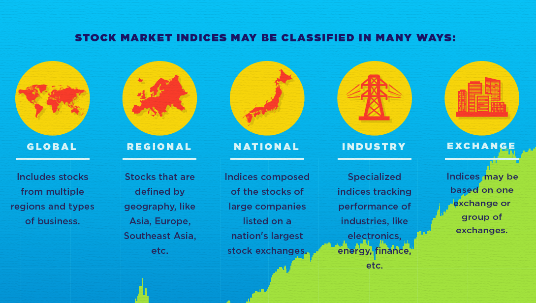
This infographic helps to explain the basics around what a stock market index is, and what it does.

See the cities that the ultra-rich are buying in - and which cities are the up-and-comers in the ever-changing market for luxury real estate.
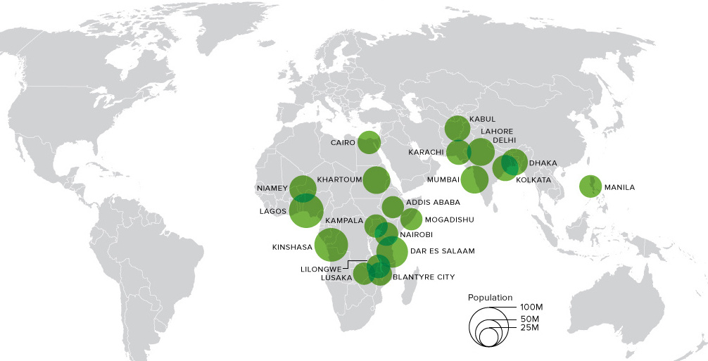
This animation shows big changes in the world's most populous cities over the next 80+ years. Africa alone will hold 13 cities bigger than NYC by...
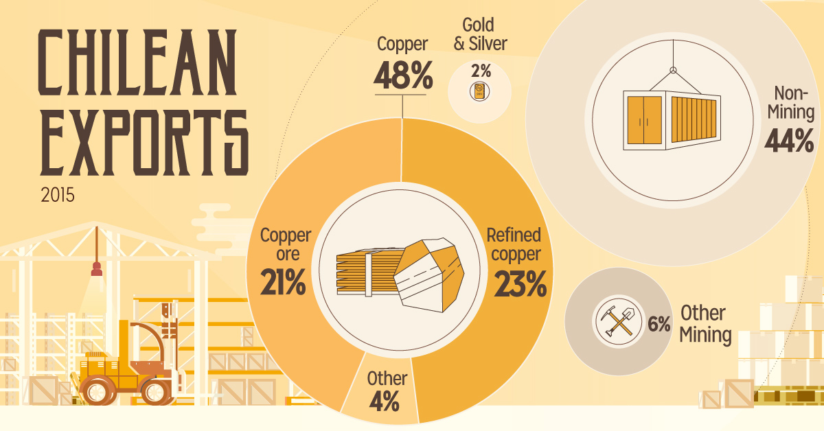
How Chile became a copper powerhouse, and how this helped to propel its economy to become the richest and freest in Latin America.
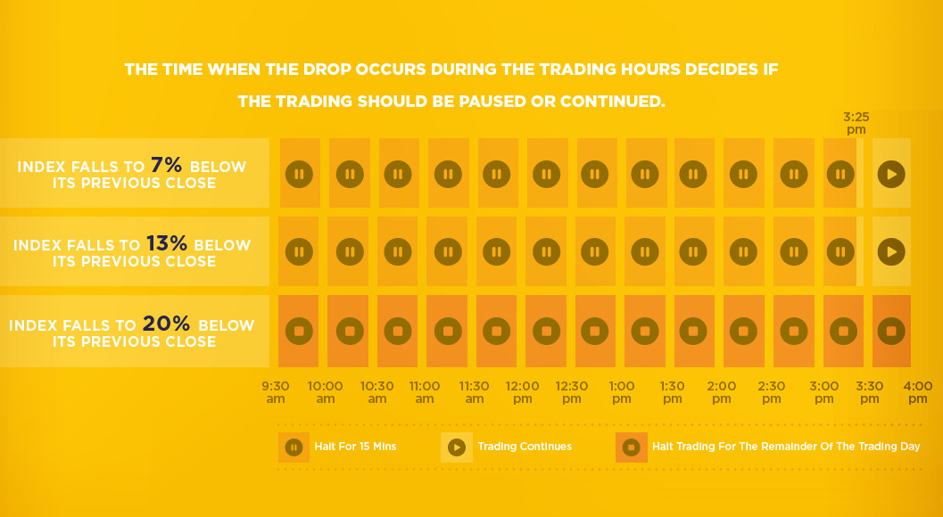
Here's how 'circuit breakers' in the stock market work, and how these pauses are supposed to prevent the next market crash from happening.
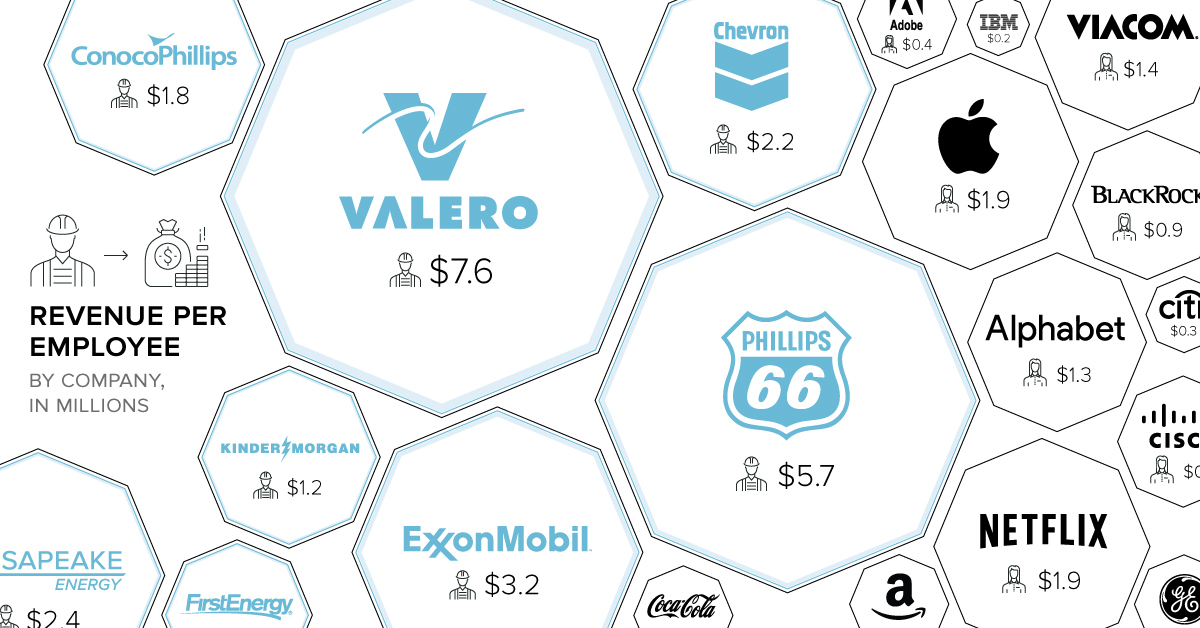
When it comes to revenue per employee, energy companies dominate. On average, oil companies bring in 2x more per employee than companies in other sectors.
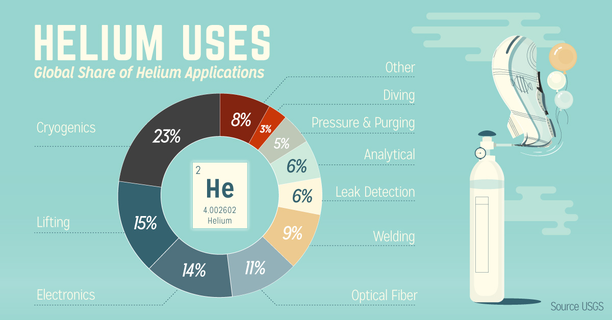
Helium is incredibly important for technology. Yet, because it is so light, it escapes into the atmosphere and is very limited in supply.
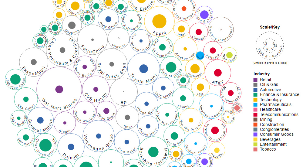
This data visualization compares the revenue and profit numbers for the top 100 companies by market valuation in the world.
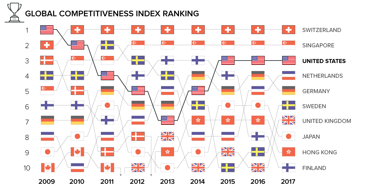
What makes a country competitive on the world stage? Today's animation and interactive charts show global competitiveness over time, and how it's measured.


