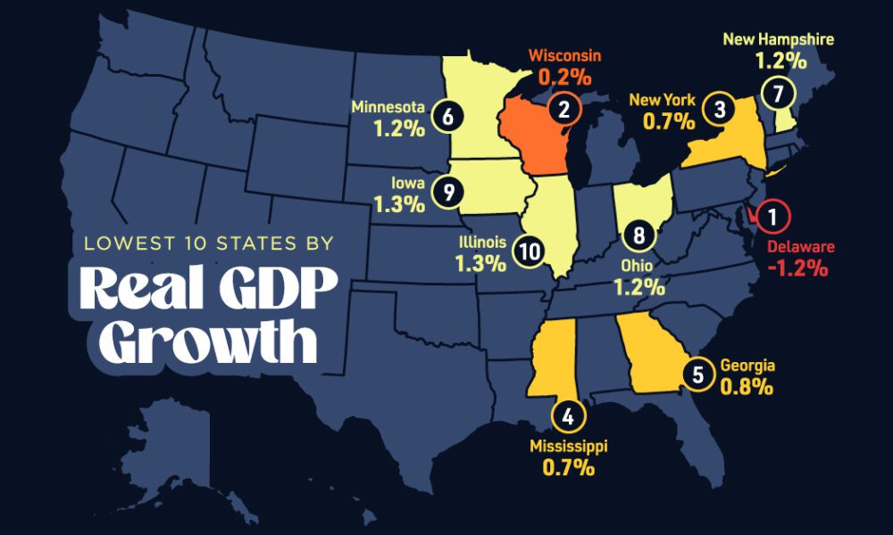

In this graphic, we show where real GDP lagged the most across America in 2023 as high interest rates weighed...
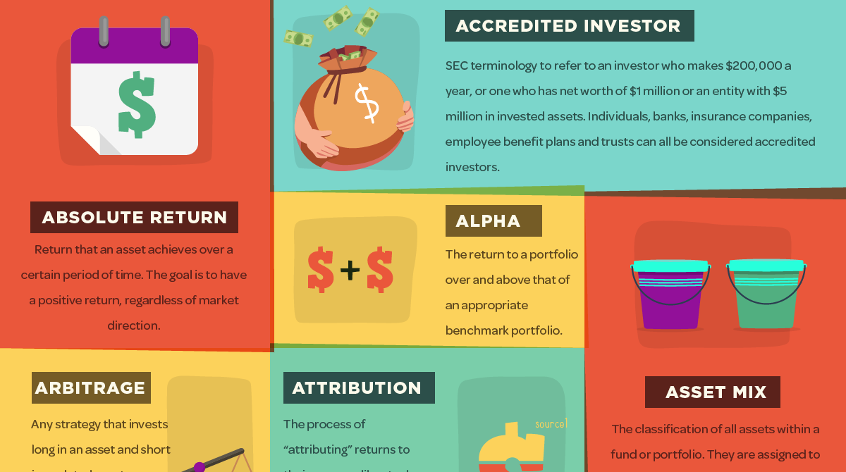
Hedge funds may seem secretive and mysterious at first, but this infographic helps to make them more understandable. Here's 48 hedge fund terms you should know.
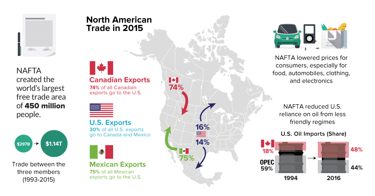
Everything you need to know about NAFTA, including a comparison of economic numbers before and since the agreement was signed in 1994.
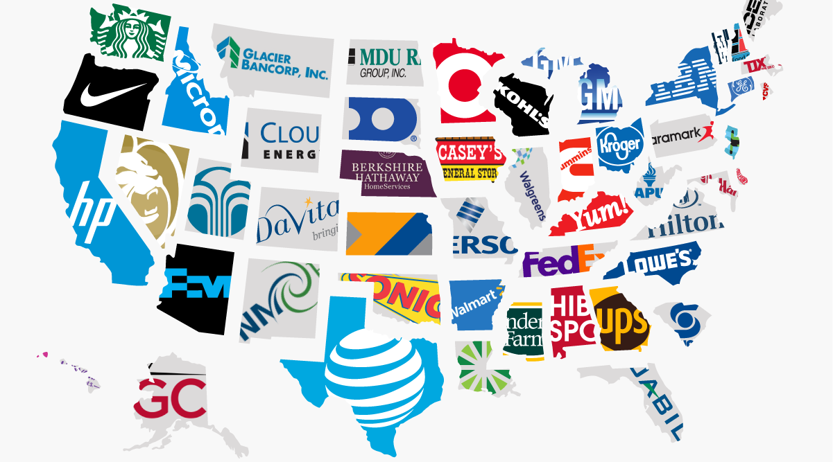
What is the largest company in each state? This infographic breaks it down based on the number of employees.
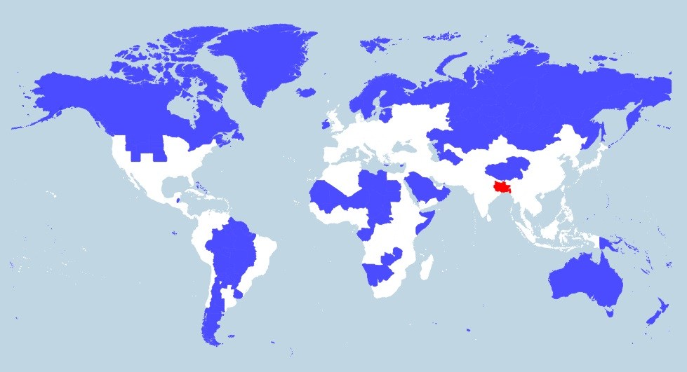
More people live in the tiny red region than all of the blue areas combined. This map really shows the disparity in population density throughout the...
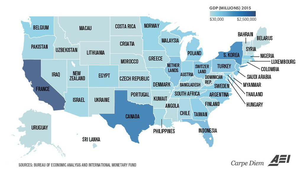
Texas is the size of Canada, and California is similar to France. Even tiny Vermont is comparable to a country's GDP (Bahrain).
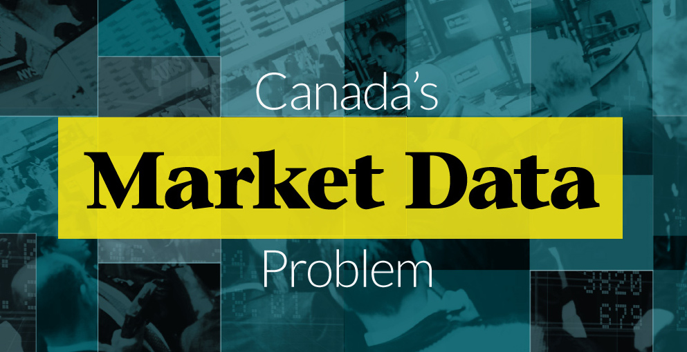
Do investors see an accurate depiction of market data in Canada? The answer is surprising.
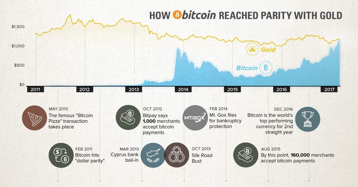
After being the top performing currency for the last two years, bitcoin has hit another milestone. This chart plots a short history of the cryptocurrency.
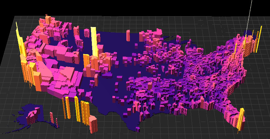
What are the most expensive U.S. housing markets? This interactive 3D map looks at county-level data by price per square foot to provide an answer.

Gold packs a high amount of value in a tiny package - and these gold cube visualizations help put the value and extreme rarity of gold...
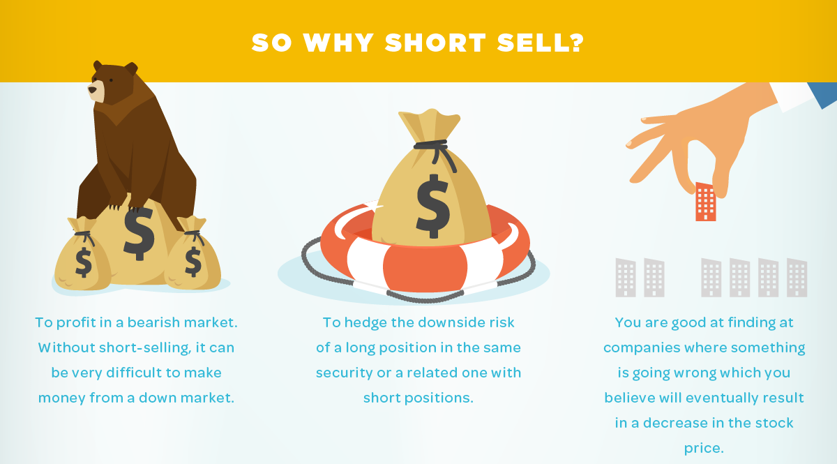
A look at the potential risks and added costs of short selling, but also an explanation where the practice may make sense for some investors.


