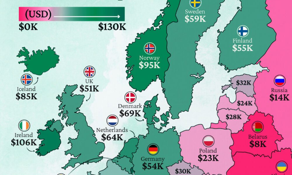
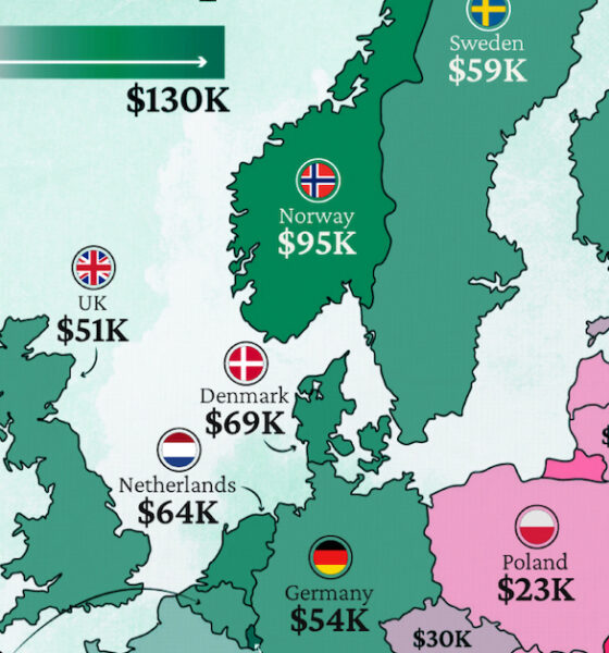
Which European economies are richest on a GDP per capita basis? This map shows the results for 44 countries across...

Roughly 75% of all financial market volume comes from automated trading. Here's how algorithms caused the flash crash in the British pound in early October.
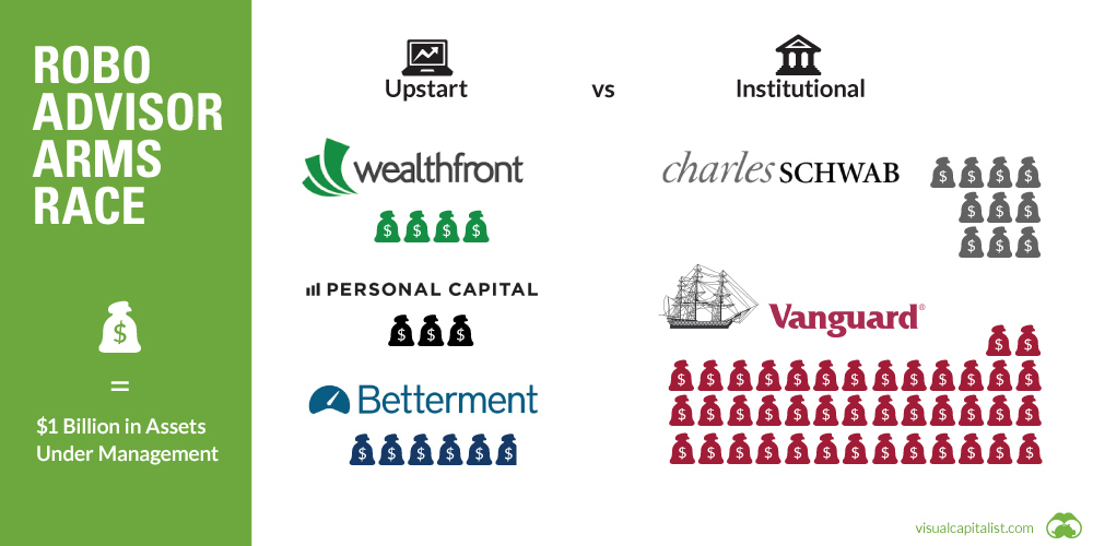
Can upstart robo-advisors compete against the scale of financial behemoths like Vanguard or Blackrock? See in this week's chart.

With zinc prices up over 35% in 2016, many metal investors are taking a second look at zinc. See 11 reasons to re-think zinc in this...
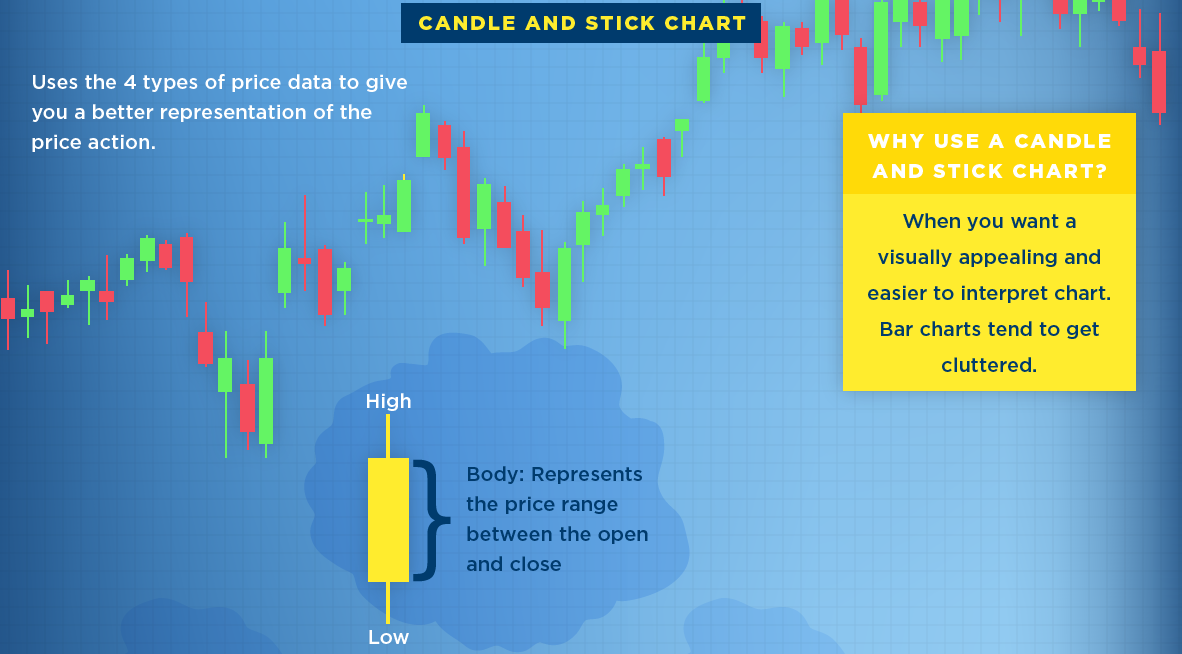
What is a stock chart? Here's three of the most common types of stock charts, along with a description of the data they typically provide investors.
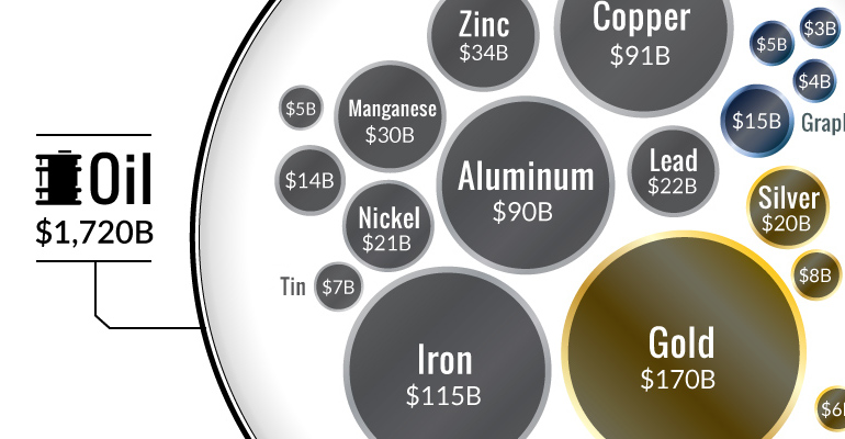
Ever wonder why the oil industry has so much influence? This chart shows that all metal markets combined don't even come close to touching the oil...
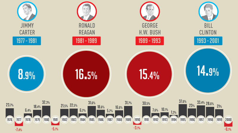
This infographic shows how the U.S. market performs in each year of a presidential term - and specifically, how the market does in election years.
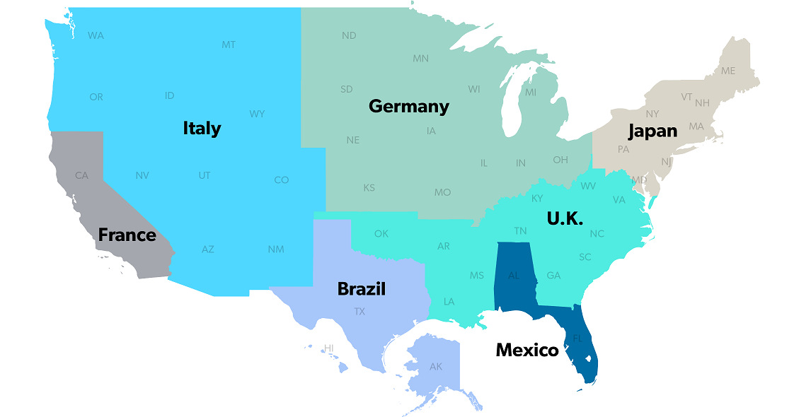
The United States has a $18 trillion economy - the biggest in the world. But here's another way of looking at it, using three interesting maps.
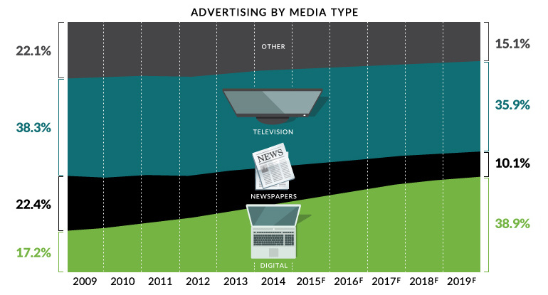
Digital media will be the largest advertising channel globally by 2019 - even bigger than television. This chart covers the death of traditional media.
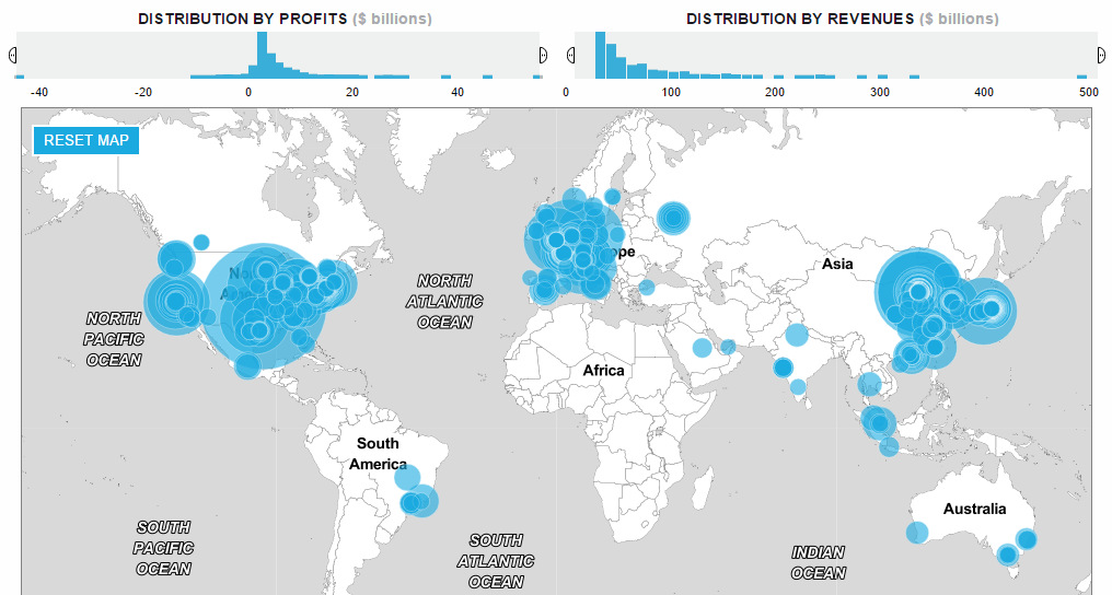
How has the list of the world's largest companies by revenue changed over the last 20 years? See the rise and fall of the companies on...

Here are nine 'black swan' events in recent memory that profoundly changed markets, ranging from the Asian financial crisis of 1997 to the more current Brexit.


