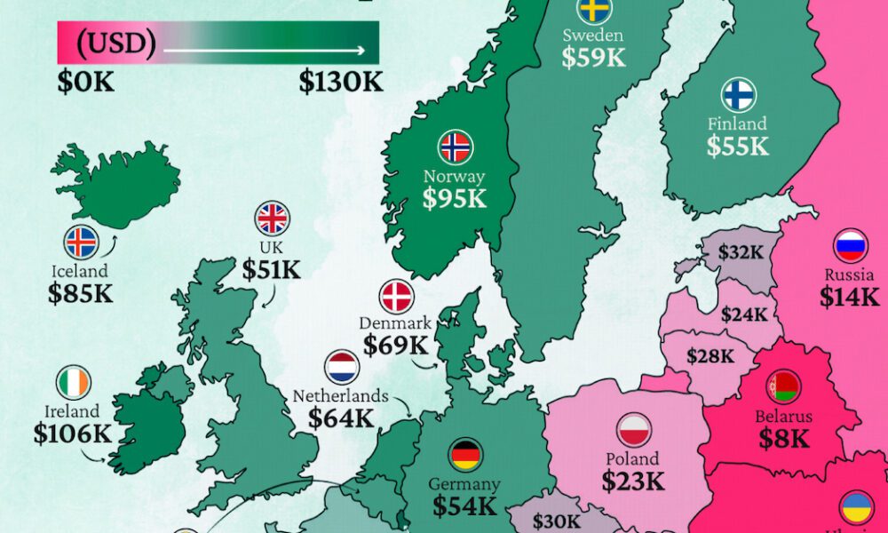
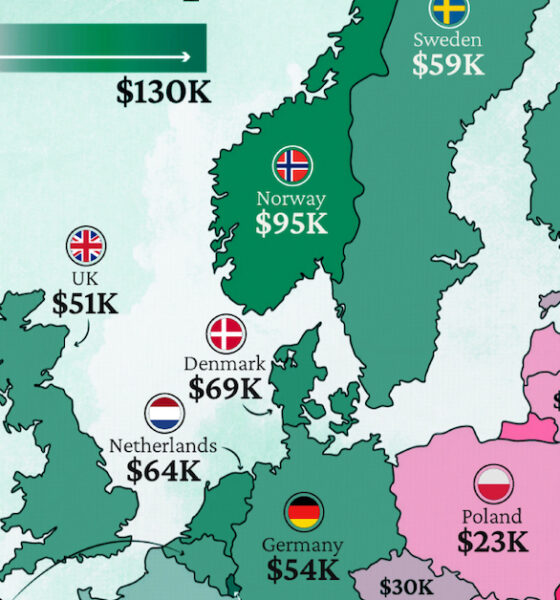
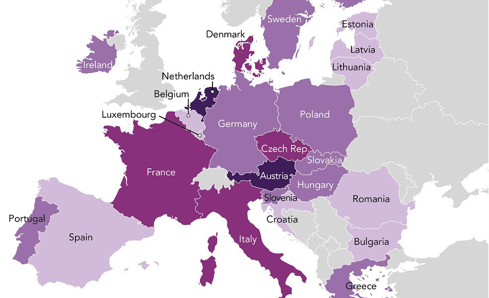
Which European economies are richest on a GDP per capita basis? This map shows the results for 44 countries across...
The rise of Asia has been swift. Here's three GIFs that show the speed of China in becoming an economic power house - and how India...
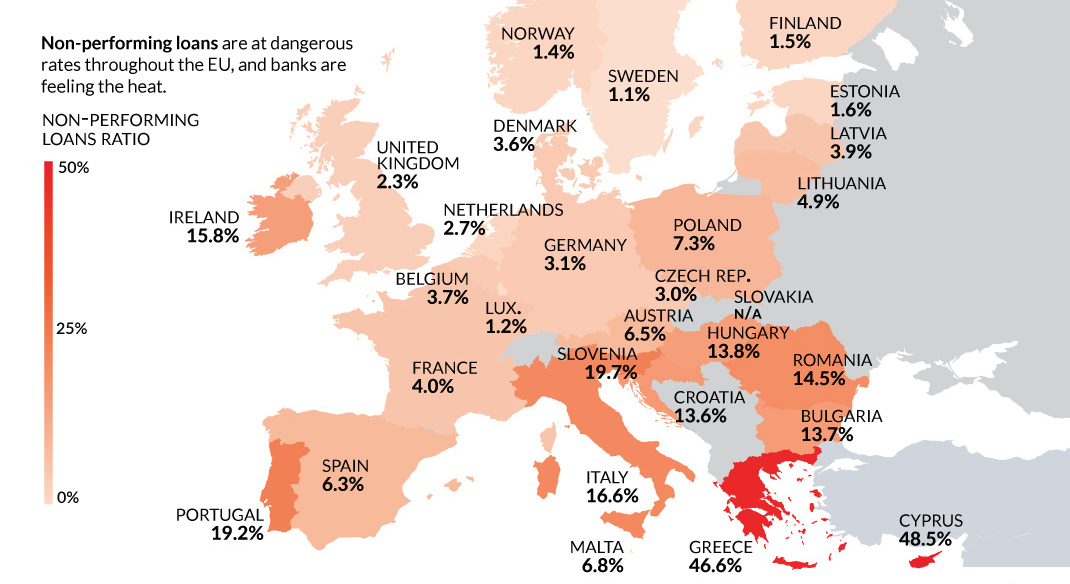
Despite the potential negative economic consequences, there is one reason a Brexit makes sense: non-performing loans and Europe's troubled banking sector.
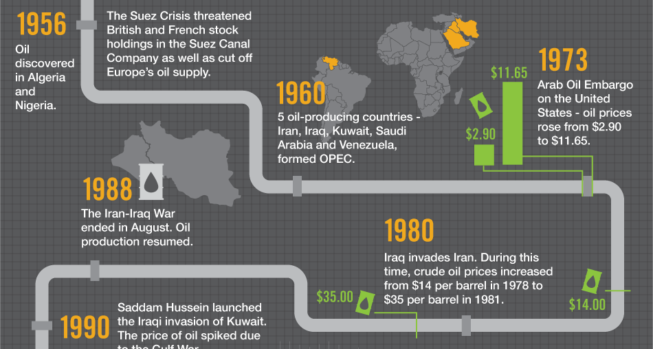
Oil is the world's most traded commodity and a staple for investors - this infographic shows the volatile history of crude oil markets.
What will be the driving factors behind global real estate investing over the coming years? This infographic covers three that are worth keeping an eye on.
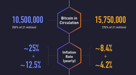
On July 9, 2016, the bitcoin halving event cut the rewards for mining in half. Today's infographic explores the progress of bitcoin since the last halving.
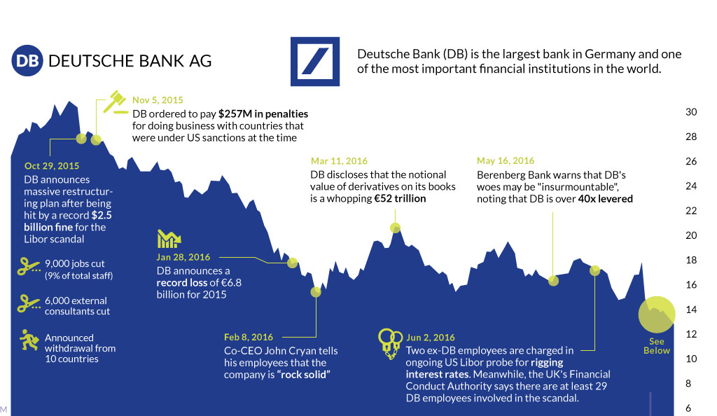
The fate of Germany's largest bank appears to be sealed. This timeline shows the fall of Deutsche Bank, one of Europe's most crucial financial institutions.
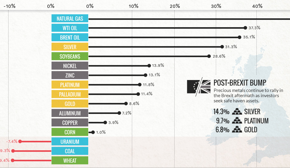
Commodities are back! Precious metals hit two-year highs post-Brexit, while oil and natural gas had their best quarter in years.
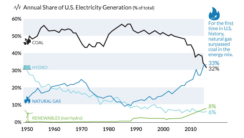
The decline of coal has been swift and unprecedented. We show in these three charts how it went from American energy hero to zero.
Europe's got a fever, and the only prescription is...more referendums. Austria and Holland have been identified by Eurasia Group as the likely sources.
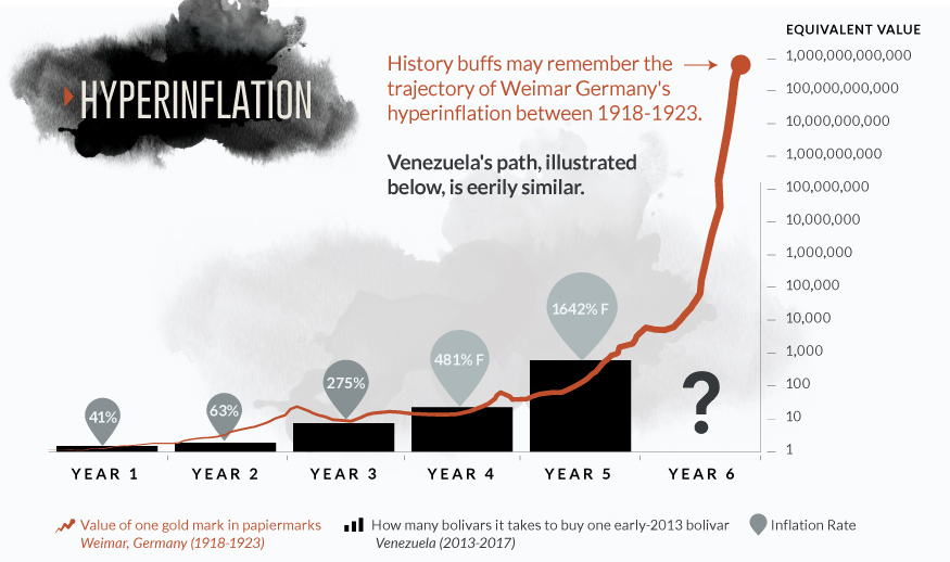
Does the chart for the Venezuelan bolivar look eerily familiar? Get a full perspective on Venezuelan hyperinflation with these two important visualizations.


