Markets
These 3 Animated Charts Capture the Economic Rise of Asia
The economic rise of Asia has been swift, but it has also been a little reckless at times.
China’s rapid spending and investment has come at a price. The country is now saddled with a massive debt bomb that could detonate at any moment. Further, economic interests have helped to create a precarious situation in the South China Sea, which many experts see as having escalating potential for armed conflict. Such actions would disrupt trade along one of the most important sea routes in the world.
To be fair, no one ever said that executing on five-year plans would be easy.
The Economic Rise of Asia
Despite the possible economic landmines that could be waiting for China, it is still impressive how fast this all happened.
China now has the second-largest economy by a wide margin, but before the 1990s the country did not even crack the top 10.
The following three animated charts from data visualization whiz-kid Aron Strandberg help to tell the story of the rise of China – and how India is projected to follow in those same footsteps.
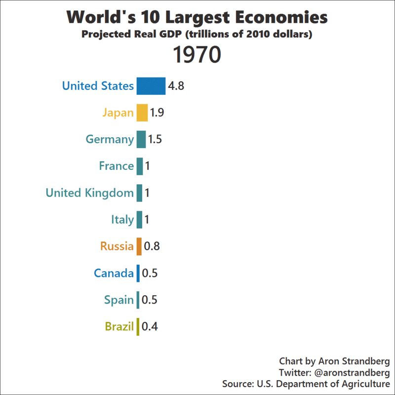
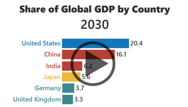
By the year 2030, it is projected that China and India will both be in the top three economies by real GDP. Even with growth continuing to stagnate, Japan remains in fourth place.
European economies such as France, Italy, and Spain also begin to slow in their pace of growth as the European Debt Crisis, demographics, and other factors start to weigh on them in the late 2000s.
Here’s another look at the top 10, this time with a focus on the share of the global economy that each country will have. This chart really shows the effects of this aforementioned stagnation in Japan, as well as the slowing growth in Europe.
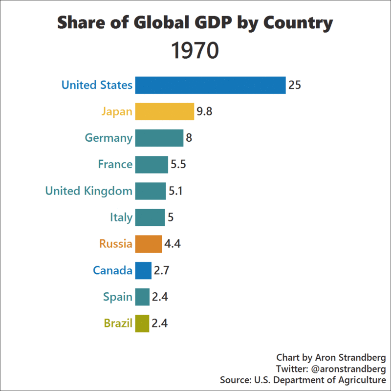
Japan’s share of the world economy drops like a rock – and the same goes for countries like Italy and France, which also fall down the list.
By 2030, the United States, China, and India now make up almost 43% of the global economy.
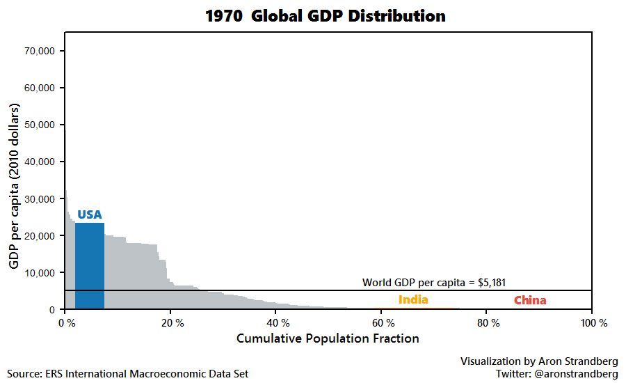
Lastly, we show GDP per capita charted against population share:


Markets
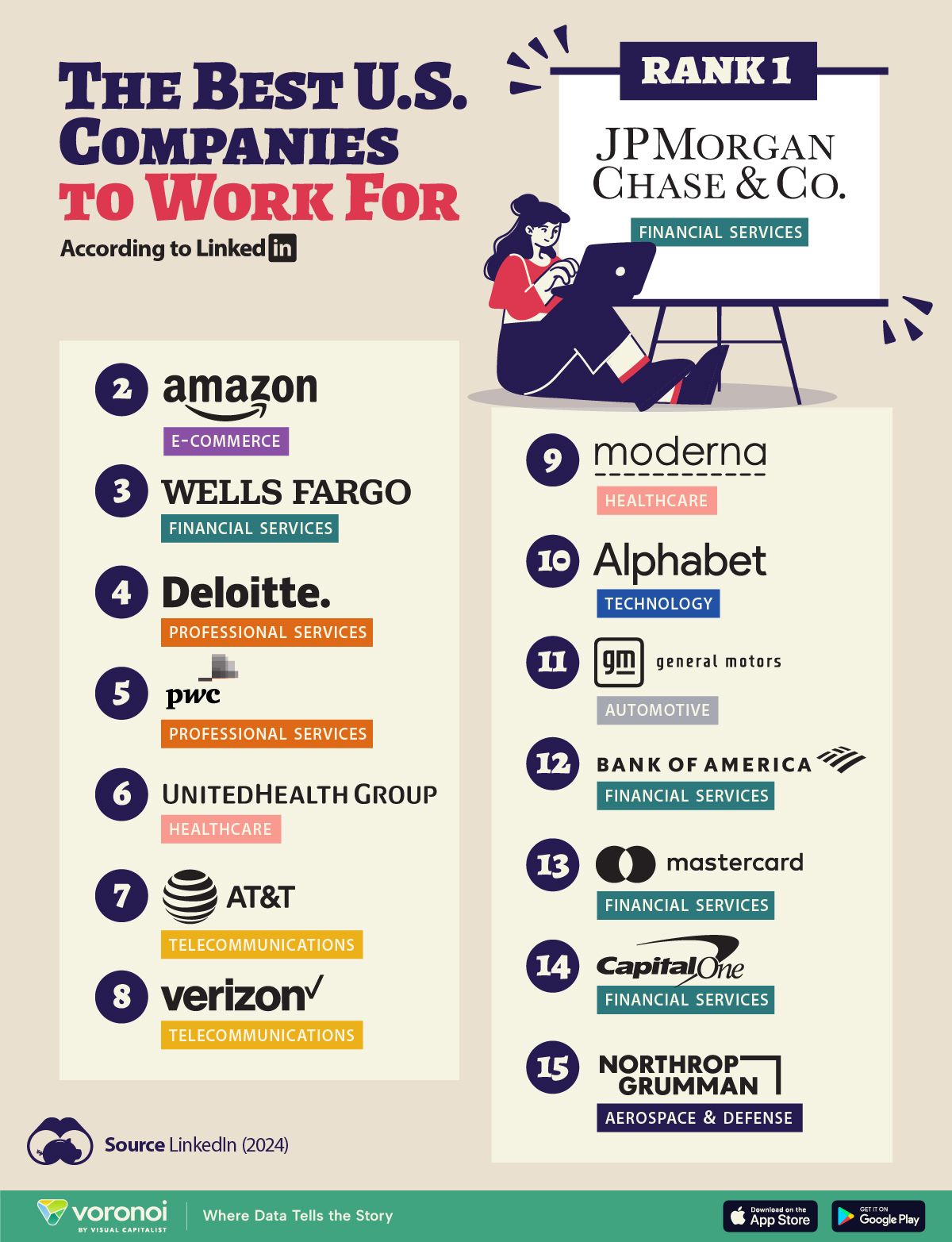
The Best U.S. Companies to Work for According to LinkedIn
We visualized the results of a LinkedIn study on the best U.S. companies to work for in 2024.
The Best U.S. Companies to Work for According to LinkedIn
This was originally posted on our Voronoi app. Download the app for free on iOS or Android and discover incredible data-driven charts from a variety of trusted sources.
In this graphic, we list the 15 best U.S. companies to work for in 2024, according to LinkedIn data.
LinkedIn ranked companies based on eight pillars: ability to advance, skills growth, company stability, external opportunity, company affinity, gender diversity, educational background, and employee presence in the country.
To be eligible, companies must have had 5,000 or more global employees, with at least 500 in the country as of December 31, 2023.
Data and Highlights
Financial institutions dominate the ranking of the best U.S. companies to work for in 2024, with JP Morgan Chase & Co. ranking first.
| Rank | Company | Industry |
|---|---|---|
| 1 | JP Morgan Chase & Co. | Financial Services |
| 2 | Amazon | E-commerce |
| 3 | Wells Fargo | Financial Services |
| 4 | Deloitte | Professional Services |
| 5 | PwC | Professional Services |
| 6 | UnitedHealth Group | Healthcare |
| 7 | AT&T | Telecommunications |
| 8 | Verizon | Telecommunications |
| 9 | Moderna | Pharmaceuticals |
| 10 | Alphabet Inc. | Technology |
| 11 | General Motors | Automotive |
| 12 | Bank of America | Financial Services |
| 13 | Mastercard | Financial Services |
| 14 | Capital One | Financial Services |
| 15 | Northrop Grumman | Aerospace & Defense |
J.P. Morgan has a program that offers opportunities for candidates without a university degree. In fact, in 2022, 75% of job descriptions at the bank for experienced hires did not require a college degree.
Meanwhile, Deloitte and Amazon offer a variety of free training courses, including in AI.
Moderna includes in its employee package benefits to help avoid employee burnout — from subsidized commuter expenses and pop-up daycare centers, to wellness coaches.
Mastercard offers flexible work availability, with 11.5% remote and 89% hybrid options.
It’s also interesting to note that only Amazon and Alphabet made the cut from the ‘Magnificent Seven’ companies (Apple, Microsoft, Google parent Alphabet, Amazon, Nvidia, Meta Platforms, and Tesla).
See more about the best companies to work for in this infographic, which covers a separate ranking from Glassdoor.

-

 VC+7 days ago
VC+: Get Our Key Takeaways From the IMF’s World Economic Outlook
-

 Maps2 weeks ago
The Largest Earthquakes in the New York Area (1970-2024)
-

 Green2 weeks ago
Ranked: The Countries With the Most Air Pollution in 2023
-

 Green2 weeks ago
Ranking the Top 15 Countries by Carbon Tax Revenue
-

 Markets2 weeks ago
U.S. Debt Interest Payments Reach $1 Trillion
-

 Mining2 weeks ago
Gold vs. S&P 500: Which Has Grown More Over Five Years?
-

 Energy2 weeks ago
The World’s Biggest Nuclear Energy Producers
-

 Misc2 weeks ago
How Hard Is It to Get Into an Ivy League School?