Markets
Cheat Sheet: NAFTA’s Mixed Track Record Since 1994
NAFTA’s Mixed Track Record
Cheat sheet sums up the results of North American trade since 1994
The Chart of the Week is a weekly Visual Capitalist feature on Fridays.
On January 1, 1994, the North American Free Trade Agreement (NAFTA) officially came into effect, virtually eliminating all tariffs and trade restrictions between the United States, Canada, and Mexico.
Bill Clinton, who lobbied extensively to get the deal done, said it would encourage other nations to work towards a broader world-trade pact. “NAFTA means jobs. American jobs, and good-paying American jobs,” said Clinton, as he signed the document, “If I didn’t believe that, I wouldn’t support this agreement.”
Ross Perot had a contrary perspective. Lobbying heavily against the agreement, he noted that if it was ratified, Americans would hear a giant “sucking sound” as jobs went south of the border to Mexico.
It’s a Complicated World
Fast forward 20 years, and NAFTA is a hot-button issue again. Donald Trump has said he is working on “renegotiating” the agreement, and many Americans are sympathetic to this course of action.
However, coming to a decisive viewpoint on NAFTA’s success or failure can be difficult to achieve. Over two decades, the economic and political landscape has changed. China has risen and created a surplus of cheap labor, technology has changed massively, and central banks have kept the spigots on with QE and ultra-low interest rates. Deciphering what results have been the direct cause of NAFTA – and what is simply the result of a fast-changing world – is not quite straightforward.
In today’s chart, we break down a variety of metrics on the U.S., Canada, and Mexico to give a “before” and “after” story. The result is a mixed bag, but it will at least paint a picture of how the nations have fared comparatively since the agreement came into effect in 1994.
NAFTA: A Mixed Track Record
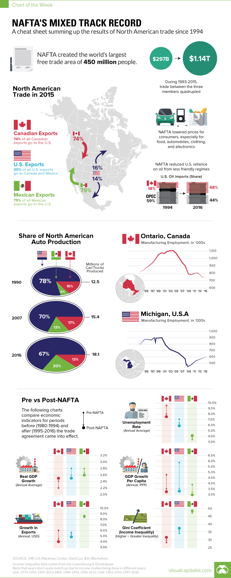
On the plus side, NAFTA created the world’s largest free trade area of 450 million people, where trade between the three members quadrupled from $297 billion to $1.14 trillion during the period of 1993-2015.
Further, the agreement likely had the effect of lowering prices for consumers, especially for food, automobiles, clothing, and electronics. It also reduced U.S. reliance on oil from OPEC. In 1994, the United States got 59% of its oil imports from OPEC, but that number is reduced to 44% today as trade with Canada has ramped up. Canada is now the #1 source of foreign oil in the United States.
NAFTA has also unequivocally led to the movement of auto jobs. While the amount of autos manufactured in North America has increased from 12.5 million (1990) to 18.1 million (2016), the share of that production has shifted.
North American Auto Production by Share
| Year | Canada | Mexico | USA | Total Car/Trucks Produced in North America |
|---|---|---|---|---|
| 1990 | 16% | 6% | 78% | 12.5 million |
| 2007 | 17% | 13% | 70% | 15.4 million |
| 2016 | 13% | 20% | 67% | 18.1 million |
Mexico now produces 20% of all vehicles in North America – and U.S./Canadian shares have shifted down accordingly over the years. The ultimate result is the destruction of hundreds of thousands of jobs in both Michigan and Ontario, Canada.
As a final note, we also looked at comparing macroeconomic indicators from 1980-1993 (“Pre-NAFTA”) with those from 1994-2016 (“Post-NAFTA”).
For the U.S. in particular, here’s what has changed:
| Metric | Pre-NAFTA (1980-1993) | Post-NAFTA (1994-2016) | Change |
|---|---|---|---|
| Avg. Real GDP Growth | 2.8% | 2.5% | -0.3% |
| Avg. Unemployment Rate | 7.1% | 5.9% | -1.2% |
| Annual Growth in Exports | 5.7% | 4.9% | -0.9% |
| Annual Growth in GDP per Capita (PPP) | 5.9% | 3.3% | -2.6% |
| Average Gini Coefficient (Inequality) | 34.2 | 37.4 | 3.2 |
This is not intended to be a comprehensive analysis, but it gives a snapshot of what has changed since NAFTA was ratified.


Markets
U.S. Debt Interest Payments Reach $1 Trillion
U.S. debt interest payments have surged past the $1 trillion dollar mark, amid high interest rates and an ever-expanding debt burden.


U.S. Debt Interest Payments Reach $1 Trillion
This was originally posted on our Voronoi app. Download the app for free on iOS or Android and discover incredible data-driven charts from a variety of trusted sources.
The cost of paying for America’s national debt crossed the $1 trillion dollar mark in 2023, driven by high interest rates and a record $34 trillion mountain of debt.
Over the last decade, U.S. debt interest payments have more than doubled amid vast government spending during the pandemic crisis. As debt payments continue to soar, the Congressional Budget Office (CBO) reported that debt servicing costs surpassed defense spending for the first time ever this year.
This graphic shows the sharp rise in U.S. debt payments, based on data from the Federal Reserve.
A $1 Trillion Interest Bill, and Growing
Below, we show how U.S. debt interest payments have risen at a faster pace than at another time in modern history:
| Date | Interest Payments | U.S. National Debt |
|---|---|---|
| 2023 | $1.0T | $34.0T |
| 2022 | $830B | $31.4T |
| 2021 | $612B | $29.6T |
| 2020 | $518B | $27.7T |
| 2019 | $564B | $23.2T |
| 2018 | $571B | $22.0T |
| 2017 | $493B | $20.5T |
| 2016 | $460B | $20.0T |
| 2015 | $435B | $18.9T |
| 2014 | $442B | $18.1T |
| 2013 | $425B | $17.2T |
| 2012 | $417B | $16.4T |
| 2011 | $433B | $15.2T |
| 2010 | $400B | $14.0T |
| 2009 | $354B | $12.3T |
| 2008 | $380B | $10.7T |
| 2007 | $414B | $9.2T |
| 2006 | $387B | $8.7T |
| 2005 | $355B | $8.2T |
| 2004 | $318B | $7.6T |
| 2003 | $294B | $7.0T |
| 2002 | $298B | $6.4T |
| 2001 | $318B | $5.9T |
| 2000 | $353B | $5.7T |
| 1999 | $353B | $5.8T |
| 1998 | $360B | $5.6T |
| 1997 | $368B | $5.5T |
| 1996 | $362B | $5.3T |
| 1995 | $357B | $5.0T |
| 1994 | $334B | $4.8T |
| 1993 | $311B | $4.5T |
| 1992 | $306B | $4.2T |
| 1991 | $308B | $3.8T |
| 1990 | $298B | $3.4T |
| 1989 | $275B | $3.0T |
| 1988 | $254B | $2.7T |
| 1987 | $240B | $2.4T |
| 1986 | $225B | $2.2T |
| 1985 | $219B | $1.9T |
| 1984 | $205B | $1.7T |
| 1983 | $176B | $1.4T |
| 1982 | $157B | $1.2T |
| 1981 | $142B | $1.0T |
| 1980 | $113B | $930.2B |
| 1979 | $96B | $845.1B |
| 1978 | $84B | $789.2B |
| 1977 | $69B | $718.9B |
| 1976 | $61B | $653.5B |
| 1975 | $55B | $576.6B |
| 1974 | $50B | $492.7B |
| 1973 | $45B | $469.1B |
| 1972 | $39B | $448.5B |
| 1971 | $36B | $424.1B |
| 1970 | $35B | $389.2B |
| 1969 | $30B | $368.2B |
| 1968 | $25B | $358.0B |
| 1967 | $23B | $344.7B |
| 1966 | $21B | $329.3B |
Interest payments represent seasonally adjusted annual rate at the end of Q4.
At current rates, the U.S. national debt is growing by a remarkable $1 trillion about every 100 days, equal to roughly $3.6 trillion per year.
As the national debt has ballooned, debt payments even exceeded Medicaid outlays in 2023—one of the government’s largest expenditures. On average, the U.S. spent more than $2 billion per day on interest costs last year. Going further, the U.S. government is projected to spend a historic $12.4 trillion on interest payments over the next decade, averaging about $37,100 per American.
Exacerbating matters is that the U.S. is running a steep deficit, which stood at $1.1 trillion for the first six months of fiscal 2024. This has accelerated due to the 43% increase in debt servicing costs along with a $31 billion dollar increase in defense spending from a year earlier. Additionally, a $30 billion increase in funding for the Federal Deposit Insurance Corporation in light of the regional banking crisis last year was a major contributor to the deficit increase.
Overall, the CBO forecasts that roughly 75% of the federal deficit’s increase will be due to interest costs by 2034.

-

 Mining2 weeks ago
Charted: The Value Gap Between the Gold Price and Gold Miners
-

 Real Estate1 week ago
Ranked: The Most Valuable Housing Markets in America
-

 Business1 week ago
Charted: Big Four Market Share by S&P 500 Audits
-

 AI1 week ago
The Stock Performance of U.S. Chipmakers So Far in 2024
-

 Misc1 week ago
Almost Every EV Stock is Down After Q1 2024
-

 Money2 weeks ago
Where Does One U.S. Tax Dollar Go?
-

 Green2 weeks ago
Ranked: Top Countries by Total Forest Loss Since 2001
-

 Real Estate2 weeks ago
Visualizing America’s Shortage of Affordable Homes