Misc
Visualizing the Power and Frequency of Earthquakes
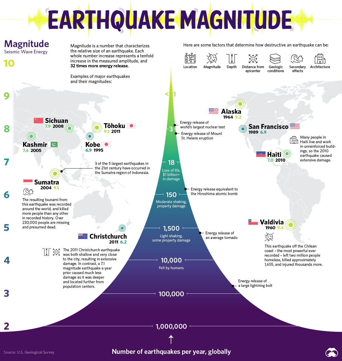


Visualizing the Power and Frequency of Earthquakes
The surface of our planet is in a constant state of creation and destruction as the plates of the Earth collide. It is this movement of the Earth’s crust that causes earthquakes, sending tremors throughout the world.
Today’s graphic is inspired by a classic USGS diagram that tracks the scale and frequency of earthquakes.
Shifting Foundations
Earthquakes occur because the crust of the Earth is made up of several plates. The boundaries of these plates create faults that can run into one another.
Earthquakes describe both the mechanism that causes a sudden stress release along plate boundaries and also the ensuing ground shaking.
They occur when stress builds up along a tectonic fault. This stress causes the two surfaces of the fault, which had previously been stuck together due to friction, to suddenly move, or slide, releasing energy in the form of seismic waves.
Measuring an Earthquake’s Impact
There are three factors to assess the impact of Earthquakes – magnitude, energy, and intensity.
Magnitude is a number most commonly associated with the Richter scale, describing the size of an Earthquake on a scale from 0 to 10 – the latter of which is the maximum motion recorded by a seismograph. Each increase by one on the scale represents a tenfold increase in the amplitude. There are over a million tremors around the planet each year, but it’s not until an earthquake reaches a magnitude of 4 that humans can typically feel it.
Another way to measure the size of an earthquake is by how much energy it releases. The amount of energy radiated by an earthquake is a measure of the potential for damage to man-made structures.
An earthquake releases energy at various frequencies, and in order to calculate accurately, you have to include all frequencies of shaking for the entire event. Some research suggests technology could harness this energy for power generation.
Intensity describes the severity of an earthquake with a qualitative evaluation of its effects on the Earth’s surface and on the built environment. An earthquake may have a high magnitude but if a city or landscape experiences little damage, it can be said that the intensity is low. The Modified Mercalli Intensity Scale measures this intensity.
The World’s Largest Earthquakes by Magnitude
Prior to the development and use of seismographs, around 1900, scientists could only estimate magnitudes, based on historical reports of the extent and severity of damage.
| Date | Location | Magnitude |
|---|---|---|
| May 22, 1960 | Valdivia, Chile | 9.4-9.6 |
| March 27, 1964 | Prince William Sound, Alaska | 9.2 |
| Dec. 26, 2004 | Indian Ocean, Sumatra, Indonesia | 9.1 |
| March 11, 2011 | Pacific Ocean, Tohoku Region, Japan | 9.1 |
| July 8, 1730 | Valparaiso, Chile | 9.1-9.3 (est.) |
| Nov. 4, 1952 | Kamchatka, Russia | 9 |
| Aug. 13, 1868 | Arica, Chile | 8.5-9.0 (est.) |
| January 26, 1700 | Pacific Coast, Modern Day British Columbia | 8.7-9.2 (est.) |
| April 2, 1762 | Chittagong, Bangladesh | 8.8 (est.) |
| Nov. 25, 1833 | Sumatra Indonesia | 8.8 (est.) |
Earthquakes are a fact of life on Earth and mark distinct moments in history. One would think given our knowledge of earthquakes, that humans would avoid these locations – however, the very faults of the Earth also create its greatest advantages.
Living with Your Faults
It’s extremely common to find human settlements along the fault lines where earthquakes occur most frequently. Some could say that this is because these decisions were made before a complete understanding of science enabled us to know the potential risks involved.
However, a recent scientific study reveals that there may be more to the pattern than previously thought. Tectonically active plates may have produced greater biodiversity, more food, and water for our human predecessors.
Certain landscape features formed by tectonic processes such as cliffs, river gorges, and sedimentary valleys create environments that support access to drinking water, shelter, and an abundant food supply.
This inherent problem reveals that humans are more connected to their environments than previously thought. It comes down to a question of how well humans can adapt their lifestyle and built environments to a dynamic planet.
Now let’s worry about the asteroids…


Misc
The Evolution of U.S. Beer Logos
In this graphic, we analyze the evolution of popular U.S. beer logos like Budweiser, Coors Light, Bud Light, and more.


The Evolution of U.S. Beer Logos
This was originally posted on our Voronoi app. Download the app for free on iOS or Android and discover incredible data-driven charts from a variety of trusted sources.
Despite selling a popular product, beer companies have to be creative to stand out in a competitive market.
In this graphic, we analyze the evolution of some U.S. beer logos based on various sources. We chose brands based on a mixture of criteria, including popularity (based on YouGov surveys), availability of logo assets, and those with interesting developments.
Bud Light Back to the ’80s
Despite recent backlash and calls for a boycott after sending a commemorative can to transgender influencer Dylan Mulvaney, Bud Light remains one of America’s best-selling beers.
The brand of light beer, owned by the Anheuser-Busch company, has switched from its more circular logo with italic letters adopted in the 1990s back to the Bud Light badge of the 1980s. It is composed of heavy uppercase lettering, written in two levels in a shade of blue with the inscription placed on a solid white background and enclosed in a thin rectangular frame.
Miller Lite Goes Old School
After following a similar approach to Bud Light’s branding throughout the 2000s, Miller Lite decided to undergo a major rebranding in 2014.
The company returned to its 1970s roots, once again combining a white can with its original blue, gold, and red logo. The redesign was largely considered a success, given that Miller Lite sales immediately increased following the change.
A Symbol of American Brewing
The oldest brand on our U.S. beer list, the Budweiser logo, has undergone more than 15 changes over the years.
The design of two connected triangles represents a red bow tie, as a symbol of American brewing.
The colors of the Budweiser logo include a vibrant red, which helps the logo stand out and be easily recognizable from a distance. Studies also suggest that the color red stimulates appetite. Meanwhile, the white inscription symbolizes purity and cleanliness.
Curious to learn more about the beer market? Check out this graphic about global beer consumption.

-

 Markets7 days ago
The Most Valuable Companies in Major EU Economies
-

 Wealth2 weeks ago
Charted: Which City Has the Most Billionaires in 2024?
-

 Technology2 weeks ago
All of the Grants Given by the U.S. CHIPS Act
-

 Green2 weeks ago
The Carbon Footprint of Major Travel Methods
-

 United States2 weeks ago
Visualizing the Most Common Pets in the U.S.
-

 Culture2 weeks ago
The World’s Top Media Franchises by All-Time Revenue
-

 voronoi1 week ago
Best Visualizations of April on the Voronoi App
-

 Wealth1 week ago
Charted: Which Country Has the Most Billionaires in 2024?