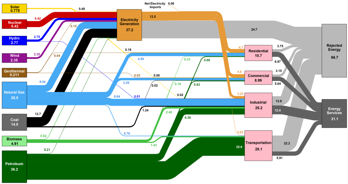
How is the country's energy generated, and how is it consumed? This nifty Sankey diagram shows U.S. energy consumption in a simple and understandable way.
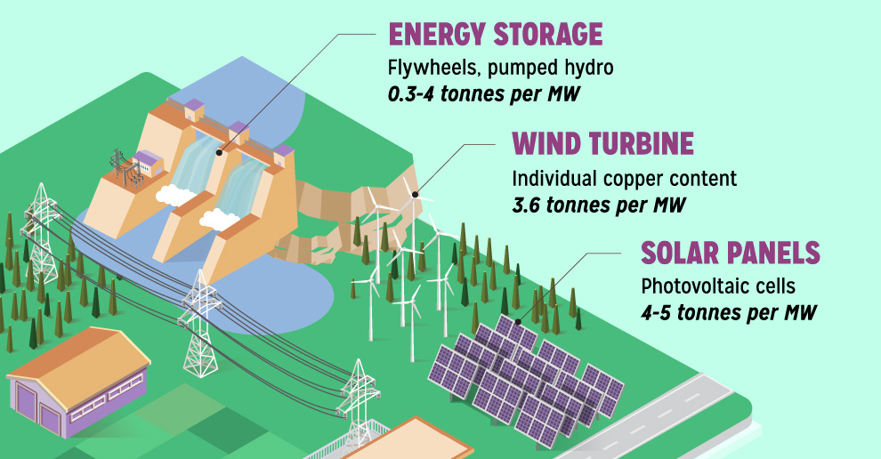
Renewable energy is set to fuel a new era of copper demand - here's how much copper is used in green applications from EVs to photovoltaics.
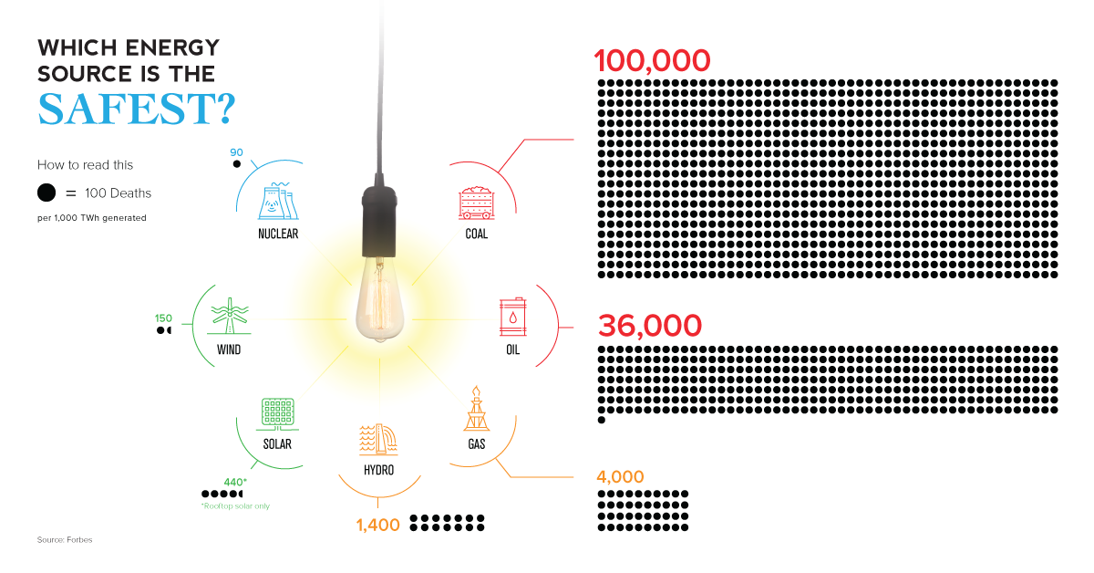
The empirical data on which energy source has led to the fewest human deaths may not be the one you expect.

In 2016, more net capacity was added for clean energy than all other types combined. Who's adding renewable capacity, and how much are they investing?
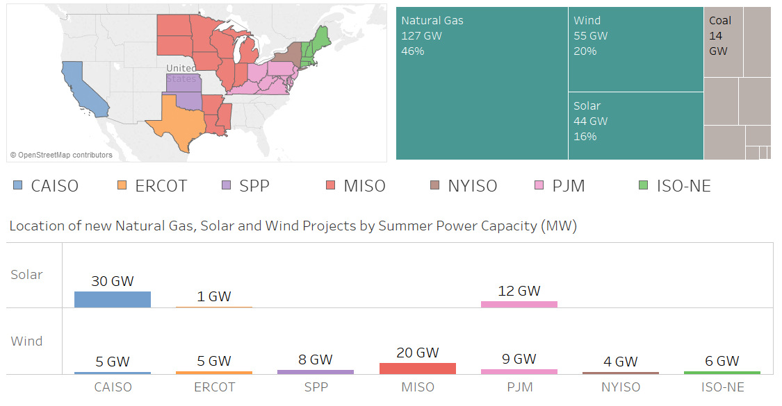
Nearly 100 GW of new power coming online is from solar and wind, making up 36% of new electrical capacity being added in these jurisdictions.
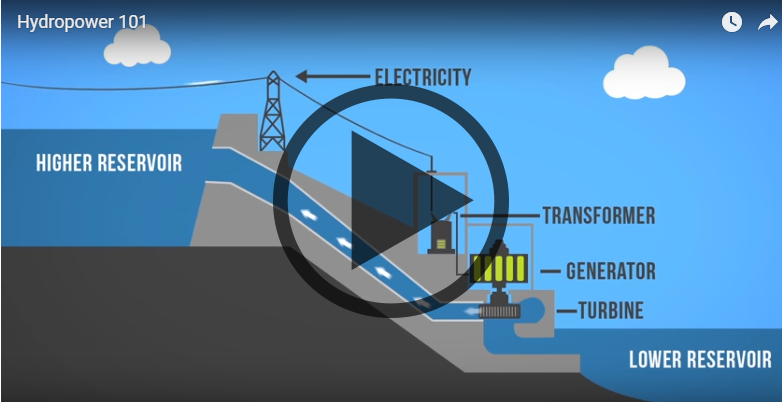
Want to learn about how different energy sources work? Check out these short, fact-driven videos on topics like oil, hydro, solar, wind, LNG, or fracking.
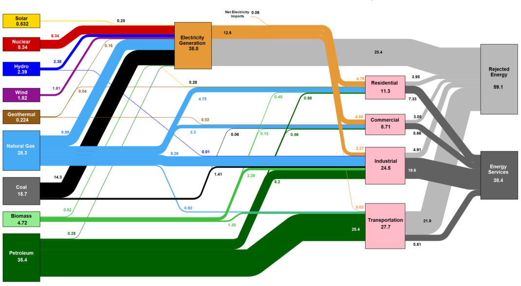
This massive diagram shows all energy created in the U.S., and where it goes. It's not sexy, but it gives a great 10,000 ft overview of...
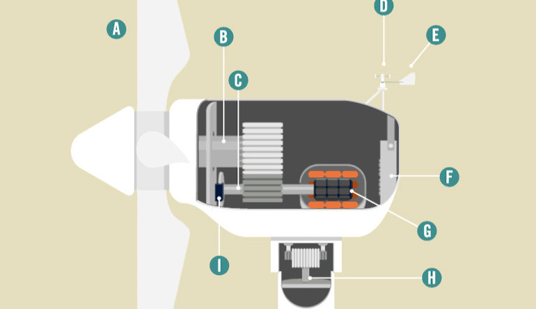
How does the modern wind turbine generate electricity? This animation breaks down the parts of a turbine, and how they all work together to make green...
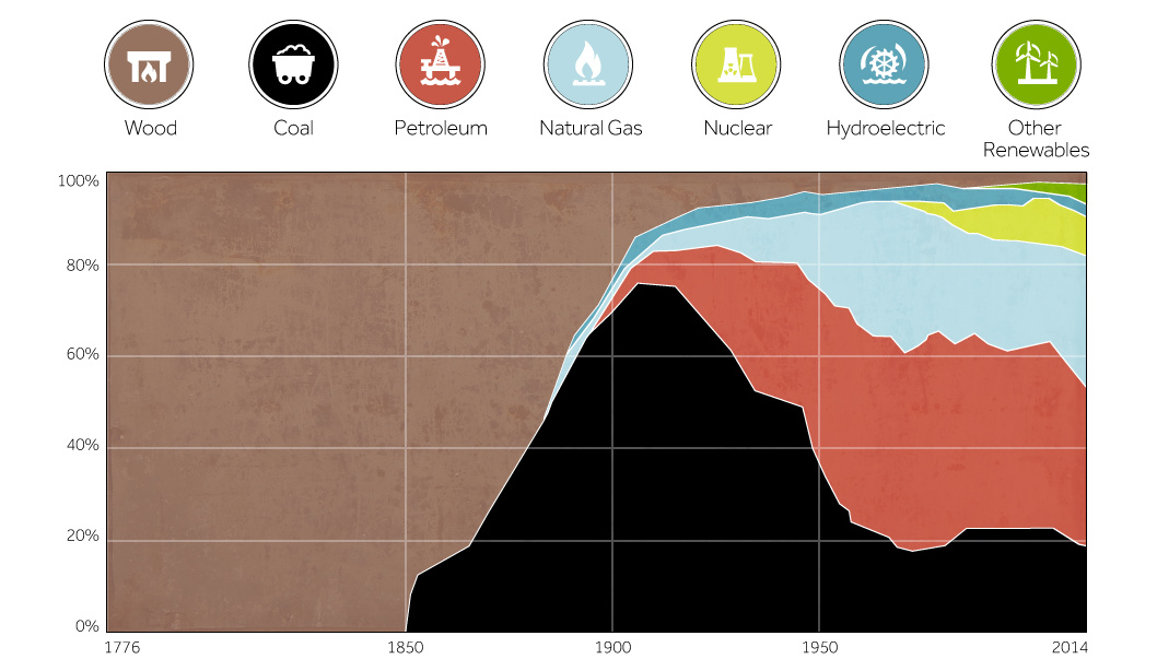
This chart shows the history of America's energy supply based on energy source. This brief history covers all from wood-powered locomotives to solar panels.
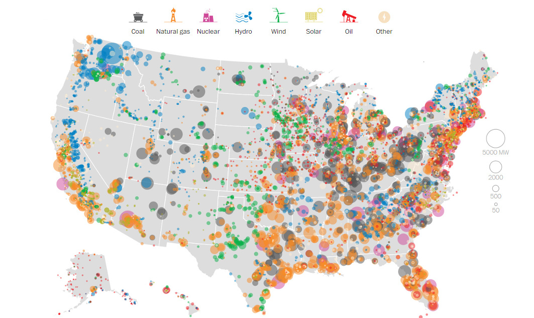
This series of data visualizations shows how the United States has generated its electricity so far in 2015 by energy source and size of each power...


