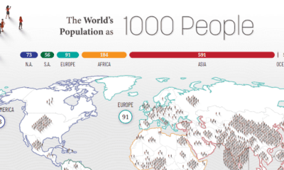

How would all the people in the world be spread out if there were only 1,000 people on Earth? This interactive map examines the breakdown.
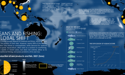

Where do our fish come from? This map charts ocean fishing activity and the amount of fish coming from aquaculture.
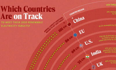

In this graphic, we visualize whether major electricity-consuming countries are on track to meet their 2030 renewable energy targets.
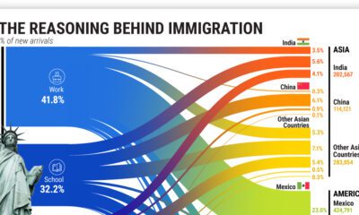

More than 45 million American residents were immigrants in 2021, having moved for various reasons.
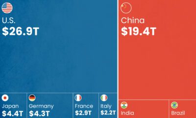

As BRICS is set to add six new countries, how does the bloc and its new members' GDP compare with that of the G7?
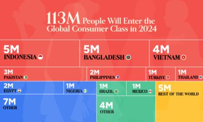

The global middle class is expected to grow by 113 million people in 2024. We visualize this growth by country and region.
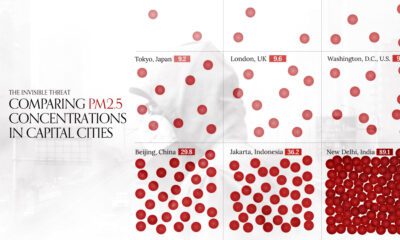

This visual compares air quality in 50 capital cities around the world by average PM2.5 concentrations in 2022.
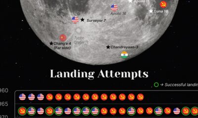

Since the beginning of the space race, only four countries have successfully accomplished missions to the moon.
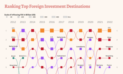

Take a look at changes in foreign direct investment flows over a decade, analyzing the top destinations and biggest investors.

This graphic shows GDP by country, broken down into three main sectors: services, industry, and agriculture.


 Creator Program