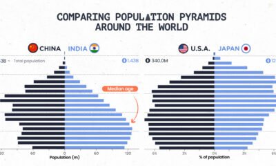

Population pyramids can show a country's demographic advantages and challenges at a glance. See how different parts of the world stack up.
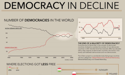

How many democracies does the world have? This visual shows the change since 1945 and the top nations becoming more (and less) democratic.
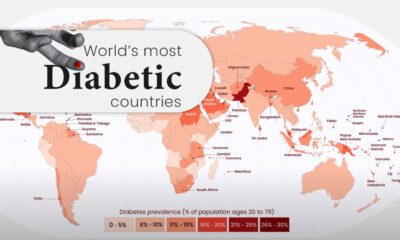

Diabetes affects millions of people around the world, but the spread isn't equal. This map highlights diabetes rates by country in 2021.
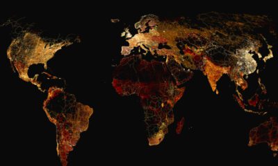

What does a road map of the world look like? Here’s a deep view of roads visualized by type across countries and continents.
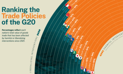

We analyze recent trade policies implemented by G20 members to determine whether they are liberalizing or harmful.
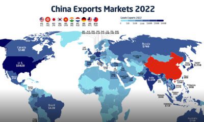

In 2022, China exported $3.6 trillion of goods, more than the GDP of the UK or India. Here's how Chinese exports have evolved since 2001.
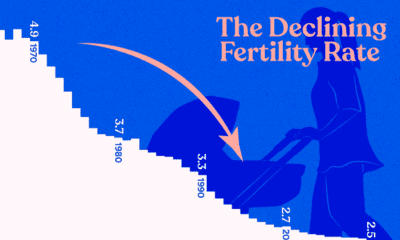

In this graphic we explore the world’s declining fertility rate over the last 60 years and the disparity in fertility rates between nations
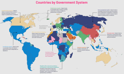

The political regimes of the world's countries have changed over centuries. This map charts the nine government systems that rule the world today.
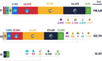

Despite the advent of renewable sources of energy, fossil fuels and their carbon emissions, haven’t gone anywhere.
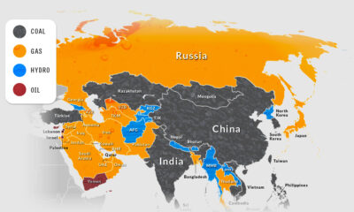

Asia is on its way to account for half of the world’s electricity generation by 2025. How is this growing demand currently being met?


 Creator Program