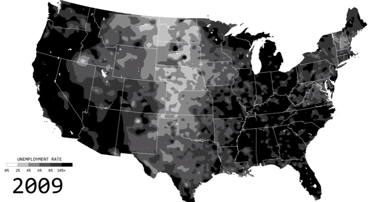
See the ebbs and flows of regional unemployment in the United States in this animated map from 1990 until 2016.
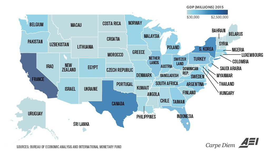
Texas is the size of Canada, and California is similar to France. Even tiny Vermont is comparable to a country's GDP (Bahrain).
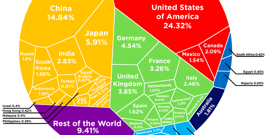
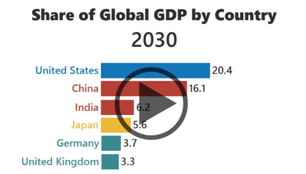
See how the multi-trillion dollar pie of the global economy gets divided between countries, based on the latest data from the World Bank from February 2017.
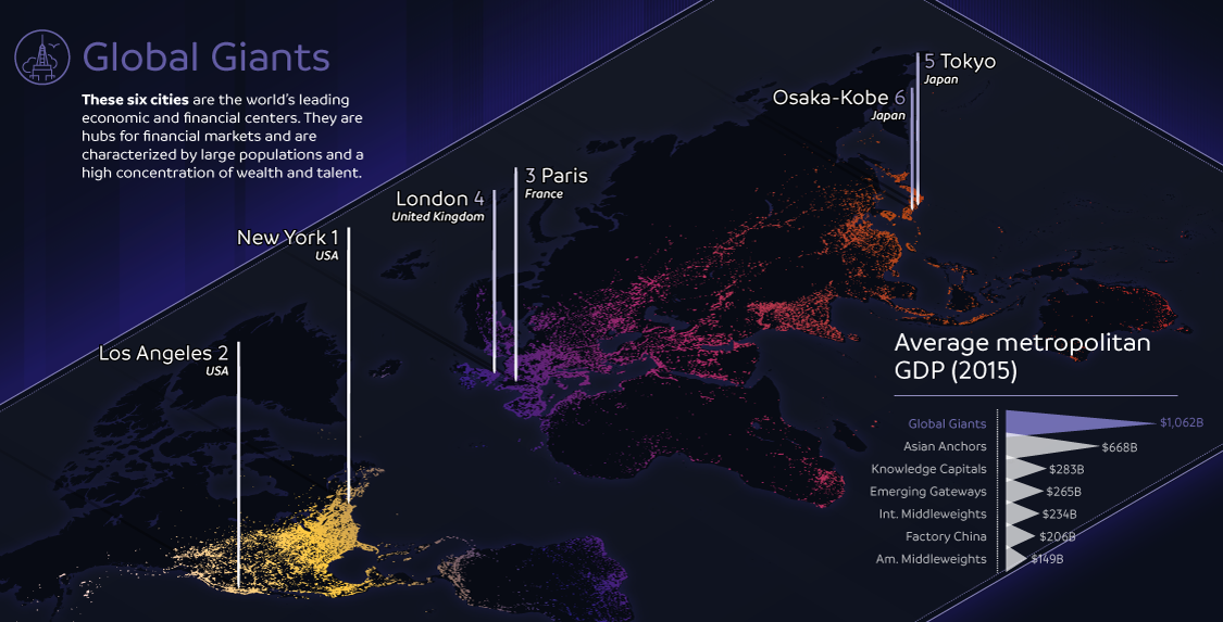
The world's largest 123 cities generate an astonishing $36 trillion in GDP per year. This infographic breaks these global cities down into seven typologies.
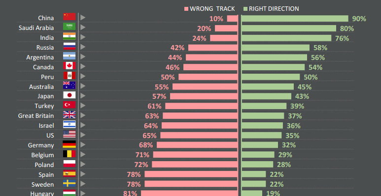
Do citizens think that their countries are heading in the right direction - or are they going down the wrong path? See survey results for 25...
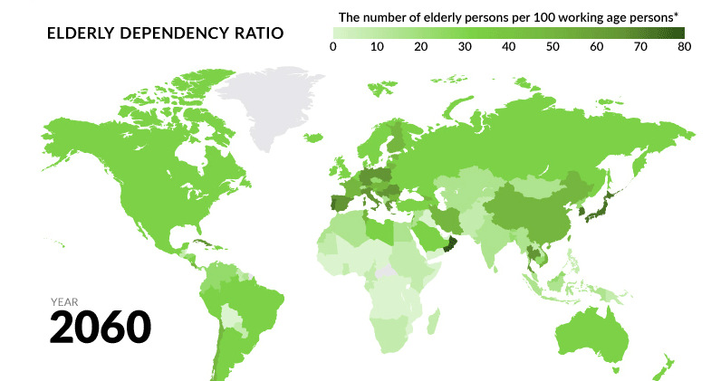
Globally, fertility rates have decreased by about half since 1960. What will happen to the economy when the world's aging population begins to retire?
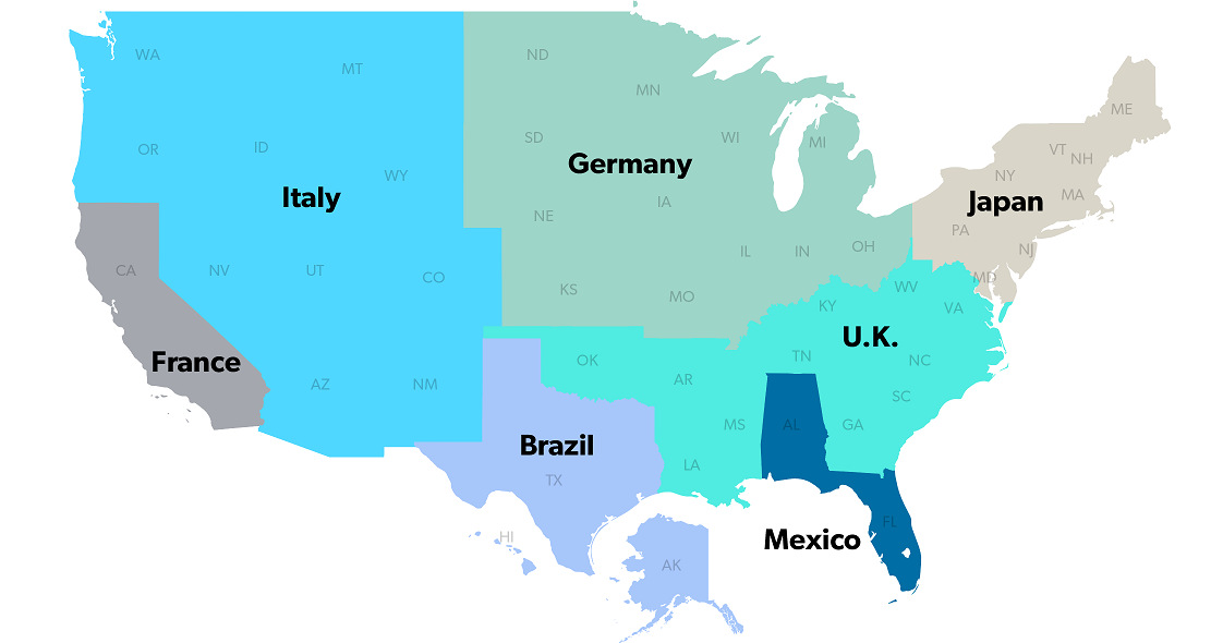
The United States has a $18 trillion economy - the biggest in the world. But here's another way of looking at it, using three interesting maps.
The rise of Asia has been swift. Here's three GIFs that show the speed of China in becoming an economic power house - and how India...
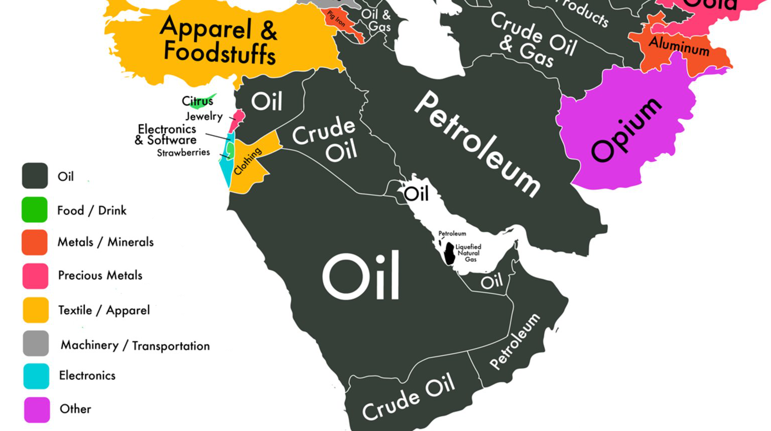
If we could only show you one map to explain the economy of the Middle East, it would be this one.
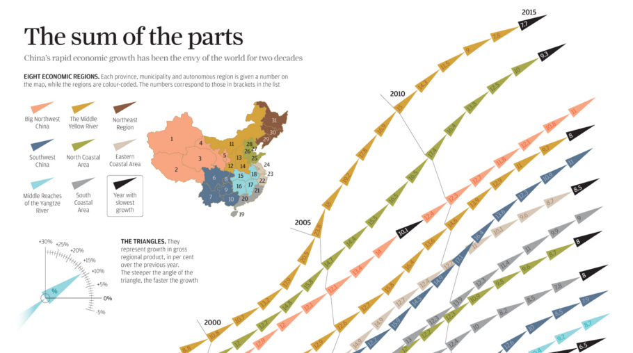
China's economic miracle over the last 20 years is the sum of its parts, with each region of the country contributing to growth in different ways.


